
Chart of the Week - Emerging Markets
Here's an update on that Brobdingnagian breakout in EM ex-China equities (but also a passing note on Chinese stocks)

This is probably one of the most important charts you’ve never heard of.
(unless you saw it when I first posted in July last year)
What it shows is Emerging Market Equities (excluding China)* breaking out from a Brobdingnagian Base 16-years in the making — and not only has the breakout withstood the tariff tantrum, the index has gone on to new all-time highs.
Here’s what I mentioned last year on this development:
“This is a rare setup that involves a long and often frustrating trading range with multiple attempts on a clear resistance zone. Part of what makes it powerful is typically throughout that period while price has pretty much gone nowhere, the fundamentals (earnings) have trended higher, so you have a valuation effect (price gets left behind by the fundamentals).“
There are many examples of chart patterns like this through history where once the breakout gets established it sets the way for a multi-year bull run.
I’ve spent a lot of time researching Emerging Markets and global equities, and what stands out to me and what makes this technical development interesting is that the countries that comprise this basket are for the most part trading on historically cheap valuations (and their currencies are also tracking extreme cheap vs the US dollar; making the odds of higher US$ returns better), and investor allocations to EM stock funds are either at record lows or decade+ lows depending what you look at.
What that all translates to me is that emerging market equities are undervalued, underowned, and underestimated — and it seems investors don’t understand what’s already underway here…
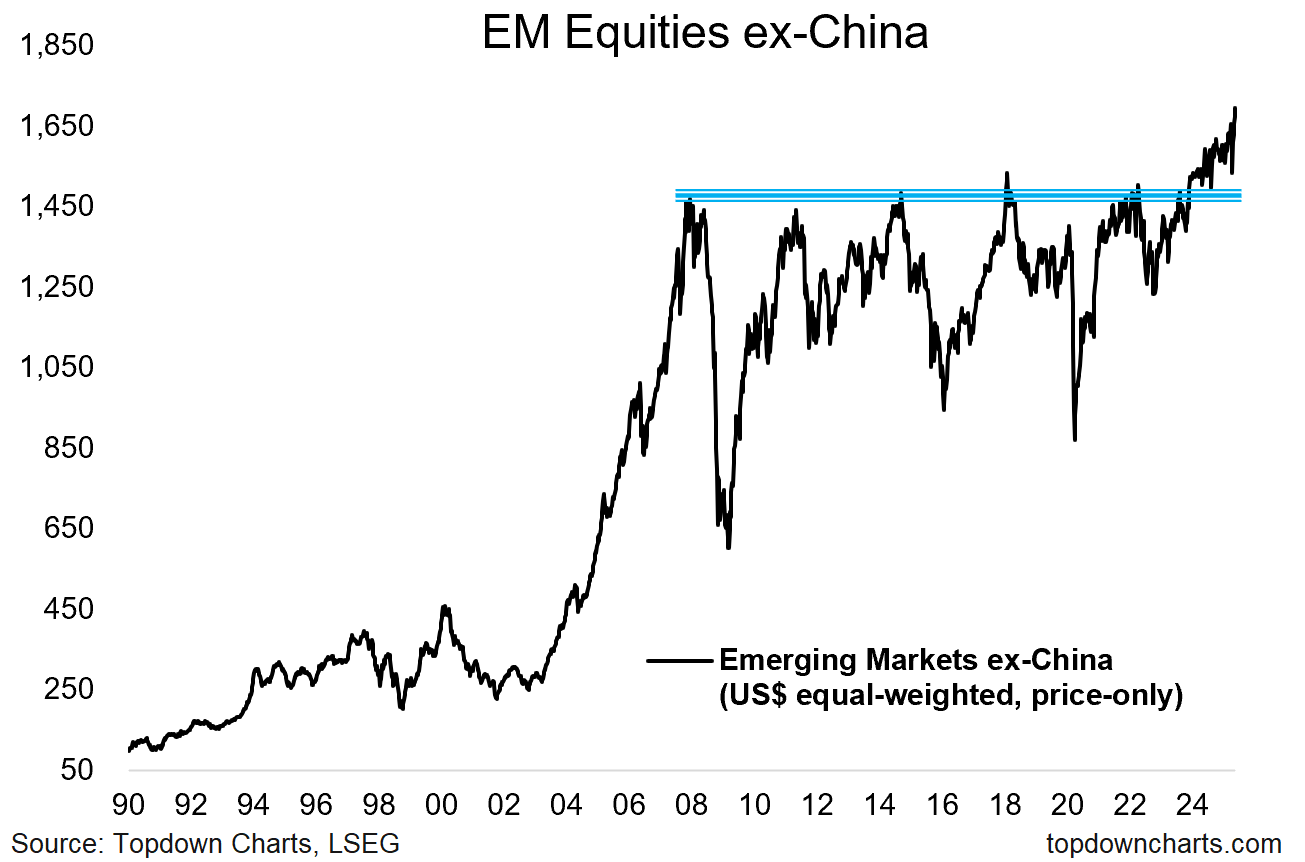
Key point: The big breakout in EM (ex-China) equities is making good progress.
*n.b. the index in the chart above was constructed (by me) using LSEG datastream country indexes, is price-only, and importantly: *equal-weighted* across emerging market countries and presented in US$ terms.
Check out our Institutional Service: Topdown Charts Professional
Top-down chart-driven macro insights for multi-asset investors.
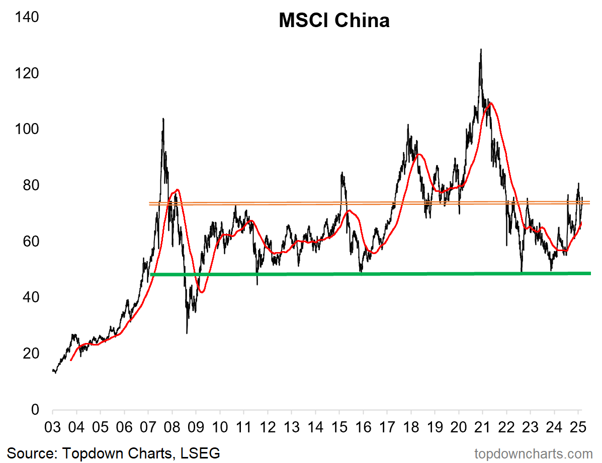
Bonus Chart: China Basing…
That’s EM ex-China, but what about China?
I would say do not count them out either. The MSCI China Index is undergoing its own basing and breakout process (looks to be either/both a double bottom or rounding bottom pattern in progress here).
And as for the setup in Chinese stocks, there’s improving technicals, cheap valuations, widespread pessimism, basing macro cycle, and monetary stimulus.
So what that all adds up to is basically: bullish emerging market equities in general.
Topics covered in our latest Weekly Insights Report
Aside from the chart above, we looked at several other charts, and dug into some intriguing global macro & asset allocation issues on our radar:
DXY Technicals: where to next for the US dollar
Global Growth Pulse: global growth outlook (actually good?)
Upside vs Downside Risks: refreshed inventory of up/down risks
Commodities: updated charts and views on this asset class
Emerging Markets: outlook for EM equities
GSV vs ULG: Global Small Value vs US Large Growth stocks
Subscribe now to get instant access to the report so you can check out the details around these themes + gain access to the full archive of reports + flow of ideas.
For more details on the service check out the following resources:
Getting Started (how to make the most of your subscription)
Reviews (what paid subscribers say about the service)
About (key features and benefits of the service)
But if you have any other questions definitely get in touch.
Thanks for your interest. Feedback and thoughts welcome.
Sincerely,
Callum Thomas
Head of Research and Founder at Topdown Charts
Follow me on Twitter
Connect on LinkedIn
NEW: Services by Topdown Charts
Topdown Charts Professional —[institutional service]
Weekly S&P 500 ChartStorm —[US Equities in focus]
Monthly Gold Market Pack —[Gold charts]
Australian Market Valuation Book —[Aussie markets]
Interesting chart, for sure.
It should be pointed out, however, that this is largely influenced by the US-dollar exchange rate. It's one reason why I don't like MSCI indices because they all convert LC stock prices into $ and hence always include the $ chart vs the respective LCU.
Doesn't invalidate your points; I just want to put it in perspective that it is largely a function and a mirror of the dollar topping and likely goig into a long term downtrend
Great chart for EM markets!