
Chart of the Week - Emerging Markets
After a 14-year bear market, investors are seriously underexposed to what may be one of the biggest opportunities in the coming decade...

Although there have been many false dawns over the past decade-and-a-half, there is good reason to believe that now is one of the best times in recent history to expect a turn in the long-term cycle of Emerging vs Developed market equity dominance.
Here’s why we should be looking at EM to start outperforming vs DM:
Valuations: on a variety of metrics, EM equities are trading at a major valuation discount vs developed market equities; this is an important starting point, but it’s also something that has been true for quite some time (so we also need to consider other factors when it comes to timing and conviction).
Allocations: as detailed in the bonus chart section below, investor allocations to EM equities are well below average, and represent major underweights vs the market cap weight of emerging markets.
Currencies: the US dollar has peaked for this cycle and is overvalued, meanwhile EMFX looks cheap and is turning up from a long downtrend (this will help EM equities outperform mathematically due to FX translation effects, but also due to financial conditions effects).
Sentiment: investor sentiment is still very skeptical on EM equities, in fact I imagine most people reading this are already coming up with arguments as to why I am wrong to be optimistic on EM :-) !
Cycles: EM central banks have been stimulating their economies, and many within this group have undergone a long period of stagnation and reform that will place them well to capitalize on the coming global economic upturn.
And then finally, let’s just take a look at the main chart this week — two key things should become obvious straightaway. First, there is a clear long-term uptrend in play, second, there are clear long-term cycles around that trend.
So even just keeping it simple, and focusing on that chart, you can see that we have deviated significantly to the downside of that long-term uptrend line (the big opportunities/risks come when you deviate substantially above/below that trend) — AND the cycle looks to be turning up again.
And then ultimately if we pair those technical chart observations with the various constructive fundamental observations, it sure starts to stack up.
We may well be on the cusp of a golden decade for emerging markets.
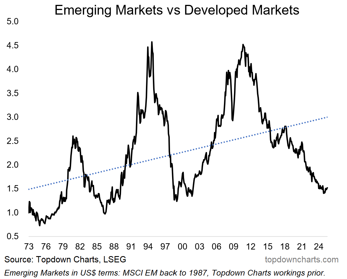
Key point: Long-term investors should rethink their global equity allocations, placing a greater emphasis on global diversification, especially with regards to EM equities.
SEE ALSO: institutional investor options for greater depth and detail of insights.
Bonus Chart 1 — EM Equity Allocations
This chart shows the market share of dedicated emerging market equity funds in both the US mutual fund market and ETF market — we can think of this as the implied allocation by investors to emerging market equities (in the aggregate).
So it’s fascinating then to see that mutual fund investors have an implied ~3% allocation to emerging market equities, while ETF investors are not much better; with 4% (which is down substantially from recent years, and a fraction of where it peaked at over 20% at the height of the post-08 recovery EM climax).
But really the key point is investors are running materially lower allocations than that seen over the past 20 years, and as you’ll see in the next chart… it’s also a fraction of the global market cap weight of EM equities (which is tracking just below 15%).

Subscribe to the Topdown Charts Entry-Level service to tap into a flow of ideas, risk management alerts, and meaningful macro insights.
Bonus Chart 2 — EM Equities Market Cap Weight
As noted, emerging market equities’ global market cap weight is hovering just below 15% — this is well below trend, and is at the low end of the range of the past 20-years. It’s also well below the GDP weight of emerging and developing countries (which is estimated by the IMF at 60%, or 41% excluding China, and that compares to advanced economies at 40%).
So the key point here is that this chart by itself is arguably another piece of evidence favoring EM equities given the deviation from trend (+undershooting of recent decades average), and given the disparity vs GDP weighting*, but perhaps most of all: even at the current lowish level it’s about 4x the typical investor’s allocation. That’s a massive underweight that investors in the aggregate are running.
All that’s needed is an excuse, a catalyst, a reason to reallocate, and we could see something really special here — something that only happens about once a decade (a shift and turn in the decadal cycles of relative performance in global equities).
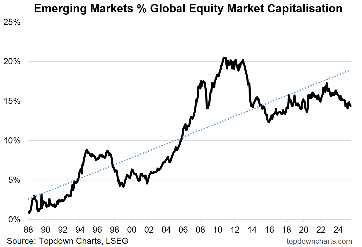
*p.s. yes, there are good reasons why EM is tracking below its GDP weight, and that DM is tracking above its GDP weight, but even if you assume it doesn’t get all the way there, it still has a lot of room to move. Also as a sidenote, the US (record high) market-cap-to-GDP-ratio is basically another datapoint affirming overvaluation there.
Topics covered in our latest Weekly Insights Report
Aside from the chart above, we looked at several other charts, and dug into some intriguing global macro & asset allocation issues in our latest entry-level service weekly report:
Market Update: latest on stocks, rates, credit, FX, commodities
US Dollar Outlook: tactical + strategic outlook for USD
Macro Risk Radar: key events & technical triggers to watch for
Quarterly Pack link: link to the latest Quarterly Pack & webinar
Ideas Inventory: latest updates and status of live views/ideas
Subscribe now to get instant access to the report so you can check out the details around these themes + gain access to the full archive of reports + flow of ideas.
For more details on the service check out the following resources:
Getting Started (how to make the most of your subscription)
Reviews (what paid subscribers say about the service)
About (key features and benefits of the service)
But if you have any other questions definitely get in touch.
Thanks for your interest. Feedback and thoughts welcome.
Sincerely,
Callum Thomas
Head of Research and Founder at Topdown Charts
Follow me on Twitter
Connect on LinkedIn
NEW: Services by Topdown Charts
Topdown Charts Professional —[institutional service]
Weekly S&P 500 ChartStorm —[US Equities in focus]
Monthly Gold Market Pack —[Gold charts]
Australian Market Valuation Book —[Aussie markets]
Appreciate the insights on emerging markets, valuations and fundamental catalysts, Callum!
My past experience with broad EM investing highlighted significant issues: currency risk, inflation, low returns on capital, and generally lower quality businesses. It made me question why own them when leading US/DM companies already operate successfully in these markets at higher profitability based on selective entry, and increased transparency. Amazon and Pepsi are good examples.
Now I focus on select, high-quality EM businesses. I hold a 2% position in Kaspi (60% ROIC) and may re-establish a position in Walmart Mexico (17% ROIC). We'd be remiss not to mention Mercado Libre of course.
see also: https://entrylevel.topdowncharts.com/p/chart-of-the-week-em-inflection-point-09a