Chart Of The Week - Global Relative Value
This week: global equities review, sources of upside, global vs US equities, value vs growth, small vs large, risk-on sentiment, commodities tactical outlook...
This email gives you a brief overview of what was covered in the latest Weekly Insights report including of course, the Chart Of The Week.
Check out the full archives of the Chart Of The Week for more charts.
Chart of the Week - Global Equity Relative Value
Global Equity Valuation Indicators: In the latest Weekly Macro Themes report, I covered small vs large, value vs growth, and global vs US equities, so I figured why not summarize the relative value picture across these 3 into one chart.
The chart uses a z-score to put them on a comparable basis. As we can see, the relative value picture is fairly compelling across these 3 flavors of global equities, and hence my directional bias to be bullish on small vs large, value vs growth, and global ex-US vs US equities.
p.s. the next chart takes it a step further…
Key point: There remains compelling relative value opportunities in global equities.
Please feel welcome to share the Chart of the Week!
I would greatly appreciate it if you can help spread the word ↓
The easiest way to help do that is to simply forward this email to your friends, or you can just share the chart/link on social media (and be sure to mention us! :-)
BONUS CHART!! [because I thought it was just so interesting to look at this one with the previous chart in context, that I couldn’t not share it!]
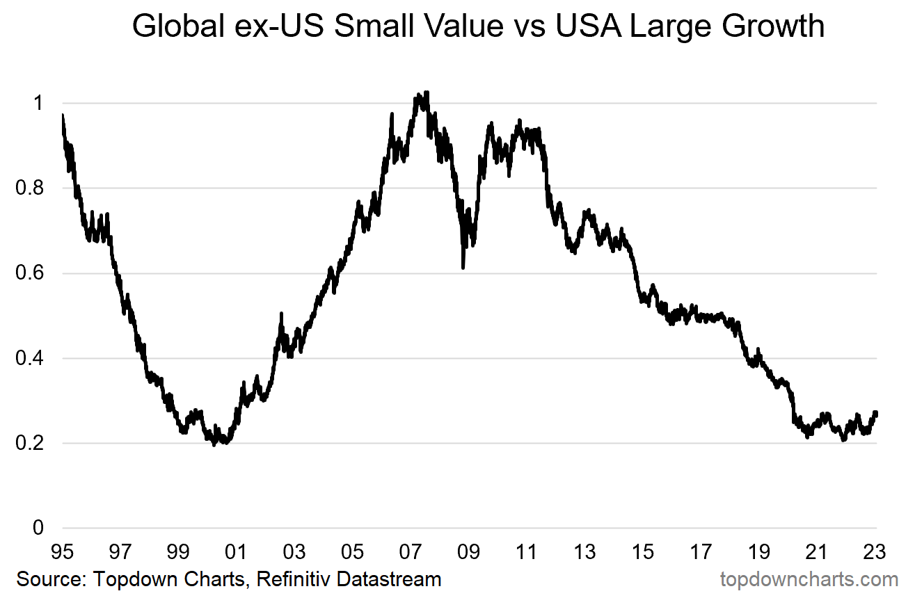
Global ex-US Small Value vs US Large Growth: This one takes the MSCI ACWI indexes relevant to the previous chart and specifically looks at the relative performance of the MSCI All Countries World Index excluding USA: Small Value, vs MSCI USA Large Growth.
We can see how the collective relative value opportunity from the previous chart emerged (a decade long ~80% drawdown in relative performance)… but also what could be at stake if history repeated (albeit it would be hard to precisely repeat all the myriad macro trends that went on during the 2000’s!!).
Another perspective on it would be that it goes to show how extreme the crowding into US large growth (tech) has been over the past decade — i.e. the flipside.
Key point: An obscure but massive relative bear market looks to have troughed.
Topics covered in the latest Weekly Insights Report
Aside from the charts above, we looked at several other charts, and basically put together a special edition on Global Equities this week:
Global Equities: risk/reward balance shifting after a big reset.
Sources of Upside: table shows sources of upside + probability/impact.
Global vs US: the tides are turning in relative performance.
Value vs Growth: a sustainable turning point is in for value vs growth.
Small vs Large: US small caps look well positioned vs large caps.
Risk-On Markets: looking at credit spreads and sector performance.
Commodities Ups and Downs: reviewing the tactical outlook.
Subscribe now to get instant access to the report so you can check out the details around these themes, as well as gaining access to the full archive of reports.
For more details on the service check out this recent post which highlights:
a. What you Get with the service;
b. the Performance of the service (results of ideas and TAA); and
c. What our Clients say about it.
Thanks for your interest. Feedback and thoughts welcome.
Sincerely,
Callum Thomas
Head of Research and Founder at Topdown Charts
Follow me on Twitter
Connect on LinkedIn


