Chart of the Week - Speculation Heights
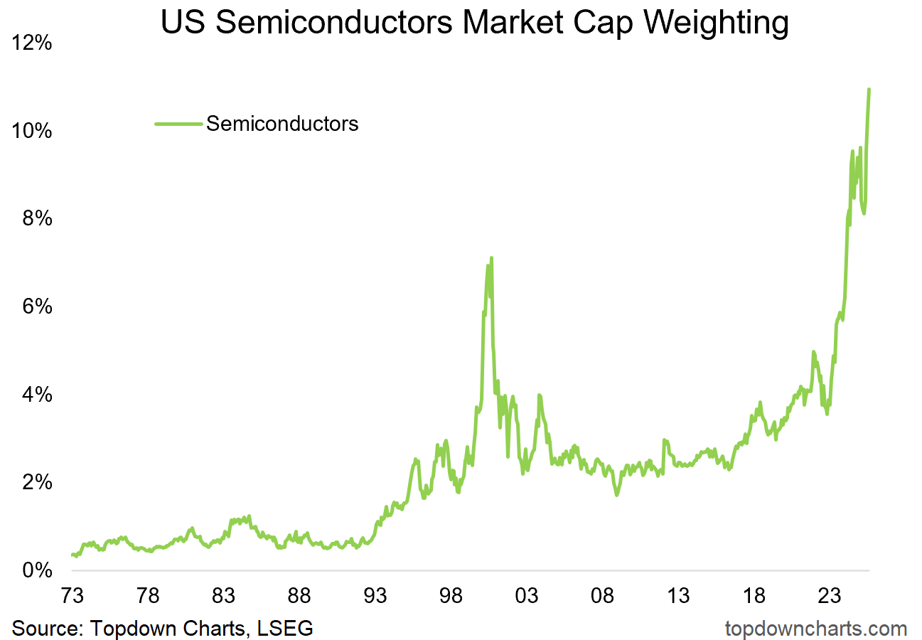
US Semiconductors market cap weight just reached a new all-time high...
It’s different this time…
That’s what they say.
And to be fair, they kind of have a point.
The tech boom we are living through right now is extremely different from the dot com bubble on many counts.
And yet —it seems for every difference there is a similarity, for every justification and cause for optimism there are rising risks and cause for concern.
This week’s chart is a perfect illustration… It shows the path of US Semiconductors’ market cap weighting (which has just reached a new all-time high).
Here’s some perspectives on this chart and possible next steps.
Glass Half-Full: sectors rise and fall over time and new sectors get big and stay bigger for longer as their economic significance rises (e.g. General Motors was the biggest stock for decades during mass adoption of automobiles, the energy sector went from about 3% market cap weight in 1912 to 18% in 1921 and ranged around 10-20% up until the 90’s... even the tech sector went from 6% in the early-90’s to an average of 15% in the decade following the dot-com bust, and there are many more examples of sectors once grand becoming a shadow of their former selves).
In other words, if semiconductors really are that economically significant in the AI-age, then it’s actually good, fine, and normal to see the rise and rise of semis.
Glass Half-Empty: it’s all gone too far too fast. I think you can even have a tactically glass half-empty view that says it’s overhyped in the short-term, but will remain a significant and important sector going forward. Even with that example before of the energy sector, there were many booms and busts along the way, and there are so many examples of sector/industry market cap weightings surging to highs and extremes like we see in the chart below, only to come crashing back down (even if to a new higher plateau relative to before the hype cycle began).
The Cycles Perspective: taking the pragmatism or realism a little further, there are 3 cycles we need to think about here — the Stockmarket Cycle (and we are looking well-progressed in the cycle on that front), the Hype Cycle (with regards to new tech adoption; arguably that’s well progressed in the hype stage), and the Bubble Cycle.
On that note, with the latest move higher it’s anyone’s guess as to how far it goes… this is the melt-up stage of the bubble cycle and it’s dangerous on 2 counts: dangerous to bet against it as it can go further and faster than you think, and dangerous when it turns as it can do so without warning —and drop just as fast: see the 2000 peak-and-pop below.
So there you go, it might go up, it might stay up, and it might come crashing down — that’s the thing, we can look for warning signs, we can prepare, we can draw up contingencies, diversify, use portfolio protection, and even let some of the upside run and lean into it… but at the end of the day, it is a guessing game as to how things will precisely run their course when we get to this stage of the big 3 cycles.
Having visibility on the state of things and a clear perspective on the possibilities is key to navigating this exciting and harrowing stage of the cycle.
Key point: We’re in dangerous market territory for bulls and bears alike.
If you haven’t already, be sure to subscribe to the Topdown Charts Entry-Level service for more exclusive ideas and helpful investment insights.
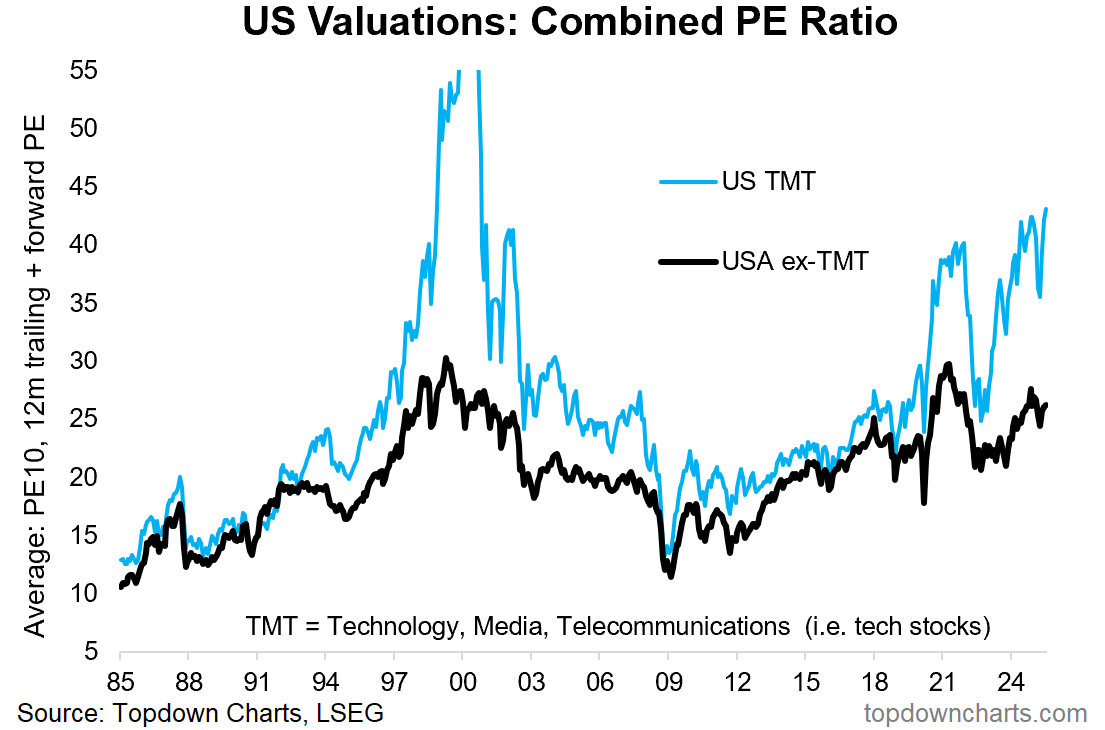
Bonus Chart 1 — US Tech Stock Valuations
Echoing those themes, I feel it’s important to highlight this chart. Tech sector valuations have reached a new post-dot com bubble high. In other words, you had to go all the way back to the heights of the dot com bubble to find a more expensive market and crazier valuations (not to mention market sentiment).
Again, to give some balance to it, we do need to keep in mind that valuation indicators like this are ultimately measures of investor confidence. Sometimes that confidence is well-placed, other times it’s an over-extrapolation of the past and the result of excess greed and liquidity sloshing through the system.
But the key truth here is that tech stocks are extremely expensive, and non-tech stocks are not exactly cheap either. As I noted before — we’re well progressed in this market cycle, and at these levels of valuation it leaves very little margin for error if anything goes even slightly wrong.
For more insights into US Equities check out the The Weekly ChartStorm
Bonus Chart 2 — Valuation Extreme Peaks
On the topic of valuations and market cycles, I re-post this chart [Chart of the Week - Tops and Bottoms] which shows how the stockmarket traveled on average into and after valuation-extreme market peaks.
Probably the key point to make is that the ride up is deceptively and seductively smooth, but when it turns it turns suddenly and significantly. Again, it goes to reiterate that point from before — we are in a dangerous market moment for bulls and bears alike…
Topics covered in our latest Weekly Insights Report
Aside from the chart above, we looked at several other charts, and dug into some intriguing global macro & asset allocation issues in our latest entry-level service weekly report:
Credit Spreads: examining the credit risk premium
Developed Market Equities: DM ex-US technicals, value
European Equities: the upside case, crowd sentiment, valuations
Japan: taking stock of fundamental improvements, upside prospects
UK Equities: key technicals, sentiment, value backdrop
Canada: establishing coverage of Canadian stocks
Subscribe now to get instant access to the report so you can check out the details around these themes + gain access to the full archive of reports + flow of ideas.
For more details on the service check out the following resources:
Getting Started (how to make the most of your subscription)
Reviews (what paid subscribers say about the service)
About (key features and benefits of the service)
But if you have any other questions definitely get in touch.
And if you would like a greater level of depth and detail + access, check out our Institutional Service: Topdown Charts Professional
Thanks for your interest. Feedback and thoughts welcome.
Sincerely,
Callum Thomas
Head of Research and Founder at Topdown Charts
Follow me on Twitter
Connect on LinkedIn
NEW: Services by Topdown Charts
Topdown Charts Professional —[institutional service]
Weekly S&P 500 ChartStorm —[US Equities in focus]
Monthly Gold Market Pack —[Gold charts]
Australian Market Valuation Book —[Aussie markets]


