Chart of the Week - The Best vs Worst
The Best stocks Now Look the Worst, and the worst look the best -- here's a look at why and what to watch for on the Bullish vs Bearish pathways from here...
Hidden pressures are building up beneath the surface of the stockmarket.
And most people are ignoring this (some knowingly, others oblivious).
What we’re seeing is some of the most extreme relative valuation readings in history —and this type of setup has been a harbinger before of big moves, major changes, and generational opportunities for smart asset allocators.
I call this theme the Relative Value Trinity of Global Equities:
Small vs Large: the smallest stocks are much cheaper than usual vs the largest stocks (and we see this especially in the USA but also globally).
Value vs Growth: the cheapest end of the market is much cheaper than usual vs the more richly priced growthier end of the market (again, this is something we see globally, but especially pronounced in the USA with big tech outshining everything else).
Global ex-US vs USA: globally stocks are much cheaper outside of the USA both absolute and relative (for instance, over 95% of countries are trading at least 20% cheaper than the USA).
As with most big trends (and even manias) in markets the way we got here made a lot of sense — in fact one of the big reasons why we find ourselves here is that just over a decade ago we were sitting in the exact *opposite* situation.
Back in 2007 large caps were cheap vs booming small caps, overhyped global stocks were trading at a major premium to lagging and cheap US stocks, and value stocks were riding high on a global commodities and credit boom while tech stocks were a shadow of their former dot-com glory.
It was precisely those conditions that set the scene for what has been a golden decade in US/Large/Growth stocks — this is an important point because it goes to show that these things go in cycles and that there are always clues for those willing to look for them.
And I also want to emphasize that back around that time the dominant investing narrative had nothing to do with tech or AI, it was all about the rise of emerging markets, the allure of global banks, and the super cycle in commodities… it may seem obvious now, but back then it was unthinkable to go against the prevailing consensus and wisdom of the time.
I emphasize that because now it’s the opposite — it’s unthinkable to go against the prevailing wisdom of our time that US big tech is the only game in town. In fact you might get fired if you lean against the hype and froth that dominates today’s market, where US/large/growth has become overvalued, overhyped, and frankly overrepresented in the cap-weighted indexes.
There’s a lot more I could say about what’s been driving and reinforcing the trends that got us here, but I think in the end it’s best to just let today’s chart speak for itself (with particular emphasis on cycles and extremes).
And one more thing: there seems to be a growing chorus these days saying valuations don’t matter, and technically these guys are correct… valuations don’t matter until they matter (when the trend turns and the tactical indicators line up with the more strategic valuation indicators). But I would add to that one more key point that I’ve seen play out over and over: valuations might not matter …until they reach an extreme; when the pressures build up to such an extent that almost any catalyst (and often the least expected and initially smallest shift) triggers a major turning point.
And p.s. in case you didn’t notice the chart below is *extreme*.
Key point: The relative value extremes building up across global vs US, small vs large, and value vs growth represents a major opportunity (and risk).
Bonus Chart 1 — Absolute Valuations
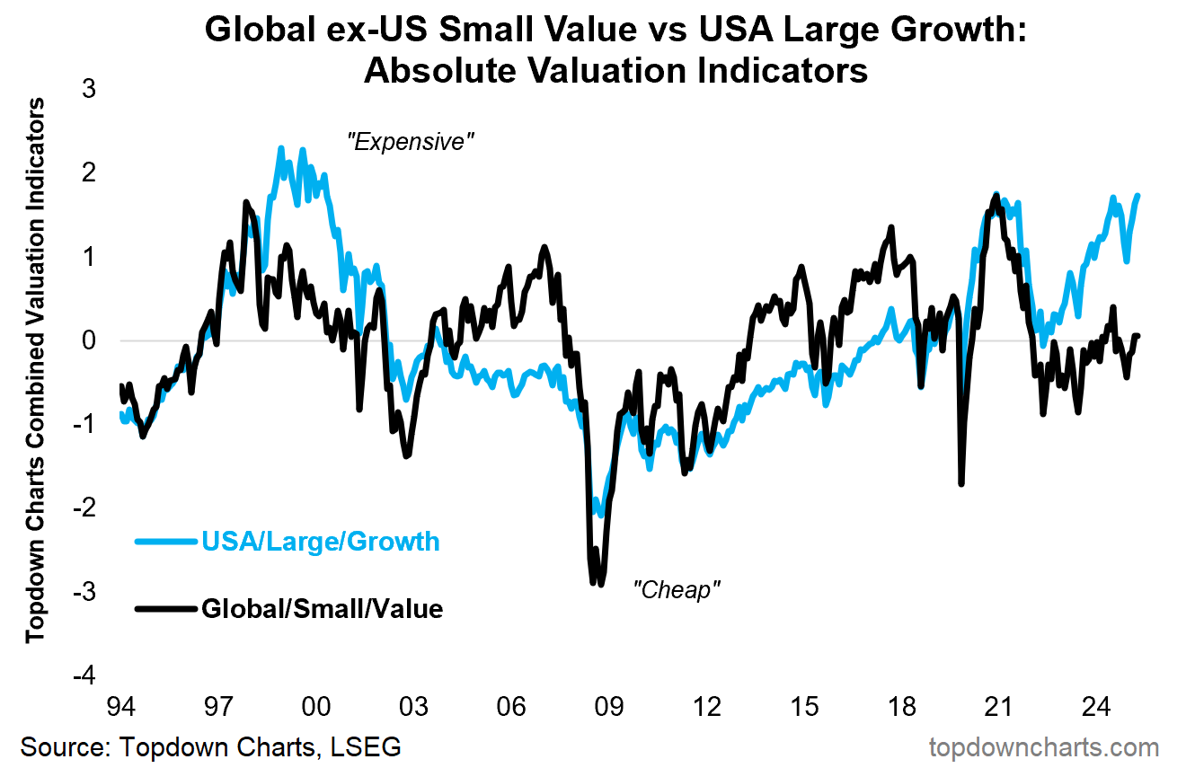
I wanted to also share this chart because it shows the average absolute valuation indicator across each of the 3 groups on either side of the chart above (USA, Large, Growth [ULG] in the blue and Global, Small, Value [GSV] in the blue).
The reason this is interesting is because it highlights on the ULG side that not only is this group trading at expensive relative valuations vs GSV, but they’re also at historically elevated absolute valuation levels — close to levels we saw at the peak of the dot com bubble in 2000 and at the peak of the 2020/21 stimulus frenzy bubble.
This touches on the bearish pathway of how this might resolve… the bearish pathway is that the overvalued and overhyped US/Large/Growth story unravels and that group mean reverts its way down (falling further and faster than the other group).
But let’s also look at the black line and the bullish pathway. The bull path is bullish rotation and catch-up by the much more reasonably priced global/small/value (reasonable absolute valuations and unreasonably cheaply priced relative valuations).
This is why I think this may be one of the most important themes in global equities right now because it touches on the big picture bull vs bear view, the major risks facing investors, and some truly significant relative (and absolute) opportunities.
Bonus Chart 2 — Relative Performance
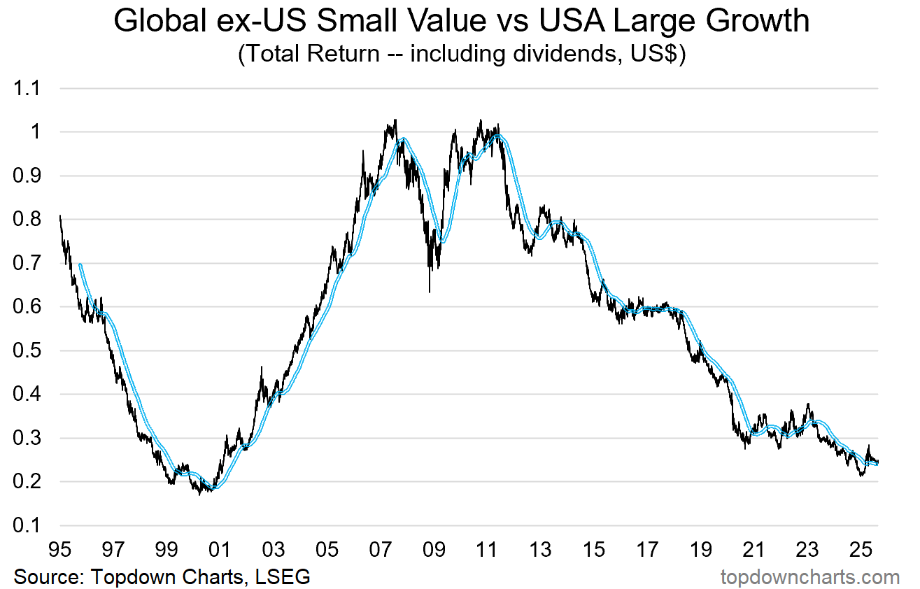
Lastly, for completeness, it’s also worth a look at the relative performance line for Global/Small/Value vs US/Large/Growth: basically GSV has been in a decade+ relative bear market vs ULG.
Aside from showing the price path of how we got here, it also is in a sense where the rubber hits the road on the relative value trinity theme — with major valuation extremes it’s important to not get too fixated on only one piece of information.
Even as the relative value indicators reach new extremes, if you’re out there hunting for turning points that’s only one piece in the puzzle. You also need to see technicals lining up… price needs to stop falling and actually turn. So I would say in terms of the timing aspect that this chart (and a few other charts I’m keeping close tabs on) is just as important to keep tabs on as the valuation charts.
Subscribe to the Topdown Charts Entry-Level service (click below) for more insights, or sign up to Topdown Charts Professional for more in-depth reports and further details on the major macro/asset allocation themes of our time...
Topics covered in our latest Weekly Insights Report
Aside from the chart above, we looked at several other charts, and dug into some intriguing global macro & asset allocation issues in our latest entry-level service weekly report:
Emerging Markets: technical update on EM Equities (+China) .
US Dollar Outlook: comprehensive update on the short+medium term outlook.
GSV vs ULG: exploring valuation issues + technicals in global equities.
EM Fixed Income: a look at emerging market bonds (value, policy, positioning).
LatAm Equities: reviewing the bull case for the other American stockmarket.
Frontier Markets: taking stock after a stunning run of bullish performance…
Subscribe now to get instant access to the report so you can check out the details around these themes + gain access to the full archive of reports + flow of ideas.
For more details on the service check out the following resources:
Getting Started (how to make the most of your subscription)
Reviews (what paid subscribers say about the service)
About (key features and benefits of the service)
But if you have any other questions definitely get in touch.
And if you would like a greater level of depth and detail + access, check out our Institutional Service for the full reports: Topdown Charts Professional
Thanks for your interest. Feedback and thoughts welcome.
Sincerely,
Callum Thomas
Head of Research and Founder at Topdown Charts
Follow me on Twitter
Connect on LinkedIn
NEW: Services by Topdown Charts
Topdown Charts Professional —[institutional service]
Topdown Charts Entry-Level Service —[entry-level version]
Weekly S&P 500 ChartStorm —[US Equities in focus]
Monthly Gold Market Pack —[Gold charts]
Australian Market Valuation Book —[Aussie markets]


Objective analysis of trend turns is the only way to ascertain the true state of small vs large .. growth vs value.. domestic vs international