Chart of the Week - The Worst Chart
This may be the worst chart ever for investors in US assets...
Late last year US asset valuations reached a major milestone 16-years in the making.
After a golden decade for returns from the depths of 2009, the average valuation score for US stocks, corporate credit (spreads), US Dollar (DXY), and real estate —reached a record high expensive level.
Even the casual observer will notice something immediately from this chart.
Investors had a good-time-for-a-long-time buying when this indicator reached low levels, and had a bad time when buying at high levels.
Basically we went from one of the best buying opportunities in history back in 2009, to one of the worst around the turn of the year.
They say don’t bet against America, but I would say that’s more of a statement about the long-term, as there has been plenty of times where from a cyclical standpoint it made a lot of sense to either bet against or go all-in betting for…
Rather —what you find in macro and markets is that sometimes the best markets have the worst setup, and sometimes the worst markets have the best setup.
Really the key point to make with this chart is that it probably doesn’t make sense for US asset classes to trade at such a premium when political risk is now a lot higher, and recession risk is rising (now at least 50%).
In short — when you price-for-perfection and then find yourself in an increasingly imperfect world, it’s time to pause and think.
(as many now are… see bonus charts below)
Key point: 16-years on from one of the best buying opportunities in history, investors in US assets now face one of the worst risk setups in recent decades.
Time to buy — upgrade to paid to access our entry-level service reports…
From a timing standpoint, good insights on macro and markets are probably more valuable now than ever, so it’s time to get on board!
Bonus Chart(s) —> Trade Fight = Capital Flight…
I thought it worth highlighting a couple of additional charts I’ve come across that illustrate how this week’s chart may play out.
The first chart shows foreign holdings of US equities vs their total holdings of US financial assets; you can see just how much foreign investors have been crowding into US stocks — just compare and contrast the peak of the dot com bubble vs the depths of the financial crisis. And the reality is foreign flows have been a critical part of the story above; driving things higher on the way up.
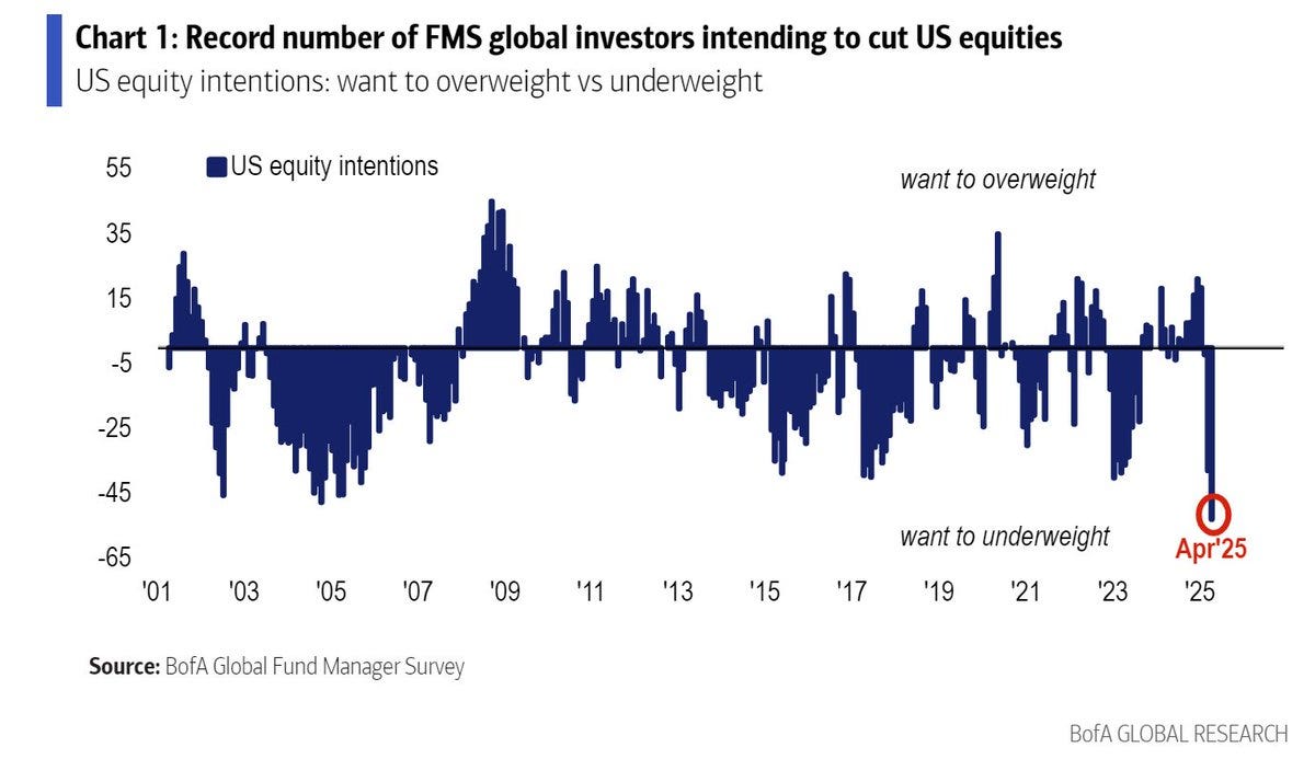
But as alluded to, the many minds of markets are beginning to change; global investors are reporting a record high intention to underweight US equities.
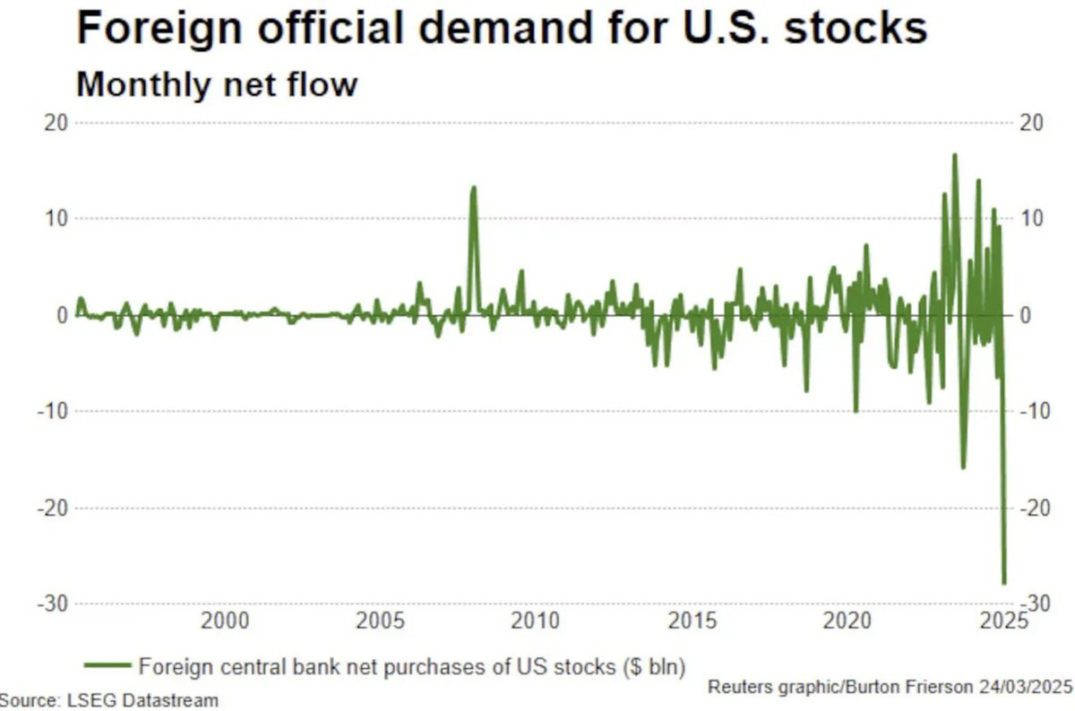
And in the flows data you can see that this is not just a matter of opinion, they are voting with their feet. Concerns around the prospect of US dollar weakness, still relatively high valuations, policy uncertainty, and recession risk make it an easy and safe decision for many to rotate out of US stocks and either back into their home markets or other assets entirely.
And as noted in our reports (e.g. the latest Weekly Insights Report), there are compelling reasons to expect global equities (ex-US) to outperform vs US equities (following more than a decade of the opposite)…
UPGRADE TO PAID, ACCESS FURTHER INSIGHTS
Topics covered in our latest Weekly Insights Report
Aside from the chart above, we looked at several other charts, and dug into some intriguing global macro & asset allocation issues on our radar:
Commodity Technicals: outlook for commodity prices
Weighing Recession Risk: the probability of recession is high
Stocks vs Bonds: key asset allocation decision required
Credit Spreads: checking in on credit spreads, risks
US Dollar: examining the bearish outlook for US$
Global vs US: checking in a prospective great rotation
Subscribe now to get instant access to the report so you can check out the details around these themes + gain access to the full archive of reports + flow of ideas.
For more details on the service check out the following resources:
Getting Started (how to make the most of your subscription)
Reviews (what paid subscribers say about the service)
About (key features and benefits of the service)
But if you have any other questions definitely get in touch.
Thanks for your interest. Feedback and thoughts welcome.
Sincerely,
Callum Thomas
Head of Research and Founder at Topdown Charts
Follow me on Twitter
Connect on LinkedIn
NEW: Services by Topdown Charts
Weekly S&P 500 ChartStorm [US Equities in focus]
Monthly Gold Market Pack [Gold charts]
Topdown Charts Professional [institutional service]
Australian Market Valuation Book [Aussie markets]


Diversification is key. I own more EM and EU equities than I ever have right now. And lots of gold. But There's still no place on earth that capital is treated better than the United States.
Image: US assets remain expensive, even after 2025 selloff https://substack-post-media.s3.amazonaws.com/public/images/4644809f-0147-4736-9bd9-ee95a4e0d382_1240x815.png
Would never buy because something is "cheap" or sell because something is "expensive", but as the technicals right now are unfavorable and Trump seems intent on continuing his tariff policy, this chart does not bode well for US assets