Chart of the Week - USD FX Volatility Crunch
Cycles of calm and chaos in currency land...
Chart of the Week - FX Volatility Crunch
From Chaos to Calm and Back Again: so you might be thinking, FX volatility crunch? …what is this, some type of new cereal for FX traders?? And well, it does actually have something to do with slumber and waking, so let’s get into it.
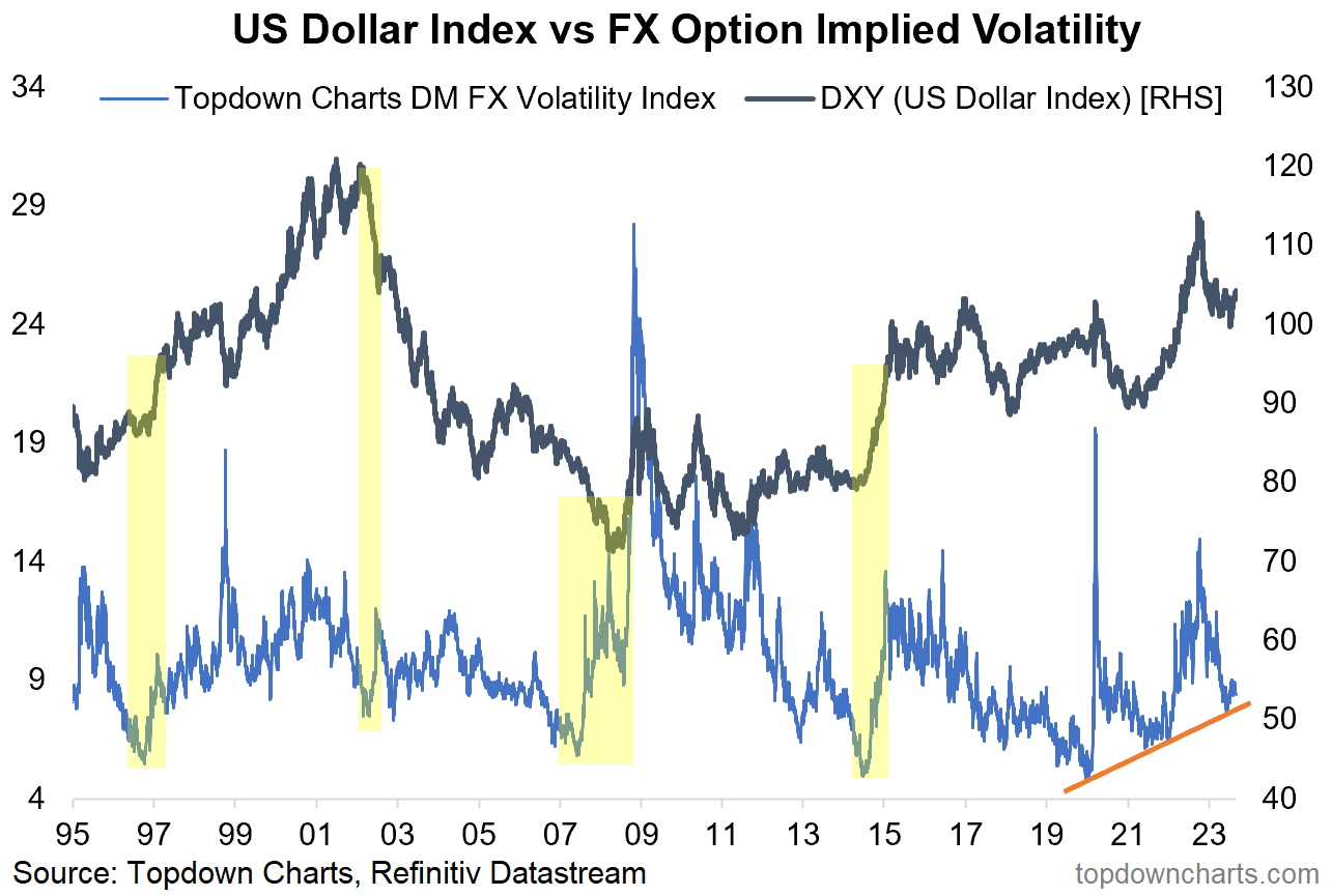
This week’s chart shows the US dollar index (DXY) vs an index I put together of 1-month FX options implied volatility for the USD vs developed market currencies. It’s a sort of similar idea to the stock market’s volatility index — the VIX.
And very much like the VIX and the stockmarket, there are interesting signals about sentiment and price action that can also be gleaned from this indicator.
From first glance you can probably fairly quickly recognize 2 main types of signals:
1. Very High Volatility (spikes).
2. Very Low Volatility (compressions).
Both types of signals offer some pretty interesting + useful information on the path of the US dollar index.
Volatility Spikes (e.g. 1998, 2008, 2015, 2020, 2022) happen during violent and sharp moves in the currency, and reflect both this actual uptick in volatility but also a market sentiment aspect, and overall basically tend to tell us that the move is being, or about to be, exhausted — often resulting in a subsequent range-trade or reversal.
Volatility Compressions (e.g. 1996/97, 2002, 2007/08, 2014, 2020, 2021) by contrast happen when the market gets very sleepy, complacent, and stuck in an indecisive stalemate of a trading range… e.g. as it is currently in the process of doing right now.
It is a well known phenomenon in markets that high volatility is a good predictor of low volatility, and vice versa, there’s good reason for this, but perhaps the main point to focus on is that the relative calm of the stalemate range-trade of indecision represents just that — an indecisive market where bulls and bears are evenly matched, and simply waiting for some type of (usually macro) catalyst to trigger an end to the impasse.
And when a breakthrough is reached out of this calm/stalemate/indecision, a breakout or turning point is almost always chalked up. In other words, from calm comes chaos.
So finally he gets to the point: the FX market has just gone through one of these volatility compressions, with the DXY itself showing a clear coiling into one of those classic range-trades of indecision and stalemate. But also of intrigue is the volatility index itself apparently marking a series of higher troughs… could “the big one“ in FX land be coming right around the corner?
With the Fed near the end of its tightening cycle, recession signals all over the place, geopolitical tinder boxes set, and about a 50/50 split between bulls vs bears, I would say the stage is indeed set for a big move in FX.
My view is no secret, I’ve been going on about the cyclical bear case for the US dollar (cyclical bear - I don’t care about the dedolarization grand prognostications and conspiracies, I’m focused on figuring out tactically relevant views in the asset allocation context, I’ll let other people tell the tales and narratives of King Dollar or the Dollar’s Demise). So in that respect I reckon this resolves to the downside… but I’m keeping a very close eye on all my FX indicators, because if the calm-to-chaos cycle resolves in an upside spike that’s going to break a lot of things along the way!
So an interesting chart, an interesting indicator, with interesting signals, and interesting setup as macro cross-currents and cycles come to a head.
Key point: The currency calm-to-chaos cycle is currently in play.
n.b. Check out the full archives of the Chart Of The Week for more charts.
Aside from the Chart Of The Week, this email gives you a brief overview of what was covered in our latest Weekly Insights Report (this email provides a free preview of the Topdown Charts premium service on Substack).
Topics covered in the latest Weekly Insights Report
Aside from the chart above, we looked at a bunch of other charts across some important and interesting macro/asset allocation issues:
Market update: REITs/Banks, US treasury yields, commodities
US Dollar Upside: what the charts say on tactical upside risks
USD Base Case: (but also the bigger picture outlook for the DXY)
Subscribe now to get instant access to the report so you can check out the details around these themes, as well as gaining access to the full archive of reports.
For more details on the service check out this recent post which highlights:
a. What you Get with the service;
b. the Performance of the service (results of ideas and TAA); and
c. What our Clients say about it.
Thanks for your interest. Feedback and thoughts welcome.
Sincerely,
Callum Thomas
Head of Research and Founder at Topdown Charts
Follow me on Twitter
Connect on LinkedIn


