
Charts of 2022: Honorable Mentions
The "Honorable Mention" charts of 2022...

Last week I shared with you some of my Best Charts of 2022 (as well as my Worst Charts of 2022 and then also My Favorites!) — so this week I wanted to follow up with what I would say are the "honorable mention" charts of 2022...
These charts were worthy of mention but didn’t quite fit into any of the previous categories -- but were definitely worth including and highlighting both due to how they proved useful in the past year or so, but also in terms of the outlook into 2023.
These charts were featured in my just-released 2022 End of Year Special Report — check it out (free download as a holiday treat!).
Enjoy, feel free to share, and be sure to let me know what you think.
n.b. be sure to check out our [FREE] Chart Of The Week series
1. Inflation: Compare and contrast: heading into this year all measures of inflation globally were accelerating, heading into 2023 all measures are peaking.

2. Valuations — A Portfolio Perspective: No wonder the 60/40 portfolio got beaten down so badly this year, with a record high weighted average valuation score it never stood a chance.

3. Value vs Growth Turning Point: It sure looks like a multi-decade turning point is in for value vs growth. The relative value backdrop certainly makes a case (value stocks still trading near 20-year lows vs growth stocks).

4. IG Credit Duration Shock: Usually when corporate bonds suffer big losses it’s due to credit stress (e.g. 2008 and 2020), not this time; it was all about the interest rate-shock.

5. Commercial Real Estate is also starting to show the scars of the rate shock. Rising interest rates, inflation pressures, and an uncertain economic outlook make for a toxic combination, especially set against historically stretched prices.

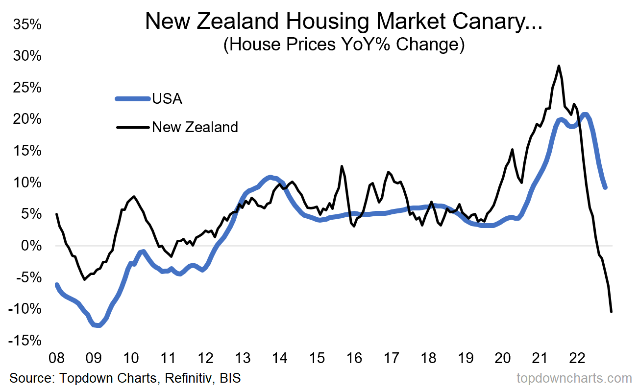
6. Housing Market Boom and Bust: My own country’s housing market seems to be the proverbial canary in the coalmine (substantial policy easing by the RBNZ, early exit from lockdowns, and subsequent aggressive policy tightening lead to a classic boom/bust cycle). A big reset in (inflation adjusted) house prices is underway across developed markets.
So an interesting set of charts for mattered in macro + markets during 2022… But also some interesting clues and snippets for the year ahead (and p.s. stay tuned for the 2023 Charts blog coming soon…!)
—
Thanks for reading!
Check out the Full Report here (free download)
Best regards
Callum Thomas
Head of Research and Founder of Topdown Charts
For more details on the service check out this recent post which highlights:
a. What you Get with the service;
b. the Performance of the service (results of ideas and TAA); and
c. What our Clients say about it.
Follow us on:
LinkedIn https://www.linkedin.com/company/topdown-charts
Twitter http://www.twitter.com/topdowncharts