My Best Charts of 2023
A look at some of our charts and calls that worked particularly well during the year
As we close out the year I thought it would be good to share some of my charts and calls that worked particularly well this year (and don't worry, I will be sharing my worst charts next week... there are always two sides to the coin!!).
These charts were featured in my just-released 2023 End of Year Special Report — check it out when you get a chance (free download as a holiday treat!).
The charts listed below were particularly helpful in arriving at some of my key calls and recommendations for clients this past year. I often find that while I do tell the story around the charts and build the picture with multiple “puzzle pieces“, in many cases a good chart speaks for itself and does much of the heavy lifting in the investment or macro thesis.
It's also a good exercise to go through — to see what worked well. It's conventional wisdom to try and learn from failures, but it's also important (maybe more important!) to try and learn from successes (albeit while also being mindful of hubris, complacency, hindsight, and the need to stay humble and trying new things in the quest for innovation).
With that all said, here they are! Hope you find it interesting...
n.b. I have updated the charts with the latest data (in a few cases the original idea has actually come entirely full-circle). Also on formatting: the italic text is a quote from the specific report in which the chart originally appeared.
n.b. be sure to check out our [FREE] Chart Of The Week series.
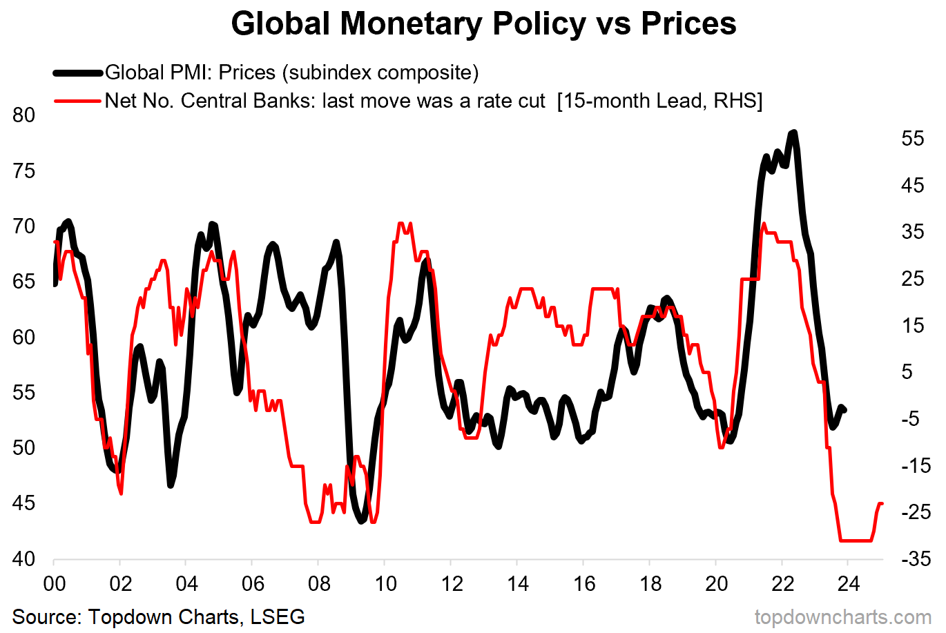
1. Disinflation: One of the key macro themes I had coming into this year was that of ongoing and further disinflation. This was one of the key charts that helped firm up the case for what was still a relatively outside consensus or pushback-receiving call (which interestingly was about the same experience that I had when warning of a surge in inflation into 2022 in the first case). Heading into next year I think this chart remains important as the unthinkable becomes thinkable.
“the central bank tightening indicator points to ongoing disinflation in 2023, with a chance of outright deflation into 2024 (just taking the chart literally)” (10 Feb 2023)
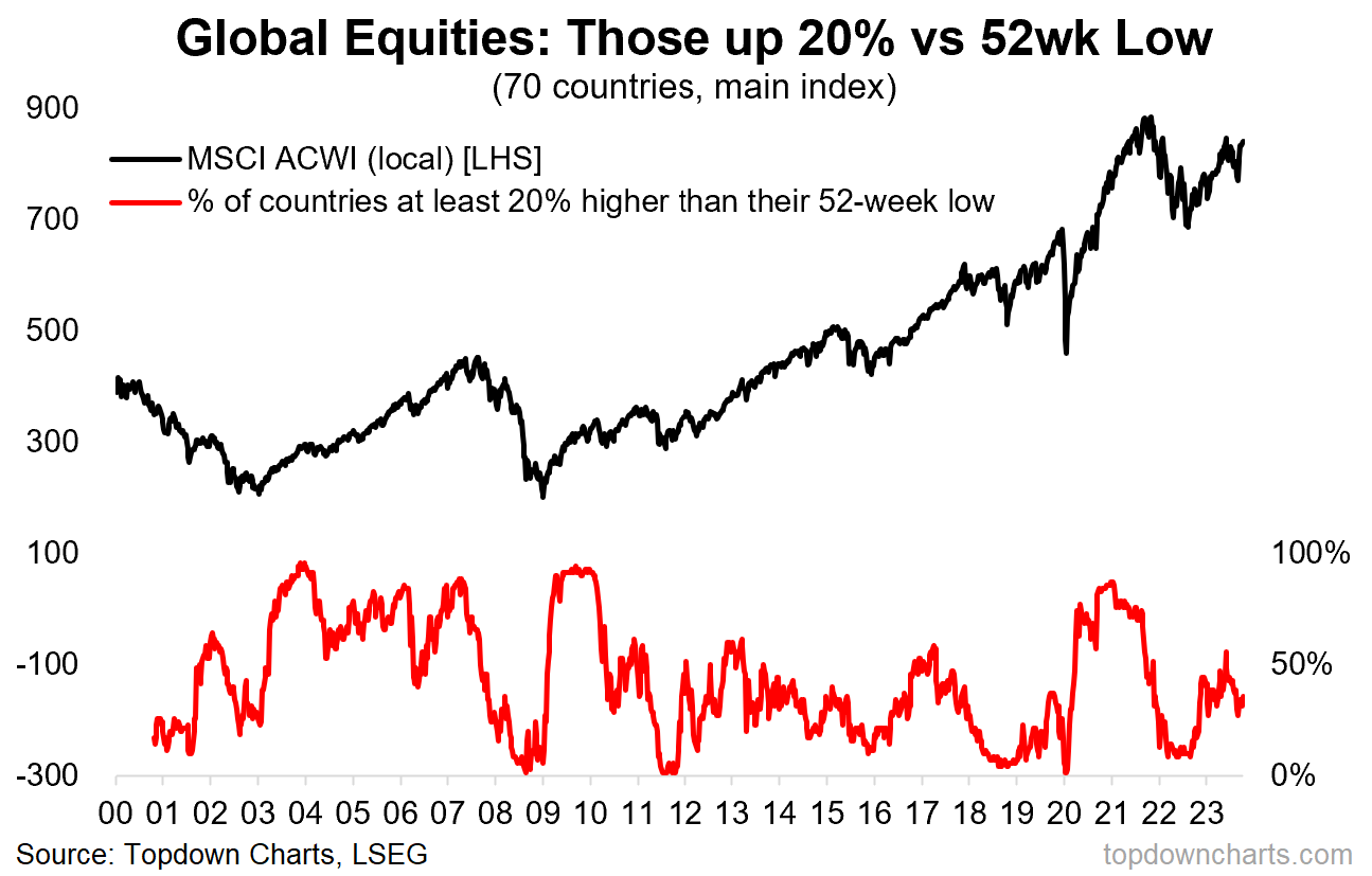
2. New Bulls: This one by itself it was helpful in highlighting the emerging bull-run in equities, despite the myriad macro factors arguably still reinforcing the downside risks. It was this chart along with a few other mostly technical charts that prompted me to lift the outright bearish call on global equities, albeit I did hang on the defensive side of things for much of the year, as outlined in the next section. One takeaway from this is the importance of listening to what price is telling us, as price (and sentiment) often moves faster than fundamentals.
“Checking in on global equities, the recent price action is taking a distinctly optimistic hue with global 52-week new highs starting to push higher from basically zero for much of last year. On a similar note the proportion of countries in a “bull market” (up 20% off the low) has sharply rebounded from oversold levels.” (27 Jan 2023)
3. Off Defense: On a similar note, I closed out the previous bullish relative-value view on defensive stocks (healthcare, utilities, consumer staples). Indirectly this was also an acknowledgement of the changing market regime from bear in 2022 to bull in 2023. Interestingly, after relative valuations moved to neutral early this year, they are now back down and showing up as cheap again – something to ponder headed into 2024!
“the previously compelling relative value picture basically went to neutral – so it no longer makes sense as an undervalued hedge, and then throw in the observation that defensive value relative performance tends to suffer seasonally in H1… all says to me, switch back to neutral.” (27 Jan 2023)
4. Valuations: The other piece of the puzzle was valuations – while the USA only saw a minor reset in valuations, globally (especially ex-US) there was a material reset. Hence the move from bearish to neutral on global equities early on in the year.
“global (global, not US) valuations did reset materially, and in many respects did get quite cheap, and perhaps even cheap enough to make up for the misbehaving macro. But given the non-universal and non-unanimous nature of the valuation picture, and the misaligned malign macro, I would look at the technical upturn as a trading rally and not something that looks sustainable at this stage” (27 Jan 2022)
5. Policy Pivot: Back onto inflation and monetary policy, this chart (one of my favourites) gave an early heads up on the shift away from rate hikes and the generalized pause that took place later in the year.
“Checking in on the smaller/developing country central banks (who are typically more exposed to the ebb and flow of the global growth and inflation tides), things have clearly turned the corner already – with the pace of hikes peaking and a trickle of rate cuts even starting to bubble up. It’s probably still too early to start talking about a global pivot to easing given the magnitude of the inflation shock, and the leads/lags and uncertainty around things, but a generalized pause is close.” (17 Feb 2023)
6. Bond Yields vs Cash Rates: And when central banks pause bond markets pounce. Indeed, it was the emerging pause in rate hikes that helped tick the top in government bond yields. As noted, the time to buy bonds is when monetary policy rates pause and ideally peak (and subsequently roll over into eventual rate cuts). But I will note as mentioned in the next section, I was bullish most of the year on government bonds – the evidence became crystal clear in October.
“one potential support would be a peak and turn in policy rates – and it sure looks like we have made an initial peak. As a side note, that chart of bond yields vs policy rates also goes to show the speed and magnitude of monetary tightening.” (20 Oct 2023)
7. Higher For Longer: And while the charts became clear on the prospect of peak bond yields in October, I did at least manage to make passing reference to the prospect of a push higher in yields earlier in the year. This chart and associated comment captured the risk well (aka higher for longer risk).
“Looking across the large developed economy bond markets, average yields have mostly caught up to and closed the gap against the long-term nominal rate of GDP growth, albeit the risk case there is if the long-term nominal rate of growth stays high then bond yields are likely to anchor higher (meaning perhaps less upside scope for bonds in lieu of a major recession). (17 Feb 2023)
8. Technical Triggers: Another useful technical chart, this one helped identify the initial bottom in emerging market equities. Ultimately there were confounding factors (such as the US dollar) preventing them from moving higher in 2023, but as things stand it has not negated the signal – and things could well be different for EM equities heading into 2024 (and indeed for EM bonds too).
“emerging markets – it’s definitely become the hot topic, and here’s why. EM equities have broken higher after a failed breakdown and with strong breadth showing relatively broad participation across countries. Sentiment has also perked up from extreme bearish levels; a classic contrarian bullish signal.” (20 Jan 2023)
9. USD Sentiment: Indeed, the rebound in the US dollar came as flagged – sentiment shifted too quickly and too resolutely to full consensus bearish. And then of course as the (what I called a sentiment and technicals driven rally) rebound ran its course sentiment went right on and flipped all the way to back consensus bullish. Like clockwork.
“the rally in the US Dollar is largely, in my view, down to short-term oversold technicals (+ rebounding off a logical support zone) and a too fast too far capitulation in sentiment. With this type of backdrop any excuse will do for a trading rally.” (10 Feb 2023)
10. USD Technicals: Another key chart for October, aside from the peak in bond yields, the peak in the US dollar was a key bullish catalyst for risk assets and especially emerging market assets following the multi-month decline into the October lows (bizarrely echoing the bigger October low in 2022). Again this was one where the macro/fundamentals helped with the direction, but where the technicals did the heavy lifting on timing – which in hindsight was a key strength in a year of trading ranges, sentiment shifts, and mixed macro.
“DXY has stalled in its rebound off support right around a key overhead resistance point. Breadth has also topped out having reached overbought levels” (27 Oct 2023)
—
Thanks for reading!
Check out the Full Report here (free download)
Best regards
Callum Thomas
Head of Research and Founder of Topdown Charts
For more details on the service check out this recent post which highlights: a. What you Get with the service; b. the Performance of the service (results of ideas and TAA); and c. What our Clients say about it.
Follow us on:
LinkedIn https://www.linkedin.com/company/topdown-charts
Twitter http://www.twitter.com/topdowncharts


