
Topdown Charts Subscriber Report Card: expectations vs reality
We surveyed our paying subscribers, and here's what they had to say...

A couple of weeks ago I shared some data and insights on why and when people *unsubscribe* from the Topdown Charts entry-level service on Substack. After surveying our paid subscribers, I can now share the reasons why people chose to subscribe to our Entry-Level service in the first place, and what they think of it.
In this article I will take you through the findings, specifically:
Why people subscribed (along with the “real reasons“)
What they think of the service vs their expectations
What they specifically said about it
(and) How all that measures up against our “why“
This should be quite interesting in general as an insight into the investment research space, but also should be useful for anyone thinking about subscribing.
When considering a service/product it always helps to know what other people are thinking as partly a mental short-cut, but also as a form of reassurance — I’m sure you’ve checked out the star ratings of a restaurant before booking, and it’s completely understandable to want to try and get a feel for what the experience will be like… especially when it’s more of a service or information product where sometimes it’s hard to nail down exactly what you’re getting yourself into.
The Survey/Method
For reference, I have shared all of the data exactly as it came in on the surveys. Anyone who knows me knows I’m all about the data and letting the facts speak for themselves. As a point of clarification, this survey only focuses on our Entry-Level service here on Substack vs the full service.
As usual I have presented the data/charts in a way that makes it easier to understand. I have also provided context and reflections both from the perspective of a business owner, and from a subscriber/consumer standpoint to help prospective subscribers better understand what we are doing and trying to achieve (and how subscribers rate us on that).
At a high level, there were 30 responses (132 subscribers were sent the survey). About 50% identified as individuals, 25% advisers, and 25% fund managers. This is roughly in line with what I intuitively know from interacting with subscribers and paying attention to names/emails in the subscriber list.
So in that respect I would say given population characteristic matching and a 20%+ sample size, the results probably are representative — or at least close enough to draw meaningful conclusions.
Here’s Why People Subscribed
Perhaps the most interesting and relevant question in the survey was “Why did you subscribe?“ — note: the question was presented as a check-box list, with respondents able to select multiple reasons (i.e. any or all that applied). Out of interest, 70% of respondents cited at least 3 reasons for subscribing (and over 90% cited at least 2 reasons). The chart below shows the percentage of respondents who cited each option as one of their reason(s) for subscribing.
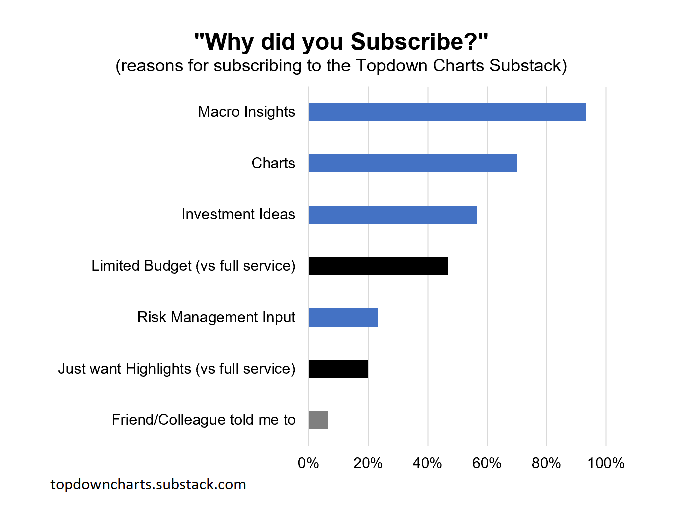
I color-coded the reasons because in my read the blue bars are basically “content features”, while the black bars are basically “product features”. In other words, the blue bars are what I focus on delivering with the content of the research, while the black bars are the specific challenges I’ve tried to solve with the entry-level version of the institutional service (the full service by contrast, involves much greater detail, reports, service level and of course is much more expensive).
Interestingly, in terms of the “product features“ there wasn’t as much overlap as you might expect, and in total 57% of respondents cited at least 1 product feature as their reason for signing up… to me this is an endorsement of the product design, in terms of condensing down the full service into a more accessible version (price and detail). n.b. see the “context section“ later in this article for more background as to why we even came up with this service, and a bit more on what/how/why we do what we do.
Focusing back on the Content Features (97% of respondents cited at least one content reason), I wanted to briefly dig into my read on what these mean and why they are important to subscribers.
Macro Insights: at a high-level this is about generating useful/usable conclusions on the outlook for growth, inflation, and monetary policy. The purpose is to provide meaningful background context to enable asset allocation decisions.
Investment Ideas: this is about assessing a given asset/sector/market within our research framework (valuation, cycle, monetary, sentiment, technicals), to turn the puzzle pieces into the fullest practical picture to enable a buy/sell or underweight/overweight decision.
Risk Management Input: very much similar to the above, but from an active asset allocation standpoint this is more about flagging incoming risks either near and pressing, or more systematic/background features likely to negatively impact on longer-term expected returns.
Charts: one of my beliefs is that if you can’t say it with a chart there probably isn’t all that much to say, and a chart/picture often speaks a thousand words. Aside from supporting a data-driven, fact-based approach, charts help speed up understanding as the brain can process images much faster than words.
These all seem immediately obvious to myself as to why someone should care about these things, but these are all basically features vs benefits as such, and it might help to try and dig deeper into the real/underlying reasons…
But why… (what is the real reason?)
There is a saying that you should ask “why“ about 5 times in order to get to the real reason, and in fairness the real underlying reason is probably going to be different depending who you talk to (their job, life-stage, goals, dreams). On that note, you can skip to the testimonials/comments section to see what people actually said about the service, but here’s my sense on the matter.
So let’s try this: why are macro insights, charts, investment ideas, and risk management important?
Based on what people say and my understanding, I would say it’s about getting informed: knowing what’s going on. Getting educated and learning about macro/markets and analytical techniques. And then ultimately getting into a position where you can make decisions about investments. But perhaps also an element of making things easier, simplifying a vastly complex world, and saving time and money by doing the work for people.
Why is that important?
You want to get informed and educated so you can make better investment decisions, communicate those decisions (with yourself or stakeholders), better understand the risk/reward outlook and reasoning for portfolio allocations. Also understanding the impact and development of macro trends, and market movements (and the impact on your portfolio/investments). And of course anything to make that easier helps.
Why is that important?
Ultimately, so you can make more money (and avoid losing money, in terms of risks/macro) and have more time/mind-space, and more freedom.
Why is that important?
This is probably the part where it really branches (at least briefly - as it probably all comes back to a similar underlying reason): for some it will be because that’s their actual job (fund manager/investment adviser) and their take-home pay, their mortgage, their family, their ambitions rely on them doing a good job of managing their client’s portfolio. For others it might be to build wealth in order to be able to retire, or to extend or preserve their retirement nest egg for as long as possible, or even to support leaving a legacy and having an impact.
Why is that important?
Probably when it all boils down, and if we are really honest, some mix of basic human needs like safety/security, love, self-esteem, and self-actualization.
Sorry to get a bit cheesy, but this is what usually happens when you dig down deep enough. And it’s interesting to reflect, both as a potential/existing client but also even just for me as the actual service provider, about how ultimately important and meaningful sometimes the seemingly mundane/day-to-day things are…
It reminds me of one of my favorite questions to try and help simplify: “what are you actually trying to do?“ And when it comes down to it, basically for me it’s about trying to make things easier for portfolio managers (saving them time, helping them understand the world of macro/markets, and enabling them to make better decisions that result in greater risk-adjusted returns).
How they rate the service
Coming back to the data, this next chart shows how respondents actually rated the service vs their expectations, and how likely they would be to recommend it to a friend. I asked both of these questions because I genuinely wanted to know the answer specifically to each of those questions, but it also acted as a bit of a cross-check (in that people who like a thing are probably more likely to recommend it!).
As a technical note, the rating question was 5 options (Very Bad, Bad, OK, Good, Very Good), while the ‘how likely would you be to recommend‘ question was a 5-point scale (1 = “would NOT recommend”, and 5 = “100% WOULD recommend”, with 3 basically being neutral or 50/50).
And…? People who subscribed (and stayed*) love it + would recommend.
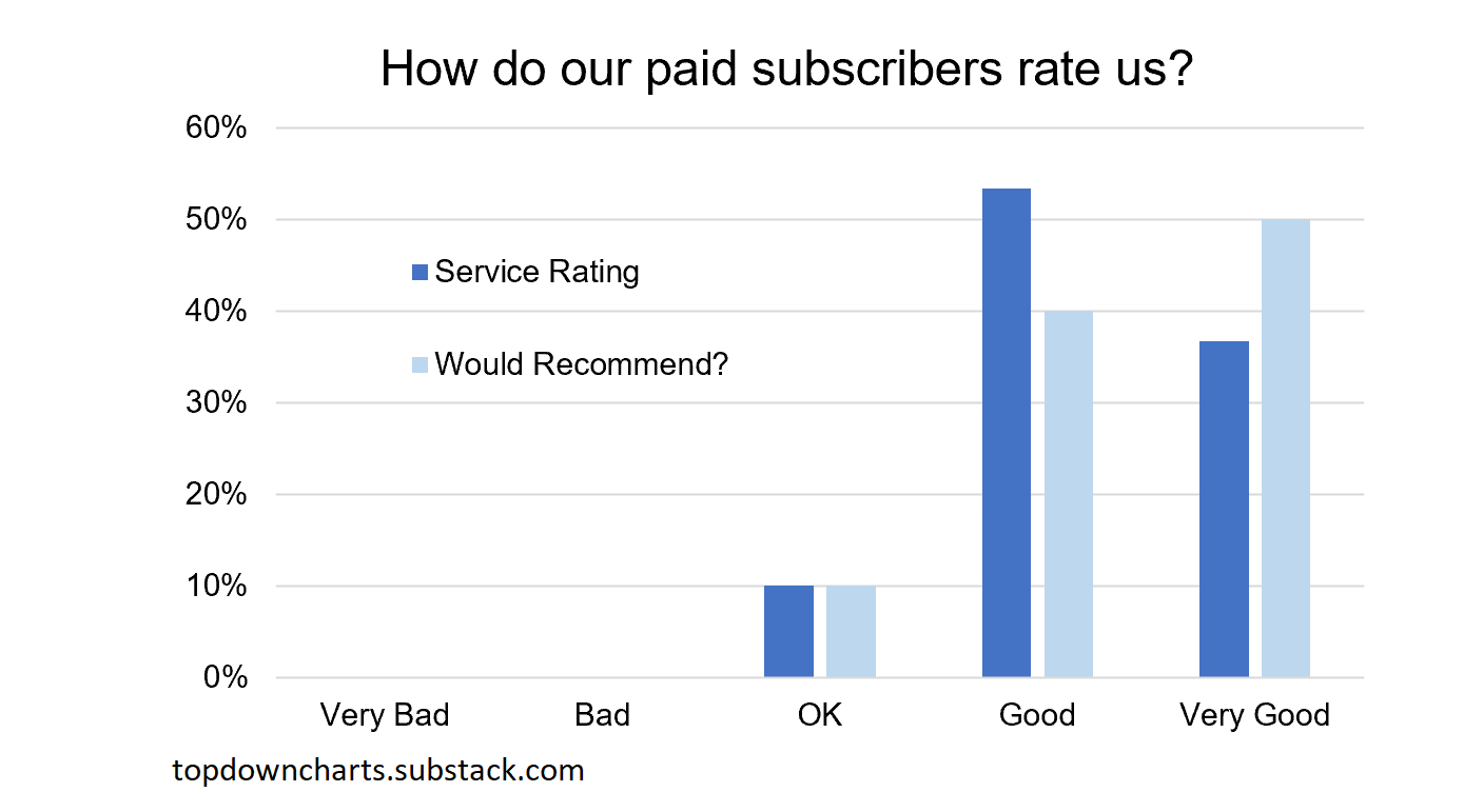
It’s reassuring to see no responses below “OK” for the paying subscribers who responded to the survey... Of course you might suggest that “survivorship bias” is a factor here in that if someone thinks it is worse than OK, then they would probably unsubscribe and hence would not answer this survey (or they might be inactive and not read any emails from us and hence not even know about the survey!).
To address this, I decided to recut the numbers, attempting to bring in the information from unsubscribes (their opinion matters too!). Note, the feedback from unsubscribes was written and unstructured (responses to emails or feedback form filled in Substack). In total I received feedback from 47% of people who unsubscribed, but that number falls to 31% where it contained some discernable comment on the service which I was able to tag as either Good, Neutral, or Bad.
Lumping the data from the previous chart into the same buckets (so bucketing good + very good together = blanket term “good“), we can compare the two datasets below and come up with a total weighted average rating across current subscribers and past subscribers (i.e. those who unsubscribed).
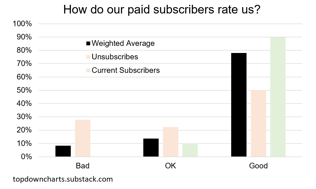
As you would expect, the unsubscribes rated it generally lower (after all, they did unsubscribe!), but still 50% said it was basically good (in many cases for them it simply wasn’t a fit e.g. either too technical or not a match to their style/timeframe, or indeed their decision to unsubscribe was more a reflection of a change in circumstances).
It’s interesting to compare the existing paid subscribers vs those that unsubscribed, and with a little bit of math we can come up with a weighted average rating across all past and present subscribers.
I’m going to go out on a fairly sturdy limb here and say that most people think it’s pretty good! Which is always reassuring as the service provider, but at the same time I am not ready to dismiss the OK/Bad responses, because while you can’t please all the people all the time and you shouldn’t try to be all things to all people… there is *always* room for improvement.
But don’t just take my interpretation of the data at its word, let’s take a look at some of the comments/testimonials that respondents provided…
Testimonials & Comments
I presented a couple of questions/boxes in the survey for people to add comments e.g. “why were those reasons important to you (for subscribing)“, a box requesting general feedback/suggestions/complaints/comments, and a box specifically for testimonials. These were all optional questions. Here is what they had to say…
What people say about the service
“I like the organized and somewhat systematic nature of views”
”A weekly go-to for me. Simple but powerful, usable insights.”
”Data helps confirm instincts and or rationale for allocations”
”Enjoy the macro thoughts expressed graphically”
”Great Summary of current macro perspective”
”Helpful in visualizing the big picture, and to get different perspectives”
”I’m always on the lookout for possible negations or contradicting views to what has been done or invested in. Vigilance is useful.”
”Material is concisely and thoughtfully presented. Good mix of technical and substantive analysis.”
Longer comments/testimonials
”I really appreciate Callum's unbiased economic insights and his charts. I use these charts in client communications all the time, and his tactical asset allocation guide is very useful in helping me determine sector allocations. I feel that this data gives me an edge over my peers and most importantly has improved the relative rate of return of my clients' portfolios.”
”Not only am I scoring more victories, I'm learning an incredible amount of information that helps and will continue to send me further towards my goals. Tools, techniques, charts. It's a brilliant newsletter for the type of person I am and where I am at in my life.”
”I like the fact that this information unbiased and independent since many of firms have their own agenda (big bank economists never seem to have negative views on real estate, for example). This service's low price is a big help, well worth the $. The concise form factor is also easy for me to digest, just the right length for me. The best part of the service is the asset class rating and TAA guide which are extremely useful for an asset allocator such as myself.”
“thank you for providing individual investors the opportunity to get insights into markets. I use Topdown Charts to get a macro picture and make adjustments to my portfolio. Thank you again.”
This is pretty much exactly the type of feedback I would want in terms of what I’m trying to achieve with the service, but I also think these comments serve as important confirmation/verification of the data in the survey in terms of client satisfaction. In terms of what I’m trying to do though, it’s probably worth digging into some background context about what we do and why…
Context — a bit more detail and background on Topdown Charts
Before I head into the final section on reflection and takeaways, I wanted to briefly go over some context, i.e. the what/why/how/where/when/who of what we do!
Starting with why, I’ll link you to the Vision and Mission of Topdown Charts (and by extension for me personally). I know what you’re thinking (e.g. it’s probably just the usual corporate BS), but please read that short post because I explained in detail the meaning behind almost every word in the statements.
But either way I’m including it below for reference:
Vision: Become an indispensable and sought-after resource for global multi-asset investors.
Mission: Deliver a consistently excellent and always improving world leading investment research service that brings clarity and perspective and adds value.
This basically goes to the why. If we dug deeper on all that, I’m sure we’d find that I basically want to be helpful, become known for my work, and yes make money too. And ultimately that probably comes back to the same combination of basic needs we talked about earlier as to why people subscribe!
In terms of the how - I’ll also link you to a useful read: Research Process & Philosophy. Basically, the practical aim is to provide a flow of meaningful macro insights, investment ideas, and risk management input. This is done by taking a chart-focused, data-driven approach to understanding the macro/market outlook and identifying the drivers of risk and return.
Specifically it’s about building up as much of the puzzle as practical for decision making, with the following puzzle pieces as a minimum (as explained in the visual below): valuations, cycles, monetary/policy, sentiment, technicals.
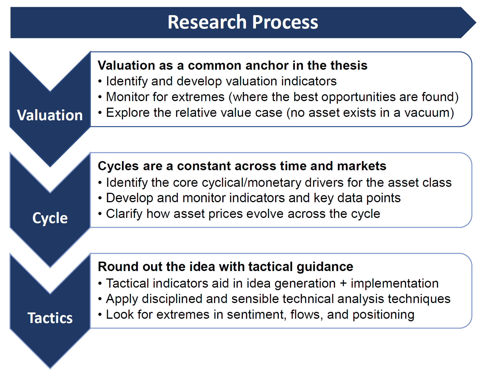
Behind that also lies a set of beliefs in terms of the repeatability of cycles, importance of pragmatism and a systematic approach, and clear enunciation of goals/purpose of the research, the investment universe + intended audience.
In terms of the what, it’s important to again note that what is on offer here on *Substack* is the entry-level version of our full service. The full service is aimed at institutional investors and carries a much greater level of detail, service, and price vs the entry level version.
And this comes back to my comment from earlier about why people specifically subscribed to the Topdown Charts entry-level service on Substack.
The service here was specifically designed to deliver a “lite“ version in terms of the level of detail and price. This was in response to specific and persistent demand (n.b. the entry-level service was launched in May 2021).
I found there were a lot of people who took a trial of the main service (which FYI, was launched in late 2016), but then didn’t/couldn’t sign up because they could not get budget approval or found it too overwhelming to keep up with the reports.
So it was a very logical and demand-driven step to launch an entry-level version, which is lite on detail and price, but still hefty with insight and usefulness — as demonstrated by the response of paying subscribers earlier in this article.
Specifically, what subscribers to the entry-level service get is:
The Weekly Insights Report (a summary of the key findings, highlights, and conclusions from the weekly reports of the full service, an update on the markets, things to watch in the week ahead, and a manageable hand-picked selection of charts).
Monthly Asset Allocation Review (a very visual high-level snapshot of asset class performance, expected returns, short/medium-term views across the major assets/markets, TAA guide, and macro outlook).
(and of course access to the report archives, and ability to post comments)
There is also an option to join the quarterly strategy webinar and Q&A for those looking for a bit more - see “what is the quarterly pack?“.
In terms of the when, as you might guess it’s weekly (Tuesdays), and around the start of the month for the monthly. And on the where in case you are curious: we’re based in Queenstown, New Zealand.
As for the who: it’s basically me, Callum Thomas (along with a small and slowly growing research/support team). In terms of my background, I spent the majority of my career in investment management (focused on multi-asset investment strategy — as you might guess!). I made the decision to leave big corporate and start Topdown Charts in 2016, and have made decent inroads into turning a hope and a dream into a business. You can connect with me on LinkedIn or follow on Twitter, to keep tabs on what I’m doing as I continue my journey.
Summary and Final Thoughts
To summarize, speaking for myself at least, this has been a very worthwhile exercise to understand my clients better, to understand myself and what I am trying to do a little better, and frankly to receive some validation as to whether what I’m doing is actually good - and on the right track. Hopefully it has helped you understand what I’m doing a little better too.
But to briefly outline the main findings:
I surveyed the paying subscribers of the Topdown Charts entry-level service, and indications are that the sample was more or less representative.
That survey followed collection and analysis of unstructured feedback from people who unsubscribed from the service, and data from that exercise augmented the findings and analysis here.
Including data from those who unsubscribed and who are currently subscribed, the clear and overwhelming consensus is that people think the service is good.
The overwhelming majority of current subscribers have also said that they would be highly likely to recommend the service.
Comments and testimonials from the survey respondents confirmed these findings qualitatively, and reflected/validated the goals of the service.
Most people signed up for more than one reason.
Most (57%) people signed up for product-related reasons, but the majority (97%) signed up for content-related reasons.
The content-related reasons largely focused on getting informed, understanding the risk backdrop, and enabling them to make better decisions that result in improved risk-adjusted returns.
We deduce the underlying reasons are about making money, saving time, self-esteem/self-actualization, security, and freedom (the “why“ exercise).
Thus overall, it’s fair to say that so far the entry-level service is fit for purpose, meeting its goals, and resulting in fairly decent levels of customer satisfaction.
Hopefully you’ve found this article interesting and useful, I would encourage you to check out the further references and reading list below for more information about us and about the investment research space in general.
Let me know if you have any questions or reflections on any of this. Otherwise I thank you for your ongoing interest and support.
Best regards,
Callum Thomas
Founder & Head of Research at Topdown Charts
Further References and Reading List
10 Things to Think About when Buying Independent Research
10 Reasons Clients Choose Topdown Charts
Thoughts & Answers on our Track Record
How does the Entry-Level Service differ from the Full Service?
2021 End of Year Special Edition (best/worst charts and calls)