Chart of the Week - Bitcoin Tipping Point or Tripping Point?
Allocations reach a new high as sentiment boils over, what's coming next...
I’ve previously mentioned that Bitcoin trades basically like a risk-asset — riding waves of liquidity and speculation.
The correlation data largely confirms this, and indicators of risk taking and sentiment show similar behavior among investors in bitcoin vs tech stocks.
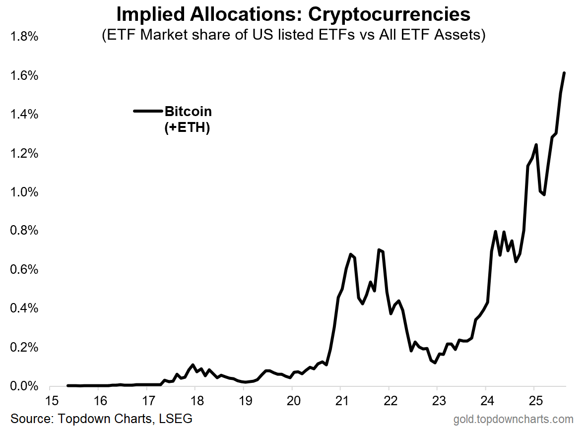
This week’s chart arguably adds weight to that idea. It’s part of a growing collection of charts showing increasing extremes of greed, risk-seeking, and speculation across markets (especially centered on tech stocks: which Bitcoin correlates closely with).
But there is a big open question here: is this a sign of an imminent peak in Bitcoin/crypto? (and risk assets in general, including increasingly frothy tech/AI stocks) …a “tripping point“ if you would: i.e. a point of vulnerability where it’s only a matter of time before the market trips and falls down into corrective mode.
OR — is it actually a sign of a *tipping point? A phase of rapid adoption where Bitcoin is making its way into the mainstream; where progress comes slowly at first and then all of a sudden…
From a market cycle and investor psychology standpoint this would be akin to the FOMO stage of the market cycle where you see the masses rushing into the market, where it’s increasingly accepted and acceptable to get involved.
It’s an interesting pair of questions, because you can probably actually answer yes to both of them, and it echoes some of what I discussed about tech stock valuations in last week’s ChartStorm.
>> i.e. even as tech stocks reach extreme expensive levels, the strong earnings trends provide some fundamental justification, and speculative manias can run further, faster, for longer than you expect.
And here’s the thing, even if you don’t follow Bitcoin/crypto, and have no intention to ever touch it, the fact is by this point it’s probably going to touch you either way — in other words, as a barometer of risk appetite and speculation, as a risk asset itself, and being closely correlated with tech stocks: if Bitcoin goes, tech probably goes too (and the rest of the stockmarket for that matter!).
So it’s an interesting chart with interesting implications for investors…
Key point: A mass adoption/speculation phase appears to be taking place as more and more investors make allocations into Bitcoin/crypto.
n.b. METHODOLOGY: the chart above aggregates assets in US listed Bitcoin + Ethereum ETFs and presents it as a percentage or market share of all US listed ETF assets (which we can loosely call the implied allocation to this asset class; in the aggregate).
Bonus Chart 1 — Bitcoin Allocation Survey
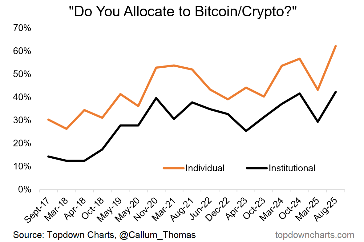
I’ve been running a semi-annual survey on my twitter page querying whether people allocate to Bitcoin/Crypto in their portfolios (and whether they’re institutional or individual investors). After a dip down in the March survey (as risk assets were in correction mode around then), the August survey showed a surge to record highs for both individual and institutional investors.
This is interesting as it provides confirmation to the previous chart that indeed it is the case that more and more investors are getting involved, and at these levels it’s starting to look more and more mainstream and acceptable.
Which probably adds weight to both the tripping point (speculative fervor) and tipping point (mass adoption phase) arguments!
Bonus Chart 2 — Semiconductor Market Cap
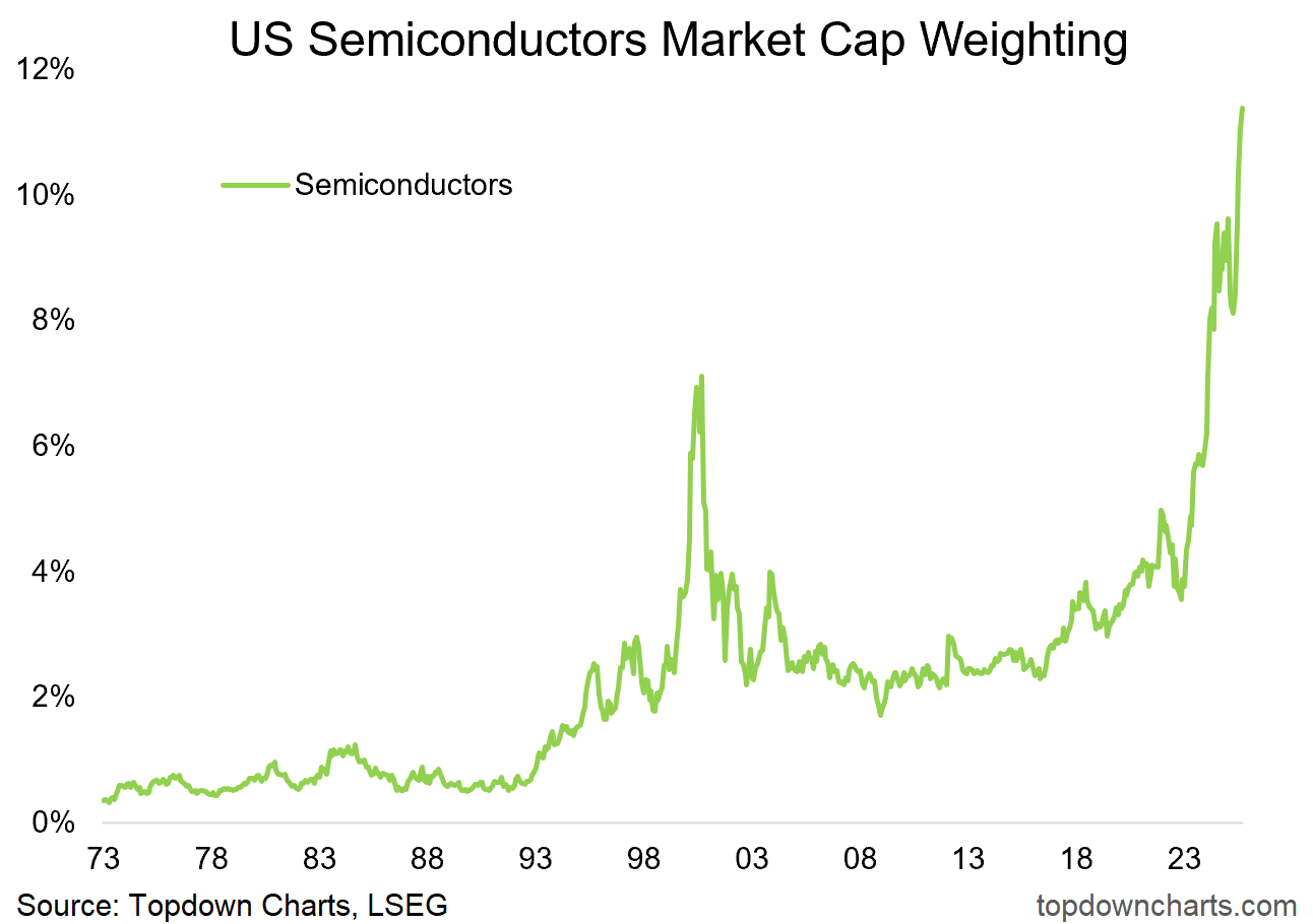
I repost what has become a favorite chart here because it illustrates a couple of things: we can see the move in bitcoin/crypto allocations echoed in this chart + the speculative surge on display here + an illustration of what bubbles in speculation look like (the dot com spike). Again, the balanced view will say that maybe this is just the new normal in the AI age (mass adoption of compute), but at the very least it shows the shifting sands and pressures building up.
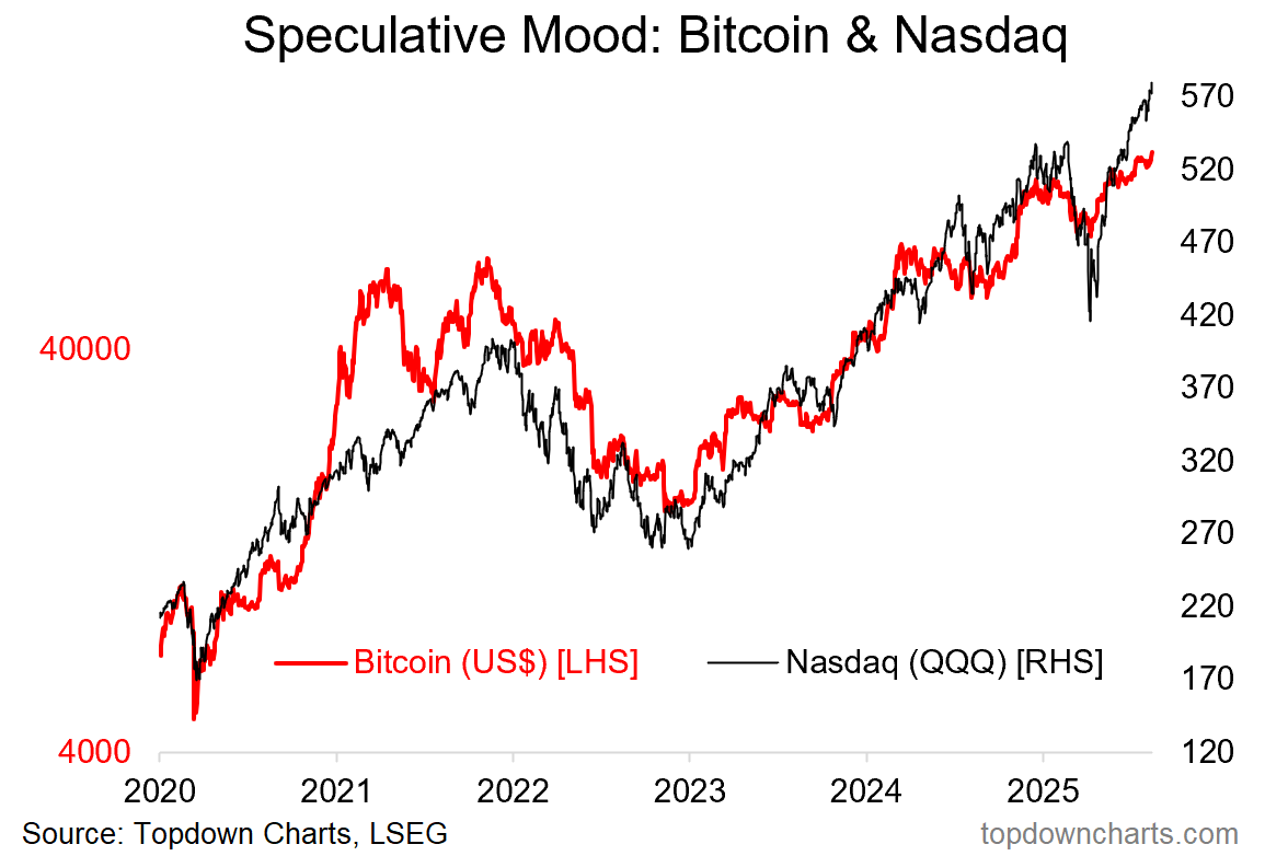
And because I can’t help myself, here’s just one more chart showing the moves in tech stocks and bitcoin rhyming. This is a textbook speculative bull market that seems to have gotten a new lease on life after the healthy correction in H1.
Topics covered in our latest Weekly Insights Report
Aside from the chart above, we looked at several other charts, and dug into some intriguing global macro & asset allocation issues in our latest entry-level service weekly report:
Global Markets Update: global equity sectors, fixed income, commodities
Global Equity Bull Market: reviewing market breadth, global vs US, and even valuations breadth
Macro Risk Radar: key events, technical levels in the week ahead
Ideas Inventory: latest live ideas, views, recommendations
Subscribe now to get instant access to the report so you can check out the details around these themes + gain access to the full archive of reports + flow of ideas.
For more details on the service check out the following resources:
Getting Started (how to make the most of your subscription)
Reviews (what paid subscribers say about the service)
About (key features and benefits of the service)
But if you have any other questions definitely get in touch.
And if you would like a greater level of depth and detail + access, check out our Institutional Service: Topdown Charts Professional
Thanks for your interest. Feedback and thoughts welcome.
Sincerely,
Callum Thomas
Head of Research and Founder at Topdown Charts
Follow me on Twitter
Connect on LinkedIn
NEW: Services by Topdown Charts
Topdown Charts Professional —[institutional service]
Weekly S&P 500 ChartStorm —[US Equities in focus]
Monthly Gold Market Pack —[Gold charts]
Australian Market Valuation Book —[Aussie markets]


We haven’t yet seen the “crypto mania” …the real top won’t occur till crypto fever grips people in earnest as evidenced by parabolic phase