Chart of the Week - Bulls and Breakouts
Yet another breakout + running of the bulls...
You might say this week’s chart is displaying renewed energy…
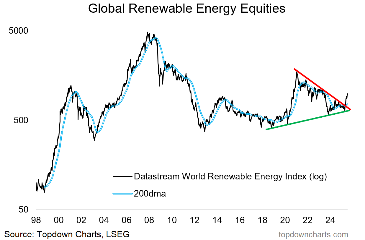
It’s yet another breakout —and one which follows on from a classic boom-bust cycle that kicked off in the final phases of the first Trump presidency (and now finds a surprising renewed bullishness in Trump’s second go).
We’re of course looking at Global Renewable Energy stocks.
After coiling into a symmetrical triangle we’ve seen a breakout, and this is interesting because it echoes several important investment themes…
ESG Backlash Back-off: you can basically track the ESG backlash of the past couple of years in the data (Google search interest, Carbon prices, fund flows), and the interesting thing is that I would say the backlash is done. Interest is picking up again, and while it might be done different going forward, ESG is here to stay and today’s chart in many respects represents some of the renewed life it’s having.
Presidential Sentiment Signals: the 2020/21 boom-bust cycle in renewable energy stocks peaked almost bang on with the Biden inauguration, meanwhile renewable energy stocks are now breaking out under Trump. Ironic given the opposing stances those two have on renewable energy… and a telling lesson in markets and sentiment.
AI Energy: I think it is fair to say some of the renewed interest is coming from the anticipated and actual surge in energy demand from AI and datacenters.
Energy Transition and Capex Boom: but also the Great Electrification going on globally as more countries push forward on the energy transition, EV adoption ticks up, and robotics +AI make strides.
Speculation Rejuvenation: and let’s face it, another key facet is the renewed speculative fervor taking hold across markets. It’s the more blue-skies and story-driven areas of the market like renewable energy that get most easily swept up in waves of rising speculation and risk appetite.
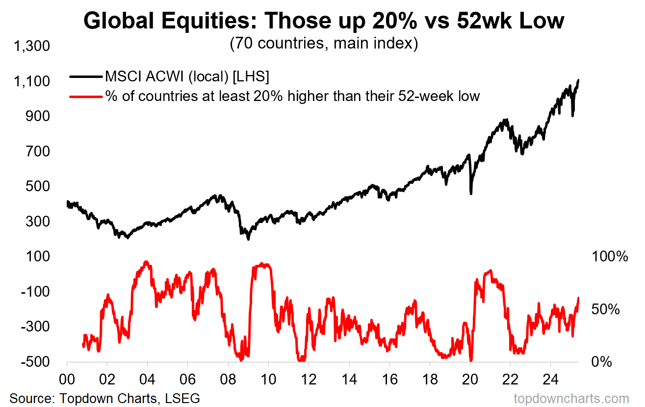
Global Equities Bull Market: as I explain below in the bonus chart, it is increasingly clear that a new bull market is taking hold; particularly in global stocks —it’s only natural that a rising tide floats this boat.
So it’s a fascinating chart. Just by itself from a market technician standpoint it looks great, looks like one of those fabled big breakouts… but also fascinating because of the various themes and trends that it represents.
As to how sustainable it is, I would keep an open mind — there’s definitely a macro-fundamental case to be made, and again from a technical standpoint it looks great, so it’s not something I would be betting against.
Key point: Renewable energy has gone from boom to bust, and now breakout.
If you haven’t already, be sure to subscribe to the Topdown Charts Entry-Level service for more exclusive ideas and helpful investment insights.
Bonus Chart — Global Bull Market Count
Following-on from the above, as alluded-to, there are more and more signs of a new cyclical bull market in global equities. Adding to the list this week is the rapidly growing count of “bull markets” — in this case operationalized as the percentage of stockmarkets that are up at least 20% off their 52-week low.
The latest reading for this indicator (which tracks the main equity benchmark of 70 different countries) is 61%, which is the highest reading since 2021.
This comes on the back of a falling US dollar, global rate cut rush, big sentiment reset and positioning shakeout back in April, and still cheap valuations for most of the world’s stockmarkets. In other words, it’s more than just fun with charts…
Topics covered in our latest Weekly Insights Report
Aside from the chart above, we looked at several other charts, and dug into some intriguing global macro & asset allocation issues in our latest entry-level service weekly report:
US Dollar Technicals: short-term vs medium-term outlook
Chinese Stocks: tracking technicals, value, sentiment, rotation
China Macro: property vs gold/bonds and commodities
Tech Check: tracking the new bubble in tech stocks
Defensive Value: healthcare, utilities, consumer staples
Renewable Energy + Carbon: technicals and changes
Subscribe now to get instant access to the report so you can check out the details around these themes + gain access to the full archive of reports + flow of ideas.
For more details on the service check out the following resources:
Getting Started (how to make the most of your subscription)
Reviews (what paid subscribers say about the service)
About (key features and benefits of the service)
But if you have any other questions definitely get in touch.
And if you would like a greater level of depth and detail + access, check out our Institutional Service: Topdown Charts Professional
Thanks for your interest. Feedback and thoughts welcome.
Sincerely,
Callum Thomas
Head of Research and Founder at Topdown Charts
Follow me on Twitter
Connect on LinkedIn
NEW: Services by Topdown Charts
Topdown Charts Professional —[institutional service]
Weekly S&P 500 ChartStorm —[US Equities in focus]
Monthly Gold Market Pack —[Gold charts]
Australian Market Valuation Book —[Aussie markets]


