
Chart of the Week - Global Equity Advance
Tracking country-level A/D lines across global equities...

Here’s a weird technical indicator you might not have seen before…
and it’s telling us some very interesting things about the state of Global Equities (+some related themes & opportunities).
First, we are looking at the “Advance/Decline Lines“ for the three major groups within global equities, and n.b. they have been rebased to 100 = Jan 2018, and standardized to percentage change for comparability. Unlike your typical A/D line, which tracks the cumulative number of risers minus fallers (stock-by-stock), this one looks at country benchmarks… so it is tracking the weekly cumulative rises vs falls across the *countries* that comprise those groups.
The more countries that are seeing their stockmarket go up, the steeper the line will be on this chart (basically the definition of a bull market). The more countries that are seeing their stockmarket go down, the flatter the line will be — or even negatively sloped (which would be the definition of a bear market).
But to get to the point, following the tariff tantrum shakeout in April, all 3 lines have surged… this is the type of behavior you see at the beginning of cyclical upswings and new bull markets.
And by the way, it’s not the only sign of strength… as I’ve previously noted, Global ex-US equities (and in particular Europe) have undertaken a major breakout this year, emerging markets ex-China also broke out last year, and over 51% of the 70 countries we track are up at least 20% vs their 52-week low (and over 80% of countries are tracking above their 200-day moving average).
But it’s also a subtle sign and symptom of a change in leadership —with the global equity bull market starting to broaden out as global vs US rotation steps up.
So an interesting chart with interesting implications…
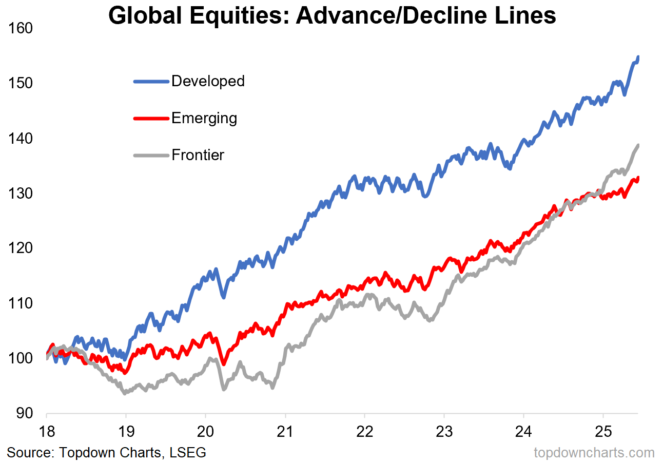
Key point: The A/D lines are showing a resurgent bull market in Global Equities.
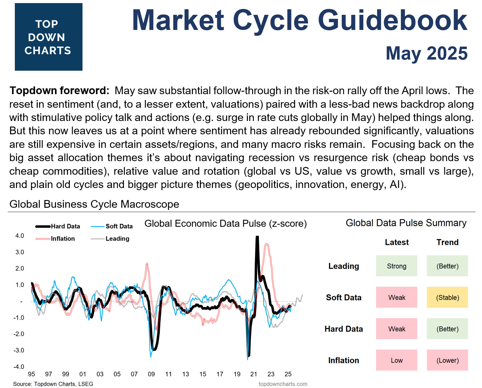
ALERT: Market Cycle Guidebook — May 2025
We’ve just published the latest "Market Cycle Guidebook", which is one of the main reports in our institutional investment research service Topdown Charts Professional.The monthly Market Cycle Guidebook is designed to be a practical & tactical asset allocation guidebook for global multi-asset investors. Check it out now
Take a 30-day no obligations, risk-free, trial of Topdown Charts Professional (our institutional service) so you can gain access to the full reports (including the monthly pack) and see what it’s all about.
Bonus Chart: Global Equity Valuations
The below chart tracks the PE10 ratio (price divided by trailing average 10 years of earnings — to help smooth out signal distortions from cyclical earnings volatility) for the USA, Developed Markets (excluding USA), Emerging Markets, and Frontier Markets.
The thing that immediately stands out is the gap between all the other major chunks of global equities vs the USA. But also, the fact that all 3 of those lower lines are lower than usual… basically cheap vs their own history.
This is particularly interesting in the context of the previous chart because what you have is a technicals assessment that the world is entering into a resurgent bull market …and this is coming from a starting point of cheap valuations (for global ex-US).
So again, as I have documented many times before, it’s time to start looking at global stocks and maybe even deprioritize US stocks (given their valuation premium and lingering political/policy risks) …certainly at least food for thought as the consensus on global vs US equities slowly but steadily starts to shift.

REMINDER: take a 30-day no obligations, risk-free, trial of the Topdown Charts Professional service (our institutional service) so you can gain access to the full reports (including the monthly pack) and see what it’s all about.
Otherwise, check out the information below for more details on the Entry-Level service provided by Topdown Charts (which presents key points and snippets from the full service).
Topics covered in our latest Weekly Insights Report
Aside from the charts above, we looked at several other charts, and dug into some intriguing global macro & asset allocation issues in our latest entry-level service weekly report:
Global markets update: global equities, fixed income, FX, commodities
US Dollar outlook: weighing up the next steps for the DXY +EMFX
Monthly Asset Allocation review: link to the latest monthly pack
Macro radar: key events and technicals to watch
Ideas inventory: latest ideas and views
Subscribe now to get instant access to the report so you can check out the details around these themes + gain access to the full archive of reports + flow of ideas.
For more details on the service check out the following resources:
Getting Started (how to make the most of your subscription)
Reviews (what paid subscribers say about the service)
About (key features and benefits of the service)
But if you have any other questions definitely get in touch.
Thanks for your interest. Feedback and thoughts welcome.
Sincerely,
Callum Thomas
Head of Research and Founder at Topdown Charts
Follow me on Twitter
Connect on LinkedIn
NEW: Services by Topdown Charts
Topdown Charts Professional —[institutional service]
Weekly S&P 500 ChartStorm —[US Equities in focus]
Monthly Gold Market Pack —[Gold charts]
Australian Market Valuation Book —[Aussie markets]
My fav “chart of the week” so far this year! Will be sharing