Chart of the Week - Defensives
Sector rotation strategy (defensives vs tech + cyclicals ex-tech)
With tech in trouble (+a number of macro risks lurking on the horizon), defensives are starting to look interesting…
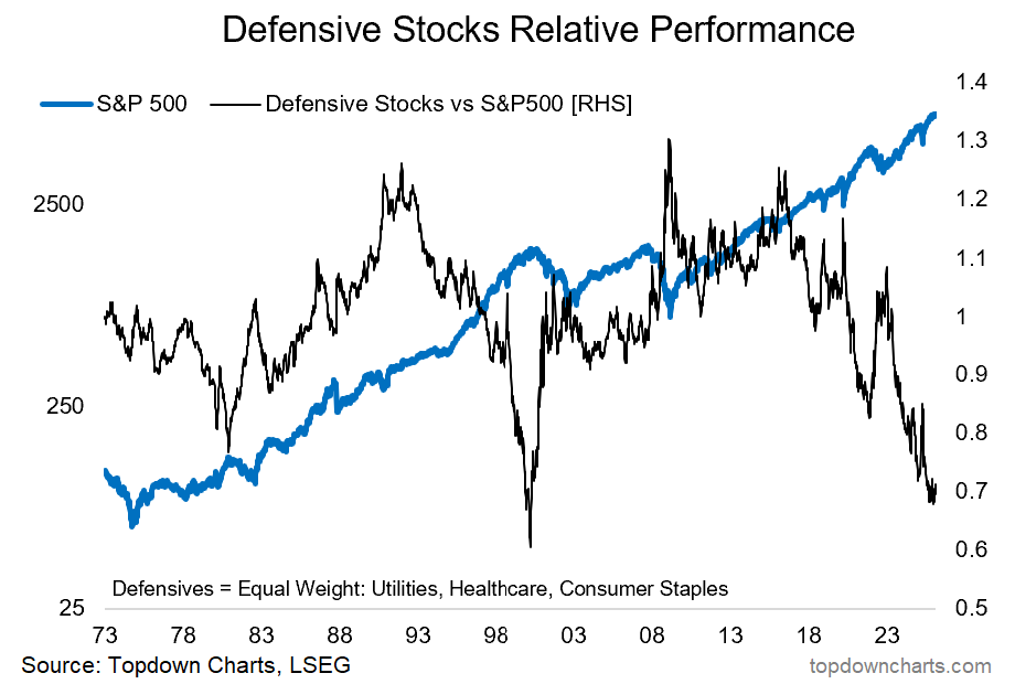
Defensives (i.e. an equal-weighted basket of: Utilities, Healthcare, Consumer Staples) are turning up vs the S&P500 —after going through what has been a major relative bear market.
But in particular, the following conditions make for a contrarian bullish (relative) setup for Defensives:
Defensives’ relative value indicator reached similar levels to that seen at the peak of the dot com bubble (Defensives are extreme cheap vs the index).
Investor allocations to defensives are ticking up from record lows.
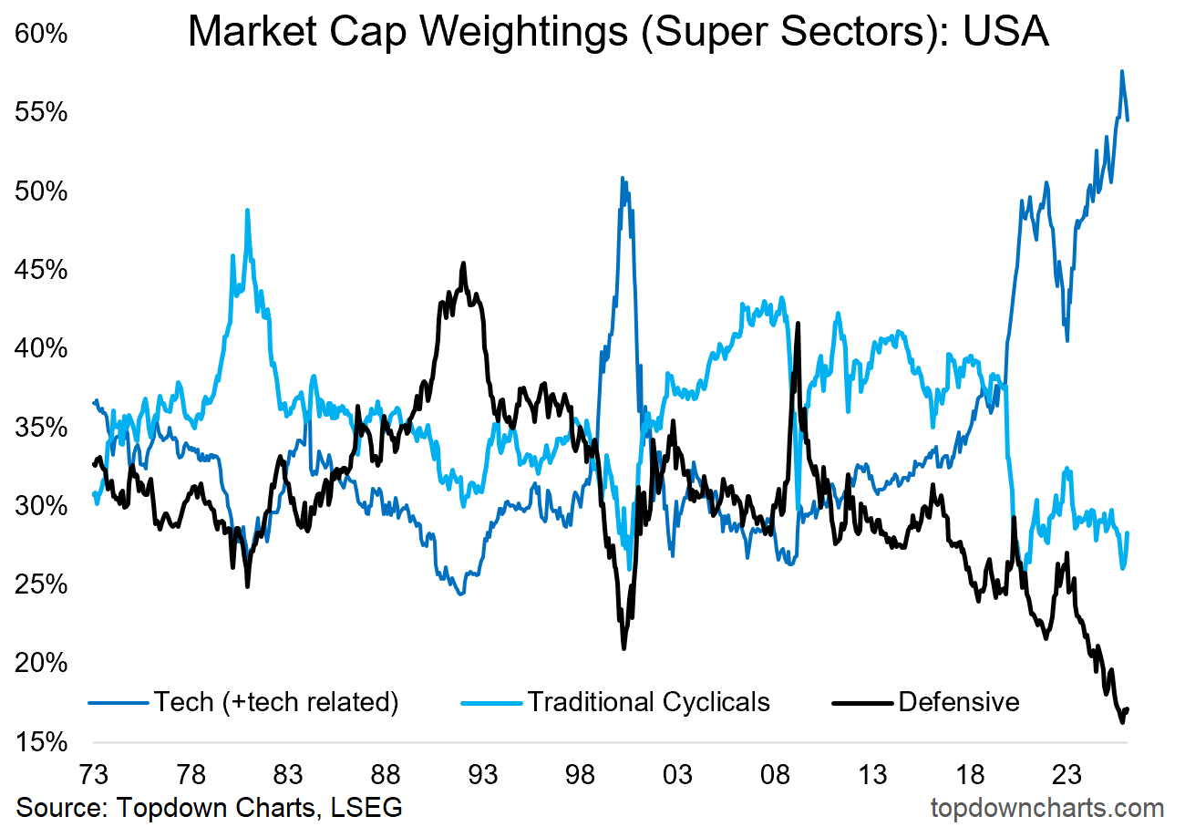
The market cap weight of defensives reached an all-time low late last year.
The relative price (black line in the chart below) has seen an extended and extreme period of underperformance.
And on the flipside, US (tech) stocks have likewise seen a number of extreme readings on sentiment, valuations, and allocations in the opposite direction (i.e. overall stock market downside risk is higher than we’ve seen since 2000 due to the key growth engine of tech stocks being overheated and looking somewhat burnt out lately).
Interestingly, this bullish outlook for defensive stocks is actually bearish for the stockmarket as a whole…
To be clear, when I say bullish outlook for defensives, I mean in relative terms — i.e. you expect defensive stocks to fall less or at best hold ground while the rest of the market falls more.
In this sense, defensives are interesting to keep tabs on both as a source of information on the market cycle (they fare relatively well in a downturn and lag behind in an upturn), but also as a sort of alternative hedge or portfolio risk dampener.
So seeing the defensives’ relative performance line ticking up from extreme lows (and the contrarian bullish setup for defensives I just outlined) tells us we need to pay closer attention to risk management and smart diversification right now.
Key point: Defensives are looking good (that’s bad).
Bonus Chart 1 — Market Cap Weight
As noted above, defensives’ market cap weight reached an all-time low last year, since then they have ticked up as tech has ticked down off record highs.
Again, this tells us about the state of the market cycle (note where previous extremes were, and how fleeting they ended up being — and how they ultimately resolved).
But it also tells us important investment strategy takeaways such as how passive index investors are now heavily exposed to tech and on the contrary, also have historically low exposure to the diversifying and risk-dampening attributes of defensives.
So this is a timely prompt to consider both the big picture macro-market outlook, but also the pragmatic implications for portfolio strategy (e.g. is this the right sector mix for equity exposure? should you look into smart diversification and up-weighting risk dampeners?)
NOTE: on the topic of Tech Stocks, I strongly encourage you to check out this recent deep-dive on the Outlook for Tech Stocks that we published on The Weekly ChartStorm
Bonus Chart 2 — Earnings Weight
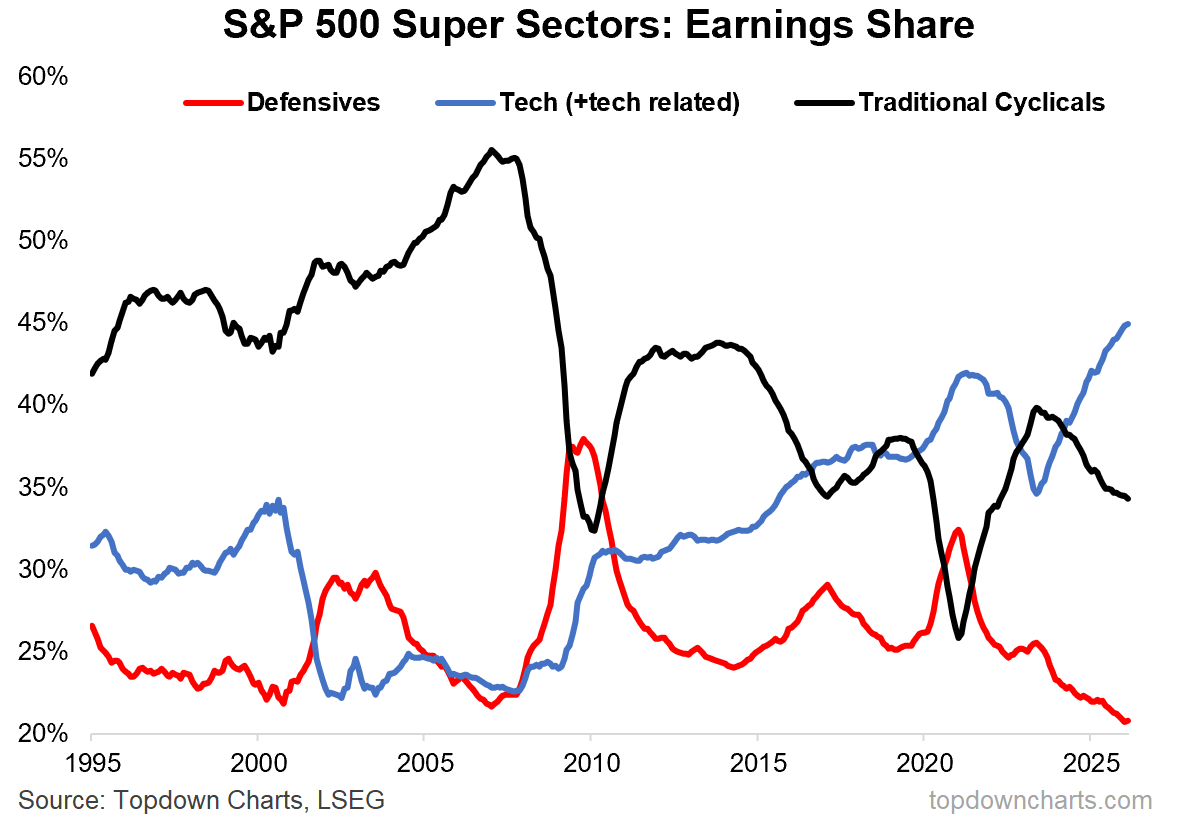
For completeness, here’s the earnings version of the market cap chart above, this one shows the earnings weight (or earnings % share) of each of those big 3 sector groups.
We can see that tech boasts the biggest earnings share, but also that cross-checking it against the chart above we can also see that the market has overshot.
Meanwhile, the history of defensives’ earnings weight tells us exactly why they are called defensives — because in times of turmoil and downturn, defensives’ earnings just keep plodding along and become a larger share of the index as tech and cyclicals ex-tech see earnings crunched by crisis, sector boom/bust cycles, and recessions.
So it pays to be cycle aware then think about equity exposure, stock market ups and downs, and overall asset allocation.
n.b. If you haven’t yet, be sure to subscribe to this [free] Chart Of The Week series or better yet: Upgrade to Paid for Premium macro-market Content.
What do you think?
Which set of sectors are best placed over the next year or so?
p.s. Not a Paid Subscriber yet?
Be sure to sign up so you can access premium content including exclusive well-rounded ideas spanning risk alerts, investment ideas, and impactful macro insights to help make you a better investor — [ Sign Up Now ]
Topics covered in our latest Weekly Insights Report
Aside from the chart above, we looked at several other charts, and dug into some intriguing global macro & asset allocation issues in our latest entry-level service weekly report:
Global Markets update: equities, fixed income, FX
Defensive Stocks: the downside of the upside in defensives
Tech Stock Top: look at the risks, bull/bear scenarios, outlook
Macro Radar: key events, market levels, research agenda
Ideas Inventory: listing of current live ideas/views
Subscribe now to get instant access to the report so you can check out the details around these themes + gain access to the full archive of reports + flow of ideas.
For more details on the service check out the following resources:
Getting Started (how to make the most of your subscription)
Reviews (what paid subscribers say about the service)
About (key features and benefits of the service)
But if you have any other questions definitely get in touch.
Thanks for your interest. Feedback and thoughts welcome.
Sincerely,
Callum Thomas
Head of Research and Founder at Topdown Charts
Follow me on Twitter
Connect on LinkedIn
NEW: Services by Topdown Charts
Topdown Charts Professional —[institutional research service]
Topdown Charts Entry-Level Service —[entry-level version]
Weekly S&P 500 ChartStorm —[US Equities in focus]
Monthly Gold Market Pack —[Gold charts]
Australian Market Valuation Book —[Aussie markets]
What did you think of this note?
(feel free to reply/comment if you had specific feedback or questions)
Already a paid subscriber?
Access the latest Weekly Insights report:


