Chart of the Week - Drift Risk Rising
Passive index investors have been drifted into an increasingly aggressive (and risky) portfolio, here's how we got here and what to do about it...
Index investing has become an increasingly dominant method for investors big and small to build wealth and manage portfolios.
But there’s one key thing you must know about the most common strategies.
Most investors buy market cap-weighted indexes.
This essentially involves buying more of the largest companies and less of the smallest companies, and over time buying more of the companies that grow (and selling out of or rebalancing from companies that decline).
The good thing about cap-weighted index investing is it automatically allocates more money over time to the best stocks (and takes from the worst ones).
The bad thing about cap-weighted index investing is it automatically allocates more money over time to the best stocks (and takes from the worst ones).
This week’s chart shows both of these aspects in action…
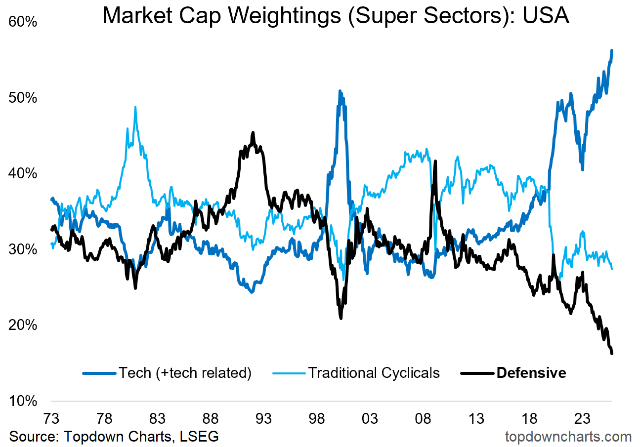
The average cap-weighted index investor today is heavily allocated to Tech and running record low allocations to Defensives. This is a great allocation for bull markets and uptrends, but it’s an increasingly risky portfolio should a downcycle take hold.
One of the key reasons investors get into index funds, aside from being easy and profitable (at least over the past [exceptionally good] 15-years) — is the instant diversification it offers.
Buying the index is a cheap and easy way to set up a diversified portfolio (and all good finance nerds know that diversification is one of the rare true free-lunches in investing [by lowering risk/volatility relative to return]).
But in times like these where you have a very sector-driven bull/boom/bubble underway, market cap-weighted strategies can end up becoming very undiversified and lop-sided very quickly [as you can see in the chart below].
So what? Three possible actions + one key insight come to mind:
Equal-Weighted Index: one way to correct this is to switch from cap-weighted to equal-weighted indexes, this avoids the clear tendency seen in the chart below for sector weights to skew (sometimes wildly) over time, but leaves you overexposed to declining companies and underexposed to growth companies.
Active Allocation: another way is to tactically make sector tilts when major extremes are reached (about once per decade in the chart below) and when confirming evidence aligns [for example raising exposure to defensives as risk signals begin to light up …as they are starting to now].
Asset Allocation: another way of dealing with it is to simply ignore it and accept that at times your equity exposure will get skewed into what looks like a risky setup such as that seen now, but correct this at the portfolio level by including uncorrelated/defensive assets like gold, bonds, commodities, cash, hedges, or other alternatives (or even looking further afield across global stock markets, e.g. those which are at different stages of the market cycle) to guard against downside risk and smoothen the ride.
Market Cycles — the Signal it’s sending: the other point to note is that this chart also tells us about the state of the market cycle itself. Major skews in the chart below have almost always occurred at or around key turning points (for example big skews to defensives around market bottoms, big skews into tech/cyclicals around market peaks). In that respect this week’s chart is waving a bit of a risk flag for the stockmarket in general right now.
So it’s an interesting chart by itself, but the implications for investors are equally interesting in terms of real practical portfolio strategy aspects but also in terms of reading the tea leaves of the market cycle.
Key point: The US stockmarket has become heavily skewed into tech stocks and much less exposed to defensives; making it overall a more aggressive/risky and less-diversified portfolio than usual.
Like this post so far? :-) Please consider sharing it (e.g. forward to a friend/colleague, share on social media + feel welcome to use the charts in your own work)
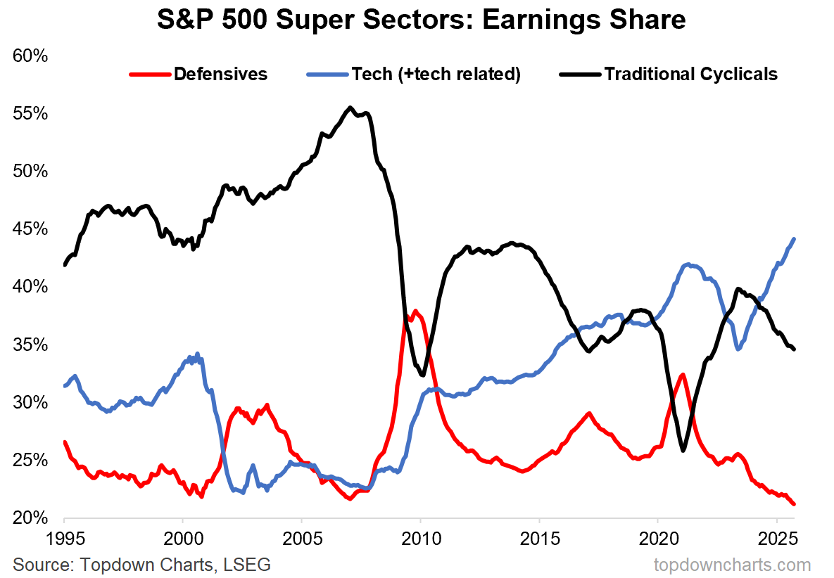
Bonus Chart 1 — Earnings Share
For completeness it is important to acknowledge the shifting sands in *earnings* weights over time — this chart is basically the same method as above but looks at the proportion of S&P500 earnings attributed by each of the super sectors.
The defensives line is interesting as those sectors just plod along and get crowded out by growth stocks during economic booms …and gain ground back + then some during downturns as defensives continue to plod along and everyone else falls on hard times.
The other interesting thing is that we can clearly see how things are different this time from the dot-com-days as tech earnings weight has reached a record high — in part justifying the high market cap …it’s just that the cap-weight has overshot the earnings weight (and defensives cap-weight has undershot).
And that brings us to the next bonus chart and a key tactical insight…
Looking for deeper insights? Check out the Topdown Charts Professional service.
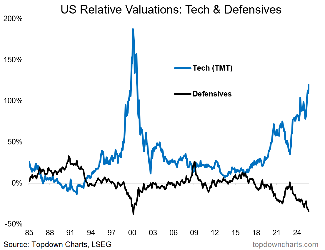
Bonus Chart 2 — Tech & Defensives RV
In what is basically an output from the previous two charts, this one shows the Relative Value premium/discount for tech and defensives.
Tech is trading at a massive Premium vs non-tech.
Defensives are trading at the largest relative value Discount since the peak of the dot com bubble.
So just to clarify: Tech — which has the highest weight in the index, is the most expensive, and Defensives — which have the lowest weight in the index, is the cheapest on a relative value basis.
And yes, this is indeed a market cycle signal and sign of the times… but it also raises the urgency and evidence to address the issues discussed in the first part of this week’s note.
Try out our entry-level service for more investment ideas and macro insights.
Topics covered in our latest Weekly Insights Report
Aside from the chart above, we looked at several other charts, and dug into some intriguing global macro & asset allocation issues in our latest entry-level service weekly report:
Global Markets review: equities, fixed income, FX, commodities
Technical risk check: monitoring early warning signals
Emerging Markets update: long/medium-term vs short-term charts
Macro Radar: key events/data and levels to monitor this week
Quarterly Pack: access to the latest slide deck (Q4 + 2026 outlook)
Ideas Inventory: current live ideas/views across asset classes and macro
Subscribe now to get instant access to the report so you can check out the details around these themes + gain access to the full archive of reports + flow of ideas.
For more details on the service check out the following resources:
Getting Started (how to make the most of your subscription)
Reviews (what paid subscribers say about the service)
About (key features and benefits of the service)
But if you have any other questions definitely get in touch.
Thanks for your interest. Feedback and thoughts welcome.
Sincerely,
Callum Thomas
Head of Research and Founder at Topdown Charts
Follow me on Twitter
Connect on LinkedIn
NEW: Services by Topdown Charts
Topdown Charts Professional —[institutional service]
Topdown Charts Entry-Level Service —[entry-level version]
Weekly S&P 500 ChartStorm —[US Equities in focus]
Monthly Gold Market Pack —[Gold charts]
Australian Market Valuation Book —[Aussie markets]
What did you think of this note?
(feel free to reply/comment if you had specific feedback or questions)


Hmm defensives vs. cash in the event of a market crash? I'm leaning toward the latter for optionality but def see the appeal of the former given how cheap