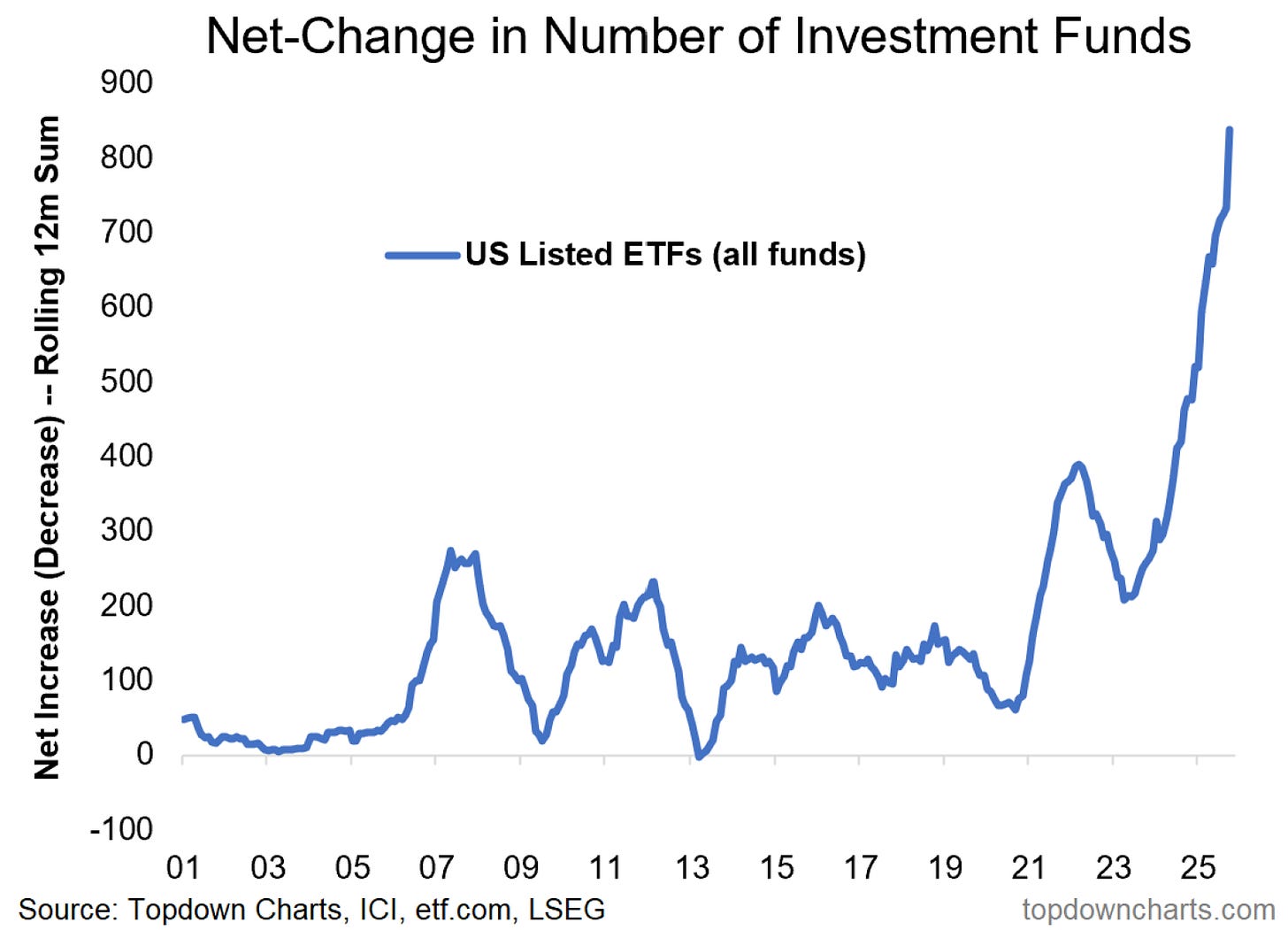
Chart of the Week - ETF Frenzy
a chart that looks a little too weird to be true — but sometimes weird things happen when things get weird...
When I first made this chart I had to check and re-check it a few times.
Because it just looks too weird.
And that’s the thing: as an analyst, sooner or later you learn (often by making an embarrassing mistake) that if something looks weird — it *is* weird and you probably need to go and find out what error you or someone else made to make it look that weird…
The problem is there’s no error here.
Well, no data error at least.
That weird looking surge in the rolling 12-month net-change in US listed ETFs is genuine. But I am certain that some errors of a different type are going to be seen here when the dust eventually settles from this frantic ETF launch frenzy.
And p.s. here’s a little something this chart doesn’t show: a big portion of ETF launches have been focused on providing “investors“ with the means to undertake highly leveraged bets on an already bubbly looking market.
In other words, this chart is a sentiment signal — a big red flag.
And I must say, if/when we do end up seeing a bubble-bursting-bear, I would not be surprised to see chart counted among the clues listed as we say in hindsight that “there were signs…“
Key point: There has been a scrambling surge in ETF launches (a sign of the times as speculation, greed, and hype take hold).
In case you missed it…
Check out the latest post from The Weekly ChartStorm — in this post I take readers through the key levels we need to focus on, short-term buy-signals, longer-term sentiment flags, capex cycles, and some key insights + frameworks for thinking about upside vs downside risk in markets. [ click through to read ]
p.s. Not a Paid Subscriber yet?
Be sure to sign up so you can access premium content — exclusive well-rounded ideas spanning risk alerts, investment ideas, and impactful macro insights to help make you a better investor —> [ Sign Up Now ]
Topics covered in our latest Weekly Insights Report
Aside from the chart above, we looked at several other charts and critical global macro & asset allocation issues in our latest entry-level service report:
Global Market Update: key moves in equities, fixed income, FX, commodities.
US Dollar Technicals: short-term vs medium/long-term outlook, + EM/DM.
Upsides vs Downsides: complete inventory of risks facing investors right now.
Inflation Outlook: a look at how and where things are trending.
Chinese Assets: reviewing property, stocks, and bonds in China.
Risk-Off Worst-Case: taking stock of key pressure points and risk-flags.
Subscribe now to get instant access to the report so you can check out the details around these themes + gain access to the full archive of reports + flow of ideas.
What did you think of this note?
(feel free to reply/comment if you had specific feedback or questions)
For more details on the Topdown Charts entry-level service check out the following resources:
Getting Started (how to make the most of your subscription)
Reviews (what paid subscribers say about the service)
About (key features and benefits of the service)
But if you have any other questions definitely get in touch.
Thanks for your interest. Feedback and thoughts welcome.
Sincerely,
Callum Thomas
Head of Research and Founder at Topdown Charts
Follow me on Twitter
Connect on LinkedIn
NEW: Services by Topdown Charts
Topdown Charts Professional —[institutional service]
Topdown Charts Entry-Level Service —[entry-level version]
Weekly S&P 500 ChartStorm —[US Equities in focus]
Monthly Gold Market Pack —[Gold charts]
Australian Market Valuation Book —[Aussie markets]


Wow, as of last week?
Interesting chart. Would have been nice for data from the ‘96-‘99 era to compare. Thx. Mark