
Chart of the Week - Japan Breakout(s)
Japanese Equities: believe the breakout, big things are happening in Japan...

Conventional wisdom has its place…
It’s often initially informed by facts and truths, and rings accurate for a time. But equally often you find that consensus narratives and conventional wisdoms have a use-by date. Their usefulness expires as the facts change (but minds don’t).
Japan is a perfect example of this.
For years Japan has been written-off as a ticking debt & demographics timebomb, a deflation disaster, and the archetype of a mature economy in decline.
But things have changed on multiple fronts and investors have not kept up with the facts …and as such, many have missed the big beautiful breakout in Japanese stocks.
For those who’ve yet to update their fact-base — after decades of stagnation, Japan has seen significant improvements in its economy (e.g. rising labor force participation offsetting demographic headwinds, benefits from friend-shoring, booming jobs growth, surging industrial capex, reviving real estate market, and cyclical upturn [n.b. see bonus chart]).
On top of that for Japanese equities, thanks in big part to Abenomics, there has been a significant improvement in corporate governance and we’ve seen rising profitability, substantial share buyback activity, and as a key litmus test: a breakout to new highs for the Nikkei 225 (it only took 35 years…!).
Meanwhile, foreign investors are still running very light allocations to Japanese stocks, valuations are cheap vs history, vs bonds, vs the upshift in long-term nominal growth, and vs global peers. In short, we’re still early here.
So I say: believe the breakout.
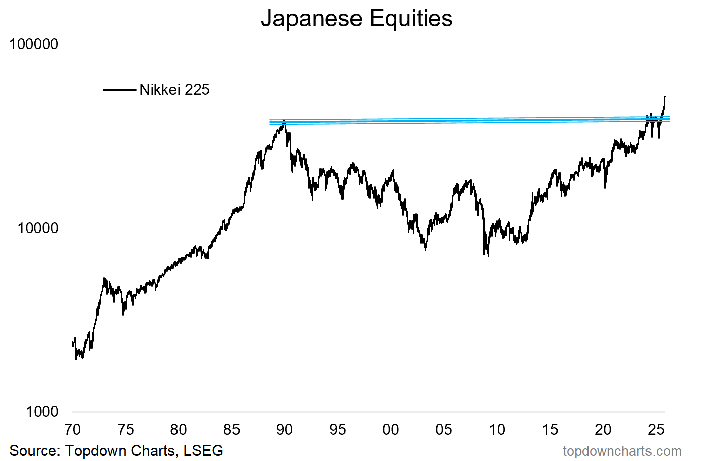
Key point: Japanese stocks are breaking out and there is room to run.
Like this post so far? :-) Please consider sharing it (e.g. forward to a friend/colleague, share on social media, + feel welcome to use the charts in your own work)
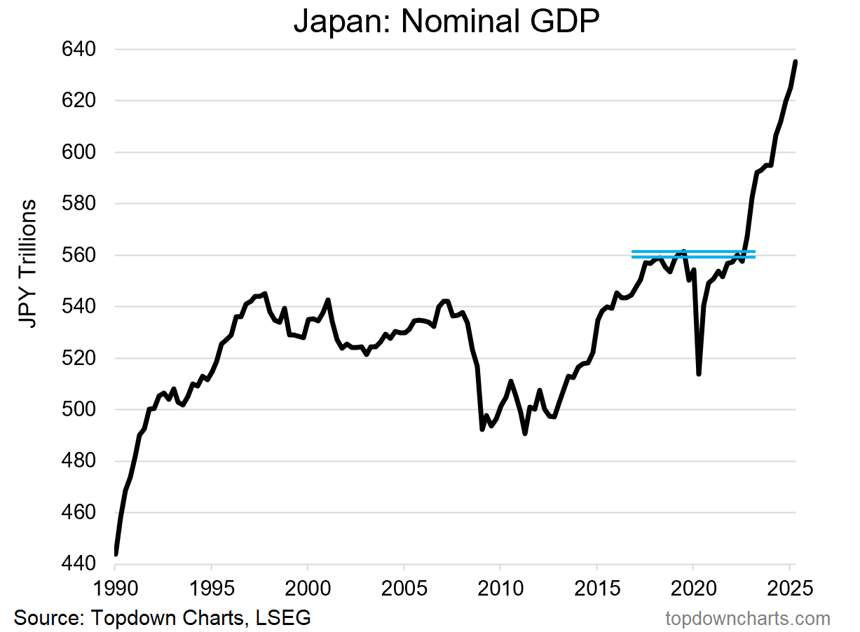
Bonus Chart — The Other Big Breakout…
As I touched on above, there really has been a big shift in the macro/fundamental situation in Japan. It’s one of those classic situations of slowly at first, and then all of a sudden.
Some might not like the “technical analysis“ of Japan’s nominal GDP in the chart below, but the key point and core truth in this chart is that after decades of stagnation and sideways movement, Japan is seeing what can only be described as a *breakout* in its economy.
This is such a significant chart — and perfect pairing to the first chart, because you basically have a situation of twin breakouts… a breakout in price, and a breakout in fundamentals.
And while you can get false breakouts and fake-outs in price, when it’s accompanied by a fundamental improvement, the confidence level goes up.
n.b. If you haven’t yet, be sure to subscribe to the [free] Chart Of The Week or for more insights: Upgrade to Paid for Premium macro-market Content.
Japanese Equities — What do you think?
(/how are you positioned? And please feel welcome to add your comments, context, critiques or questions in the comment section…)
p.s. Not a Paid Subscriber yet?
Be sure to sign up so you can access premium content including exclusive well-rounded ideas spanning risk alerts, investment ideas, and impactful macro insights to help make you a better investor — [ Sign Up Now ]
n.b. See below for an overview of what was covered in the latest Premium Report…
Topics covered in our latest Weekly Insights Report
Aside from the chart above, we looked at several other charts, and dug into some intriguing global macro & asset allocation issues in our latest entry-level service weekly report:
Global Markets Update: key developments across assets/markets
EM Equity Technicals: big picture moves and major breakouts
US Dollar Outlook: weighing the short vs longer-term view
US Treasuries: where-to next for bond yields
EMFX: update on EM currencies and fixed income
Japan: believe the big breakouts in Japan
US Small Caps: updated charts and perspectives on small cap stocks
Subscribe now to get instant access to the report so you can check out the details around these themes + gain access to the full archive of reports + flow of ideas.
For more details on the service check out the following resources:
Getting Started (how to make the most of your subscription)
Reviews (what paid subscribers say about the service)
About (key features and benefits of the service)
But if you have any other questions definitely get in touch.
What did you think of this note?
(feel free to reply/comment if you had specific feedback or questions)
Thanks for your interest. Feedback and thoughts welcome.
Sincerely,
Callum Thomas
Head of Research and Founder at Topdown Charts
Follow me on Twitter
Connect on LinkedIn
NEW: Services by Topdown Charts
Topdown Charts Professional —[institutional service]
Topdown Charts Entry-Level Service —[entry-level version]
Weekly S&P 500 ChartStorm —[US Equities in focus]
Monthly Gold Market Pack —[Gold charts]
Australian Market Valuation Book —[Aussie markets]
Isn‘t it possible though that rotational money is „fleeing“ overweight USD (also in light of the undeveralued USD/JPY)?
I agree with the notion that the long term stagnation in Nikkei is playing into it.