Chart of the Week - Relative Value Trinity
The increasingly extreme relative value trinity in global equities
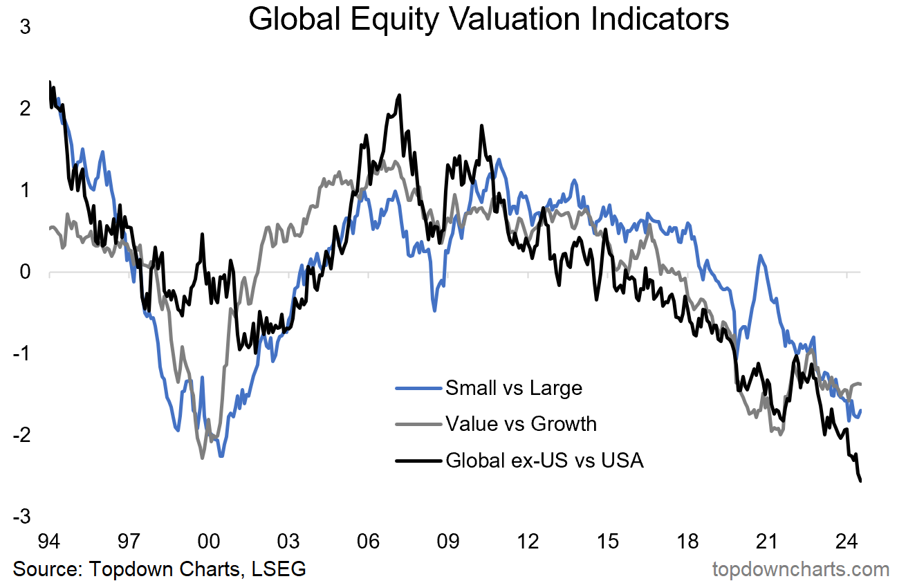
Thanks to a 17-year Bear Market, an intriguing set of valuation extremes have opened up …and may well be presenting a major harbinger for global investors in the coming years.
The chart below shows our relative value indicators for small caps vs large caps, value vs growth, and global vs US stocks (presented as a z-score).
All 3 have reached extreme cheap levels, and collectively are at the lowest point since the dot-com bubble. This should be ringing alarm bells due to the parallels to the peak of the dot com bubble — but also providing cause to pause and think about what the next big multi-year investment themes might be.
Key point: Global ex-US/Small/Value are cheap vs US/Large/Growth.
NEW: Gold Chart Pack
We’ve just launched the new Monthly Gold Market Chartbook — it is designed to be the ultimate resource for investors to help figure out when is the right time to scale up/down gold allocations, and how to think about this asset class from a portfolio-wide or asset allocation perspective. Check it out
n.b. the monthly gold pack is provided complimentary for paid subscribers to the Topdown Charts entry-level service.
Bonus Chart - Absolute Valuations
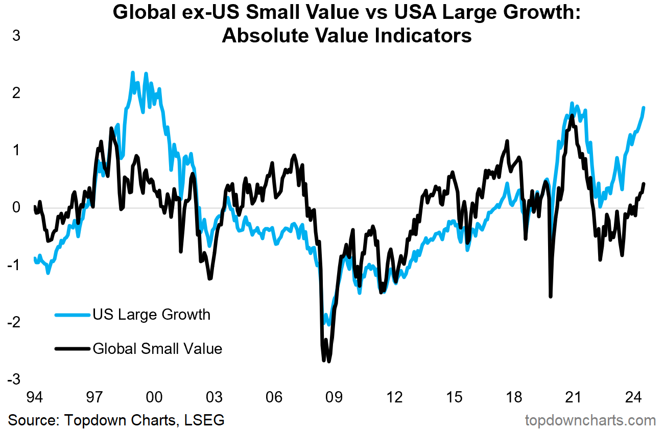
Here’s an interesting extension to the chart above, in this case looking at absolute valuations rather than relative valuations, and the combined absolute value score for all three flavors on each side of the chart above (i.e. Global ex-US Small Value in the black line, and US Large Growth in the blue line).
Three interesting things standout to me:
US Large Growth is in extreme expensive territory, the last time it reached this level was during the late-stages of the dot com bubble, and more recently at the peak of the pandemic stimulus frenzy. Risk managers take note!
Global ex-US Small Value (GSV) is playing catch-up — this is positive because you can get bullish or bearish rotations (and glad vs sad relative performance). So far this is looking bullish... but to explain:
Bullish vs Bearish Rotation: bullish rotation is where one plays catch up to the other thing, and helps drive the index higher. Bearish rotation is when the previous leader falls and the laggard catches up, but the index either stagnates or falls because the laggard is not big enough to outweigh the losses of the larger previous leader.
Glad vs Sad Relative Performance: glad is when relative performance is positive while absolute returns are also positive; sad is when relative performance is positive but absolute returns are negative (i.e. both things fall but one falls less than the other).
GSV looks reasonable vs history, and has ample room to run, and is following the classic cycle arc of starting cheap, turning up, and then gaining momentum.
So this helps provide some further context and clarity on both the risks and opportunities building up in global equities.
Topics covered in our latest Weekly Insights Report
Aside from the charts above, we looked at several other charts, and dug into some relatively obscure but important global macro & asset allocation issues:
Bond Market Technicals: where to next for yields?
GSV vs ULG: the best vs the worst of global equities
EM Equities: where things sit as the tides begin to turn
EM Fixed Income: opportunity or risk?
Frontier Markets: often overlooked part of global markets
Gold: update on the gold price outlook
Subscribe now to get instant access to the report so you can check out the details around these themes, as well as gaining access to the full archive of reports.
For more details on the service *check out this recent post* which highlights:
a. What you Get with the service;
b. the Performance of the service (results of ideas and TAA); and
c. What our Clients say about it.
But if you have any other questions on our services definitely get in touch.
Another one??
This chart came from my “12 Charts to Watch in 2024“ (something I publish at the start of every year — be sure to join the list to receive a copy of the 2025 edition!).
It shows the relative performance line of GSV vs ULG, and it highlights 2 important elements to round out this week’s themes.
First, it puts on display the magnitude and relentlessness of that 17-year long relative bear market in GSV vs ULG (and hence how we have arrived at this major moment).
But second, the technicals: the trend is not your friend, at least not yet. Also, after a promising period of consolidation and attempt at turning the corner, it actually broke down to new lows.
That’s the thing with looking for turning points like this, it actually has to turn first. So to really raise conviction on this emerging opportunity/risk, we do need to see technical confirmation, and I am actively monitoring for that and I think it is safe to say that Topdown Charts clients will be the first to know! :-)
Thanks for your interest. Feedback and thoughts welcome.
Sincerely,
Callum Thomas
Head of Research and Founder at Topdown Charts
Follow me on Twitter/X or Bluesky
Connect on LinkedIn


Interesting, how are the z score computed? Are they forward multiples or LTM?