12 Charts to Watch in 2024
Key charts and issues to keep track of in the year ahead and beyond...
Recently I shared with you some of my Best Charts of 2023 (charts and calls that worked really well) and then my Worst Charts of 2023 (ones that didn’t work!), and of course my Favorite Charts of 2023 (new, interesting, useful charts).
This week it’s time to stop looking backwards, and time to focus forward with a list of my top charts to watch in 2024 (and beyond).
These are the charts that I feel best capture the key macro issues relevant right now or set to soon come onto the radar — as well as how these tie into the risk and opportunity set across asset classes and markets.
A number of key trends are coming to a head this year, and it’s going to be a challenging one in terms of navigating what I would say are the two major macro edge risks (the potential for deflation and recession vs inflation and reacceleration at the other edge). It’s going to be key to both look forward and anticipate these shifts, as well as staying grounded in the price and data flow.
How do you manage that? With good charts and frameworks, that’s how, and I believe the charts below are an excellent starting point on that regard.
But you are also going to want to tune in to the Chart Of The Week series as a minimum to keep connected with my work as the year unfolds.
1. The Monetary Wall: Talk of soft landings, mixedcessions, vibecessions, and things of that nature may soon turn to tradcession as looming large monetary headwinds raise the risk of a traditional-recession into 2024. Several upside surprises and spots of resilience ended up warding-off recession risk in 2023, but as motivational and inspirational speakers often tell us: “just because something hasn’t happened for you yet doesn’t mean it won’t”.
2. Rise of Deflation: Adjacent to that, and along with multiple disinflationary drivers, the impact of base effects, and dissipating demand – raises the prospect of technical deflation risk (i.e. the CPI annual rate of change going negative). And it’s not just a vibe, it’s already happening in pockets of the global economy. Deflation was an unthinkable term early last year, but I think by now more people are starting to entertain the idea. It would almost be poetic for a deflation scare to follow the inflation shock and the higher for longer meme.
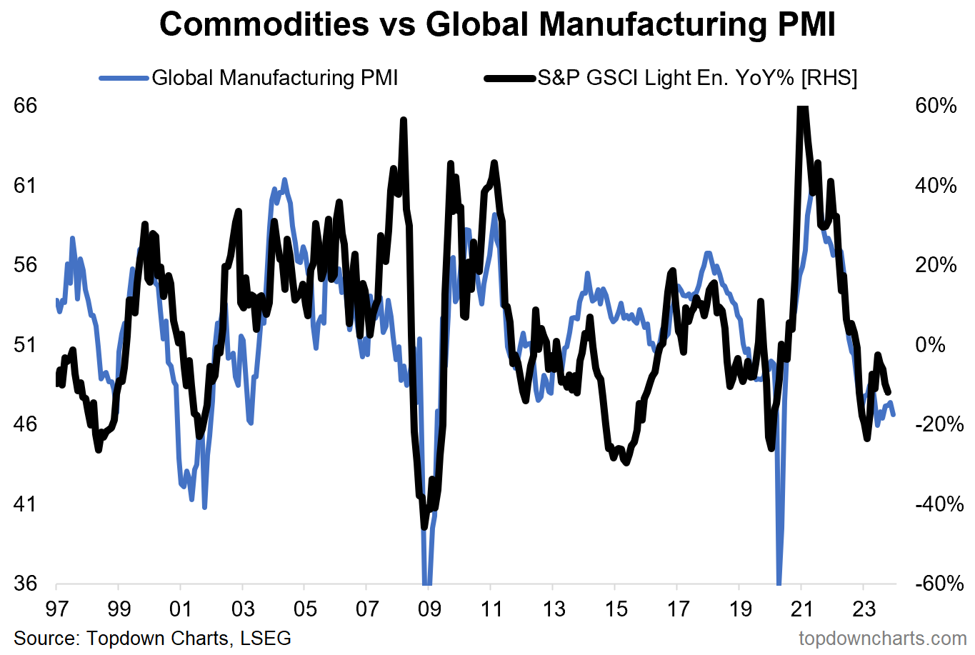
3. Resurgence Risk: Not to hedge the previous comments, but we still can’t rule-out inflation resurgence risk either. A “no-landing” rebound in global growth (especially trade and manufacturing – which have been in recession) would mean commodities up, capacity tight, inflation HFL.
4. The Story Can Change Quickly: But back on the downside risks, and to caution on complacency – while labor markets are still tight, consumer strong, wages growing… note the history on this chart. The jobs market goes up the stairs on the way up, and out the window when things turn.
5. Yield Curving: These 3 lines all measure the same thing – the maturity of the business cycle (**and turning points**). On all 3 counts they say the cycle is long in the tooth, and turning.
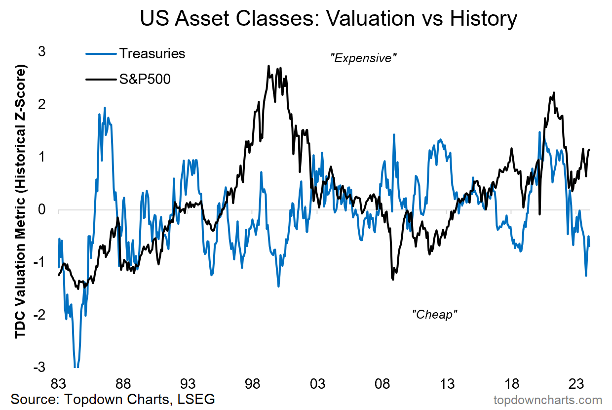
6. Bond Bargain: As such, and while things have moved a lot since the brief 5% reading for the US 10-year treasury yield in October last year, government bond valuations are still cheap, and the macro downside risk scenario I outline here is bond bullish. It won’t be a straight line, but bonds likely see further upside in the coming year following one of their worst bear markets in recent history.
Stocks are a different matter though…
7. Tech Perfection: Tech stock valuations, while still not quite eclipsing the dot-com heights, have returned to 2021 peak levels. Tech is priced for perfection, and untested by recession.
Indeed, big tech saw its big run from 2009 riding a wave of initial outright undervaluation, mostly accommodative monetary policy (including the ZIRP era), and importantly: a prolonged period of time where there were no recessions (albeit a few near misses, and p.s. the pandemic was a boon and a gift for most in the tech sector: delivering acceleration of existing trends, no real downside, and major monetary and fiscal tailwinds).
Maybe AI hype and exponential acceleration does see tech go on to justify these valuations, and maybe therefore these levels end up as a new normal. But if we want to think in terms of probabilities and risk management, keeping one foot out the door is probably a wise approach here.
8. The Best and the Worst: Speaking of relative value, if you look at the flipside of big tech (aka US large growth), the best relative value opportunities are small vs large, value vs growth, and global vs US – the chart below basically explains why (a decade+ relative bear market for everything other than big tech).
9. Defensive Doom: The roaring rebound in (tech) stocks last year left the boring old defensive sectors behind (healthcare, utilities, staples). As such, investor allocations to defensive equities have dropped to record lows. There is a signal here — contrarians take note.
10. Real Estate Realism: There is also a signal here. Investors hate real estate. The downside risks in the rising rates world (+work from home, cyclical downside risks, credit tightening, etc), are well understood, investors are already on board. That means there are a lot of minds that can change if commercial property merely does OK, and hence an upside case can be made (especially if interest rates drop).
11. Renewables Renewed: We just lived through yet another boom-bust-bubble cycle in renewable energy. Kicked-off by a steady rise of interest in ESG investing, and then the pandemic stimulus measures, along with a brief traditional energy price spike. But monetary tightening, ESG fatigue and falling commodities have taken the steam out: making valuations for the sector attractive again.
12. EM Again: It was every strategist’s favorite place to be at the start of 2023. Naturally folk will be skeptical on it showing up again in outlook pieces like this, and maybe there is a sense of once-bitten, twice-shy. But things are different this time. The value story is still there (especially for China and LatAm/Non-Asia EM), however now we also have a peak in the Fed funds rate (possible easing later), a peak in the US dollar, a pivot by EM central banks from rate hikes to rate cuts, lingering pessimism on EM assets, and promising technicals as an inflection point appears to already be in place.
So as far as I’m concerned it definitely deserves a spot in the charts and themes to watch in the year ahead as multiple trends and macro cross currents come to their logical conclusion.
For more on the macro/market outlook in 2024 (particularly as it relates to asset allocation and top-down global investing), check out our latest Quarterly Strategy Pack.
—
Thanks for reading!
Charts from the 2023 End of Year Special Report (free download)
Best regards
Callum Thomas
Head of Research and Founder of Topdown Charts
Twitter: https://twitter.com/Callum_Thomas
LinkedIn: https://www.linkedin.com/in/callum-thomas-4990063/
For more details on the service check out this post which highlights:
a. What you Get with the service;
b. the Performance of the service (results of ideas and TAA); and
c. What our Clients say about it.
Follow us on:
LinkedIn https://www.linkedin.com/company/topdown-charts
Twitter http://www.twitter.com/topdowncharts


Nice charts but I strongly suggest you include weekly jobless claims because this is the best indicator of the strength in the labor, and the strength of the US labor market has exceeded the consensus forecast by a significant amount.
A really nice thread. I might add a chart of "How much thought people give their investments". A logarithmic decline since 2009. Buy the dip, long growth, they all keep working (until they don't).