Chart of the Week - Stocks vs Bonds
Taking stock of the Stock/Bond Ratio (reviewing technicals, sentiment, valuations, macro, and strategic asset allocation perspectives)
This week I’m travelling/on holiday, but for continuity sake: here’s one of the topics I covered in my main Topdown Charts report last week…
1. Stock/Bond Ratio: All the warning signs are there…
(p.s. skip to the end if you just want the bullet point summary + conclusion)
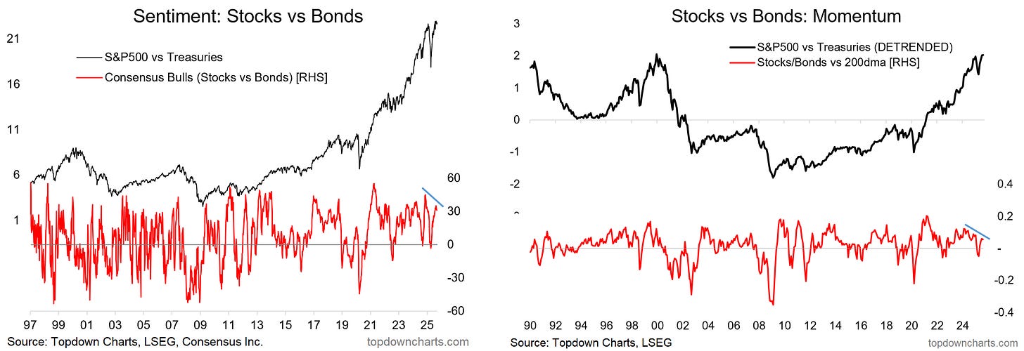
Sentiment & Technicals: While we did see a sharp correction in the stock/bond ratio back in April, this has since been unwound with a big rebound. But momentum is now fading as bonds begin to make a come back of sorts.
On the technicals, 2 points of note are the higher high in the index vs lower high in relative sentiment (and rolling over from bullish levels), and lower highs in stock/bond ratio vs its 200-day moving average (i.e. fading momentum).
These are early warning risk flags.
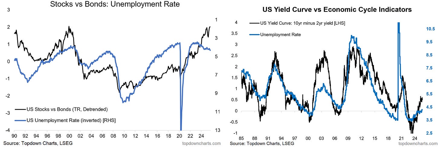
Macro: The other recent development of note for this theme is the tick up in the unemployment rate (and likely further upside if the historical linkage with the yield curve is anything to go by), and general softness in the labor market.
Of course, the real signal here is “recession: yes or no” – which is a lot of what it all comes down to when trying to guess the path of the stock/bond ratio (and hence its importance in active asset allocation).
Valuations: In the background meanwhile, valuations also caution of the potential for a peak: stocks are expensive outright, bonds are cheap outright (and turning up), and stocks are expensive relative to bonds – the combination of this and the macro/technical warning signs make it begin to become a bit more tactically relevant.
Long-Term Perspective & Cycles: Meanwhile zooming out to the strategic level, the rolling realized 10-yr equity risk premium is looking stretched vs long-term average and cyclically well-aged.
Asset Allocation Strategy: The prospective equity risk premium (based on expected returns) is negative, and the ERP indicator from the Shiller data continues to track around 20-year lows.
All the warning signs are there, and we need to be paying closer attention to opportunities in bonds and risks in stocks, with the next logical step for asset allocators being a switch to underweight stocks, overweight bonds.
In Summary…
Sentiment & technicals are waving downside risk flags for the US stock/bond ratio (bearish divergences: higher high on the index vs lower highs in relative sentiment and price momentum, and relative sentiment rolling over from the highs).
Macro risk flags are also waving (weakening jobs market, higher unemployment rate; and prospect of it going higher based on the yield curve).
Valuations also highlight the potential for a peak in the stock/bond ratio (stocks are expensive, bonds cheap, stocks expensive vs bonds).
Bigger picture, the rolling 10-yr realized equity risk premium is stretched vs long-term average, and well-aged in the cycle; and forward-looking equity risk premium indicators point to negative/poor ERP going forward.
Bottom line: Seeing multiple warning signs for a downturn in the stock/bond ratio (sentiment, technicals, macro, valuations, and long-term cycles/strategic perspectives).
Like this post? :-) Please consider sharing it (e.g. forward this email to a friend/colleague, share the web link on social media, + feel welcome to use the charts in your own work and link-back or reference Topdown Charts)
Also, be sure to sign up for more updates:
Topics covered in our latest Weekly Insights Report
While the above piece came from our full service over at Topdown Charts Professional , see below for what we covered here in our latest entry-level service weekly report:
Global Market Update: global equities, rates, FX, commodities
Stock/Bond Ratio: big picture asset allocation call
Treasuries: looking at the case for bonds specifically
Global vs US: absolute and relative return outlook for global equities
Crude Oil (and Energy Stocks): weighing up the outlook here
Commodity Equities: examining the breakout, value case, and outlook
Subscribe now to get instant access to the report so you can check out the details around these themes + gain access to the full archive of reports + flow of ideas.
For more details on the service check out the following resources:
Getting Started (how to make the most of your subscription)
Reviews (what paid subscribers say about the service)
About (key features and benefits of the service)
But if you have any other questions definitely get in touch.
And if you would like a greater level of depth and detail + access, check out our Institutional Service for the full reports: Topdown Charts Professional
Thanks for your interest. Feedback and thoughts welcome.
Sincerely,
Callum Thomas
Head of Research and Founder at Topdown Charts
Follow me on Twitter
Connect on LinkedIn
NEW: Services by Topdown Charts
Topdown Charts Professional —[institutional service]
Topdown Charts Entry-Level Service —[entry-level version]
Weekly S&P 500 ChartStorm —[US Equities in focus]
Monthly Gold Market Pack —[Gold charts]
Australian Market Valuation Book —[Aussie markets]
What did you think of this note?
(feel free to reply/comment if you had specific feedback or questions)


