
Chart of the Week - The Unthinkable
Everyone is expecting recession, but what if we get the opposite?

This week’s chart comes from the latest Market Cycle Guidebook and presents a sort of “what if?“ scenario… one that is probably “unthinkable“ from the standpoint of where consensus seems to have drifted to.
Basically the key premise in the chart is that there has been a clear Global pivot to monetary policy easing already — and with the usual leads/lags of policy transmission there should be a bunch of monetary tailwinds coming into play right about now.
So instead of getting a recession, what if we get the opposite?
(what if growth accelerates rather than stalls?)
That’s not to dismiss the real adverse impacts of the tariff shock…
And when it comes to the USA specifically, there are a lot of short-term pain points from policy moves this year e.g. fiscal tightening from DOGE cuts vs previous years fiscal stimulus, tariff impacts, collapse in tourism numbers (and other US product boycotts), and adverse confidence effects from uncertainty and market volatility (makes it hard for businesses to plan or expand vs just battening down the hatches).
But there are also good things going on, and strong spots, and parts of the economy that are less directly impacted by tariffs. So even with the USA you could still end up with a winners vs losers K-shaped economy that muddles through like it did during the inflation and rates shock of 2022-23.
Meanwhile on the global front conventional wisdom and consensus probably says something like “you can’t have a US contraction and a rest-of-world expansion“ — but I think in this instance that assertion would ignore the idiosyncratic factors faced by the USA itself, and some of the domestic strong spots in the rest of the world + increased multilateral trade + greater stimulus/monetary easing seen outside of the US (vs current policy settings in the USA are not growth friendly).
So to take a non-consensus “what if“ even further… what if you saw the global economy accelerate and US economy stall?
The probability of that may be small, but it is not zero.
Food for thought as the unthinkable seems to have a habit of becoming thinkable in these non-boring times…
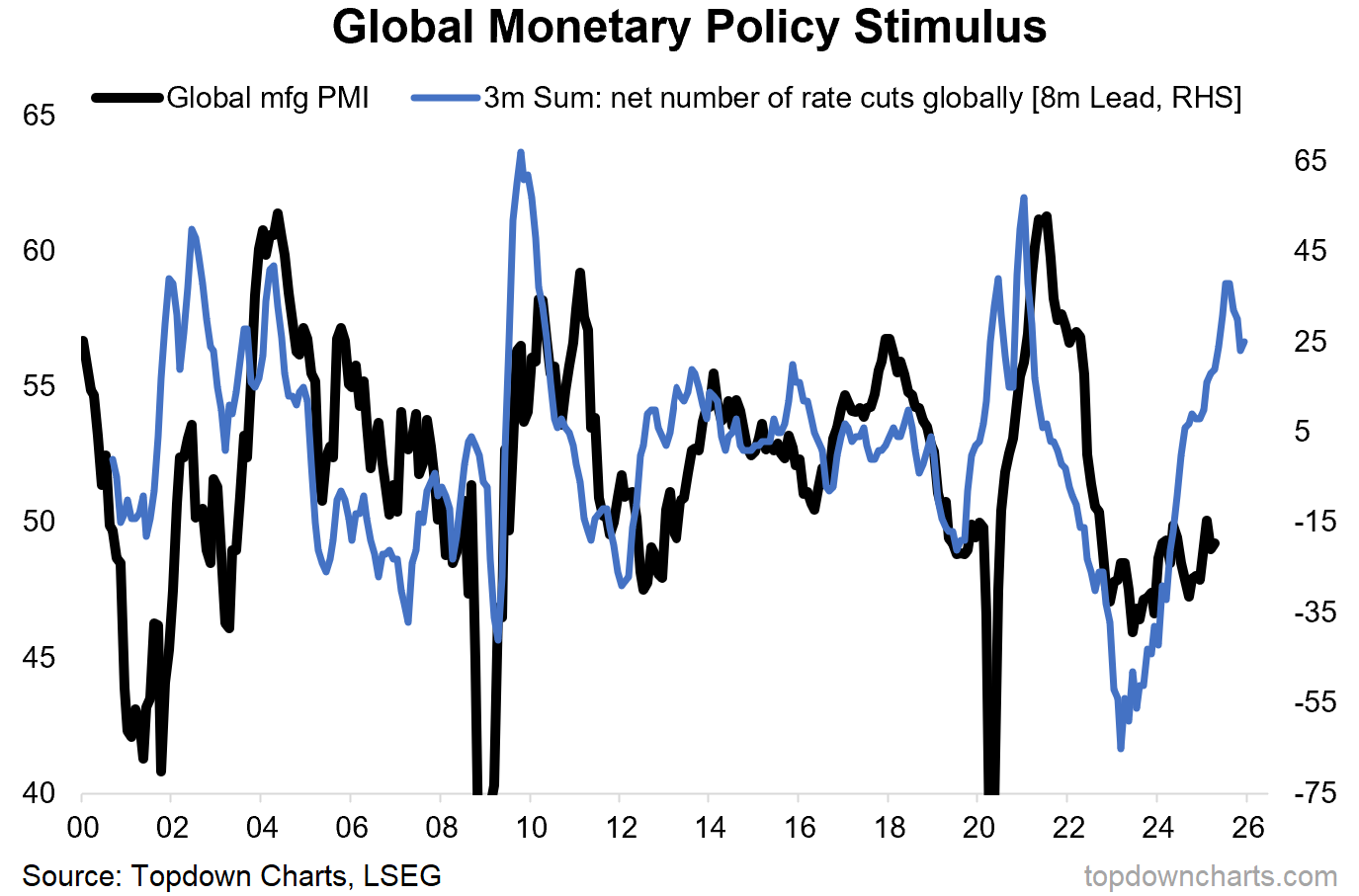
Key point: An unthinkable non-consensus growth surprise is a possibility.
see also: Chart of the Week - What's the Upside? (an inventory of upside risks)
Bonus Chart: Global Equity Technicals
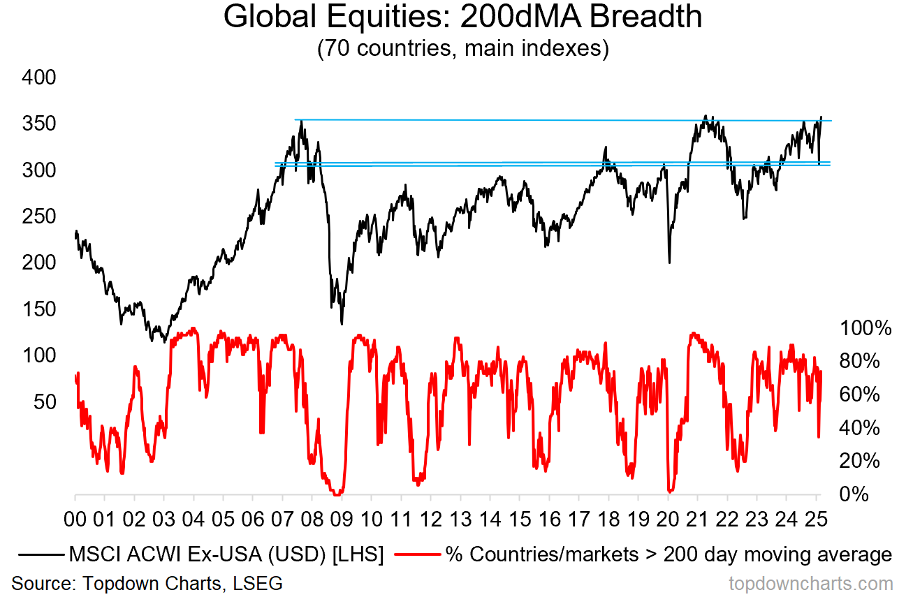
It’s not just the unthinkable on the macro side, here’s an insight into how global equities are tracking; with a specific focus on global ex-US.
While the S&P500 remains below its 200-day moving average, 74% of the countries we track are currently trading *above* their 200dma (see breadth indicator below). And while the S&P500 is still about 9% below its peak, global ex-US equities are within inches of making a new all-time high.
Part of this has to do with USD weakness (as the index below shown in US$ terms), but that’s also partly the point. The currency weakness actually reflects the relative macro predicament that the USA finds itself in vs the rest of the world. And with global stocks still trading at a massive discount vs the US, and technicals looking much better for global vs US, it seems an easy bet to say global equities will outperform vs US equities.
Topics covered in our latest Weekly Insights Report
Aside from the chart above, we looked at several other charts, and dug into some intriguing global macro & asset allocation issues on our radar:
Global Markets Update: latest in stocks, bonds, volatility, FX, commodities
Global Equity Technicals: progress update/outlook for global equities
Macro Radar: key events and setups to keep watch on
Asset Allocation Review: monthly review, outlook, model TAA
Ideas Inventory: latest live ideas and recommendations
Subscribe now to get instant access to the report so you can check out the details around these themes + gain access to the full archive of reports + flow of ideas.
For more details on the service check out the following resources:
Getting Started (how to make the most of your subscription)
Reviews (what paid subscribers say about the service)
About (key features and benefits of the service)
But if you have any other questions definitely get in touch.
Thanks for your interest. Feedback and thoughts welcome.
Sincerely,
Callum Thomas
Head of Research and Founder at Topdown Charts
Follow me on Twitter
Connect on LinkedIn
NEW: Services by Topdown Charts
Weekly S&P 500 ChartStorm [US Equities in focus]
Monthly Gold Market Pack [Gold charts]
Topdown Charts Professional [institutional service]
Australian Market Valuation Book [Aussie markets]