
Chart of the Week - US Equity Leadership
Charting the cycles and peaks of US equity leadership over the years...

When you look at enough markets for long enough you come to realize a few truths or at least rules of thumb for thinking about and navigating stockmarket regimes…
The trend is your friend until it bends.
No trend goes on forever uninterrupted.
Cycles happen for a reason, and they repeat.
Extremes are a feature of trend-ends and cycle-turns.
As it happens, this week’s chart provides an excellent case study on all 4 counts + provides some timely insights into what is unfolding right now.
Let’s go through them…
The trend is your friend: there is clear persistency in the relative performance of US vs global equities, both up and down over time (i.e. you tend to see multi-year runs that can be clearly identified as a trend).
Trends do not go on forever uninterrupted: all of those trends eventually came to an end after reaching an exhaustion point.
Cycles happen for a reason (and repeat): there are clear repeating cycles on display here, which are driven by or start under conditions of relative valuation extremes, cycles of innovation and industrialization, (geo)politics and society + currency and macroeconomic cycles.
There is information in the extremes: trend-ends and cycle-turns almost always follow some kind of extreme, here you can clearly see at peaks and troughs there is typically a final surge/plunge. But they also echo other features like extremes in valuations and crowd psychology —and price-trend-exhaustion often coincides with macro/fundamental-trend-exhaustion.
So where do things stand now?
Basically, we’re sitting at the end of a long trend of US outperformance; a stretched cycle, and a set of extremes. With the pressures already building up for some time, arguably it was already “due” or vulnerable to turn — but for want of a catalyst.
That catalyst now seems to be in place with the sharp and stark shift in US geo-economic policy. Call it a restructure, call it chaos, call it short-term pain for long-term gain… but whatever your slant is the key thing that is clear is that things have changed in the real world, just as this chart was approaching a logical turning point.
The narrative and reason behind technical-turns and market regime changes are often only obvious in hindsight… until then we can trust only price.
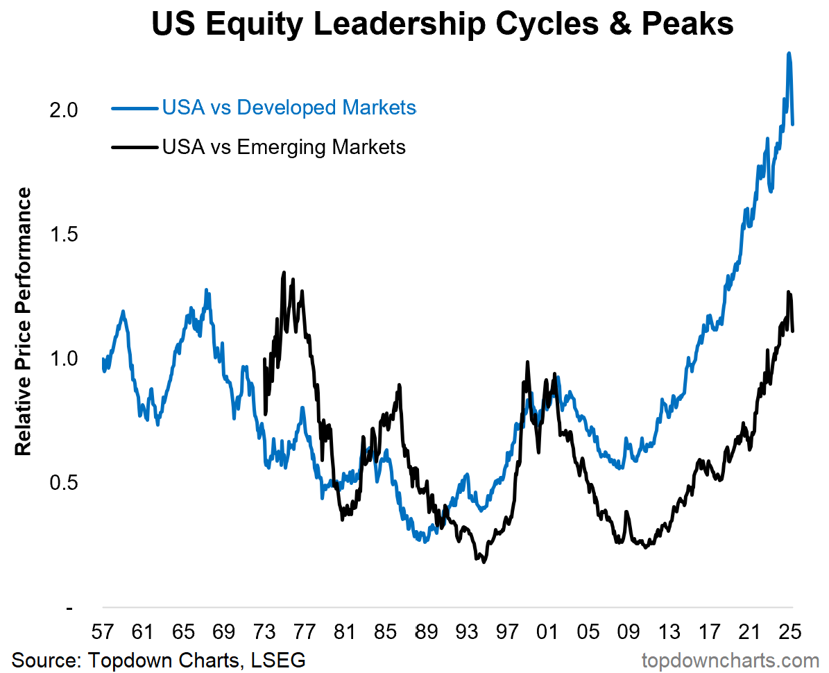
Key point: US global equity leadership is at a peaking point.
NEW: recently added information pages
In case you missed it, I’ve recently added 2 new information pages to help existing and potential subscribers get the most out of their subscription to the Topdown Charts Entry-Level Service.
“Getting Started” — Key features, who’s behind this, goals of the service, Reading List (notes on process, track record), FAQ and troubleshooting.
“Reviews“ — Paid subscriber Ratings, survey findings, testimonials.
Hopefully you find these helpful, but as always please feel welcome to get in touch with any questions or jump into the comment section for Q&A.
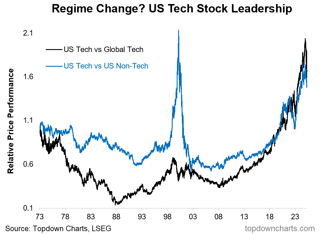
Bonus Chart: US Tech Stock Leadership
A big part of the US vs global equity dominance has been the rise and rise of US Tech Stocks. We see similar types of dynamics as discussed above playing out in this chart too. Trend persistence, cycles, extremes, and trend-ends + cycle-turns.
The shock rise in US (geo)political risk comes at a time where US tech stocks reached extremes in valuations and concentration (e.g. record high market cap weights), and an extreme surge in relative performance by US tech vs non-tech and global tech; all of which now appear to be at a trend exhaustion point…
Found this interesting? —be sure to share :-) Forward to a friend, post on social, or click the share button below…
Topics covered in our latest Weekly Insights Report
Aside from the chart above, we looked at several other charts, and dug into some intriguing global macro & asset allocation issues on our radar:
US Market Regime Change: big trends and turning points in focus
China: the cyclical outlook, policy puzzle, stockmarket outlook
Defensives: the upside for defensives (and downside of that)
LatAm Equities: a bullish setup amongst the bearish mood
Frontier Markets: an overlooked corner of the markets
Subscribe now to get instant access to the report so you can check out the details around these themes + gain access to the full archive of reports + flow of ideas.
For more details on the service check out the following resources:
Getting Started (how to make the most of your subscription)
Reviews (what paid subscribers say about the service)
About (key features and benefits of the service)
But if you have any other questions definitely get in touch.
Thanks for your interest. Feedback and thoughts welcome.
Sincerely,
Callum Thomas
Head of Research and Founder at Topdown Charts
Follow me on Twitter
Connect on LinkedIn
NEW: Services by Topdown Charts
Weekly S&P 500 ChartStorm [US Equities in focus]
Monthly Gold Market Pack [Gold charts]
Topdown Charts Professional [institutional service]
Australian Market Valuation Book [Aussie markets]