
Chart of the Week - Value vs Growth
Charting the outlook for value vs growth stocks + wider stockmarket implications...

This week I’m travelling and short on time, but for continuity sake: here’s one of the topics I covered in my main Topdown Charts report last week…
Value vs Growth Stocks: new lows, further extremes…
(p.s. skip to the end if you just want the bullet point summary + conclusion)
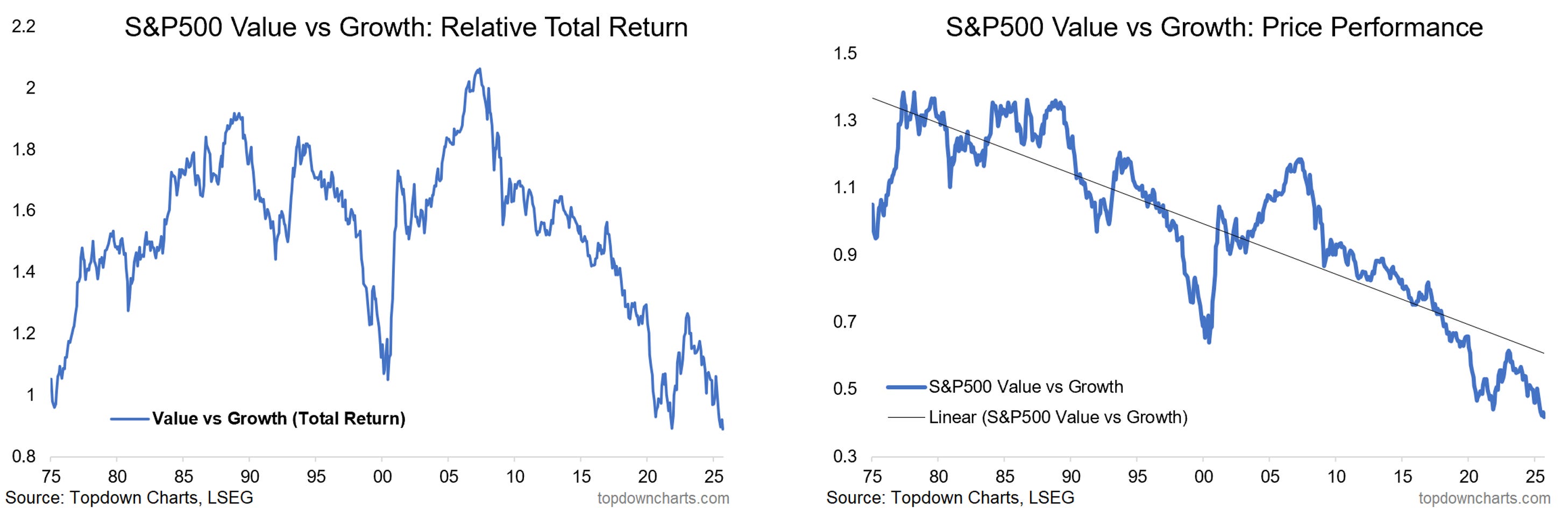
Checking in on US value vs growth, the relative price lines have drifted lower toward new all-time lows. We see this on both a price-only and total return basis; with price-only straying further and further from trend, and the relative total return line well below long-term average.
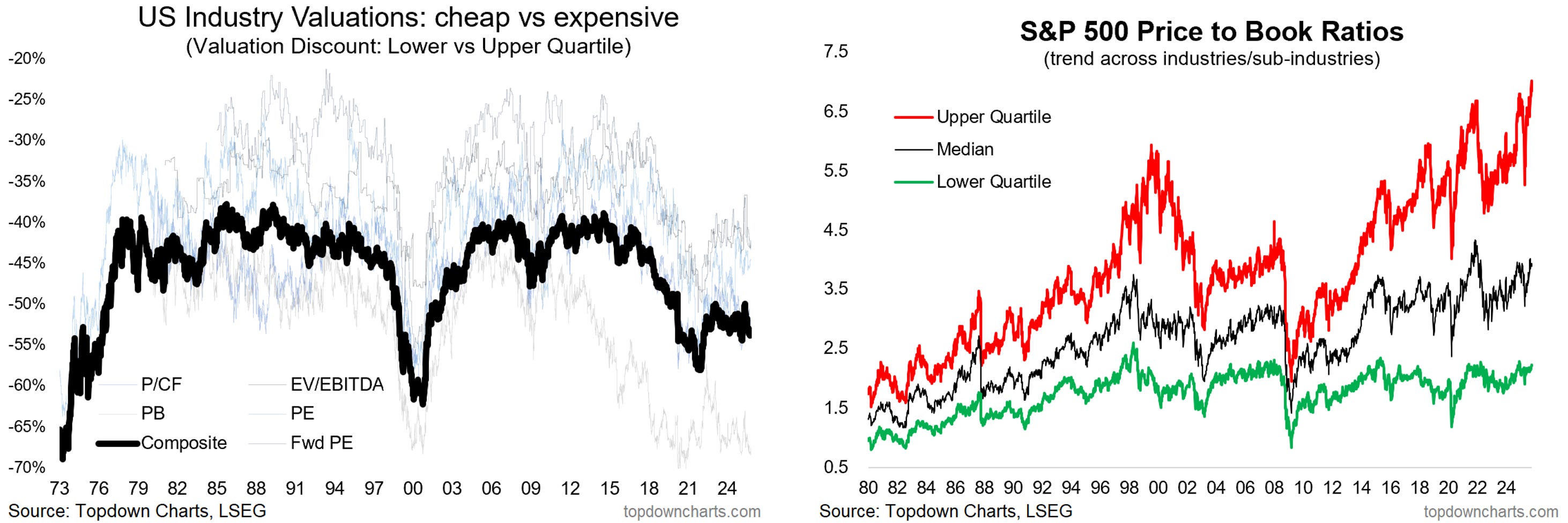
These extremes are echoed in the valuation trends picture, with the discount between the cheapest vs the most expensive parts of the market still much steeper than usual – which is quite interesting to reflect on, as for much of history this indicator has ranged around -40-45% …so this is unusual.
In passing it’s also interesting to see the different echelons of price-to-book ratio, with the most expensive parts of the market both more expensive than usual vs the cheap parts and more expensive than usual vs their own history.
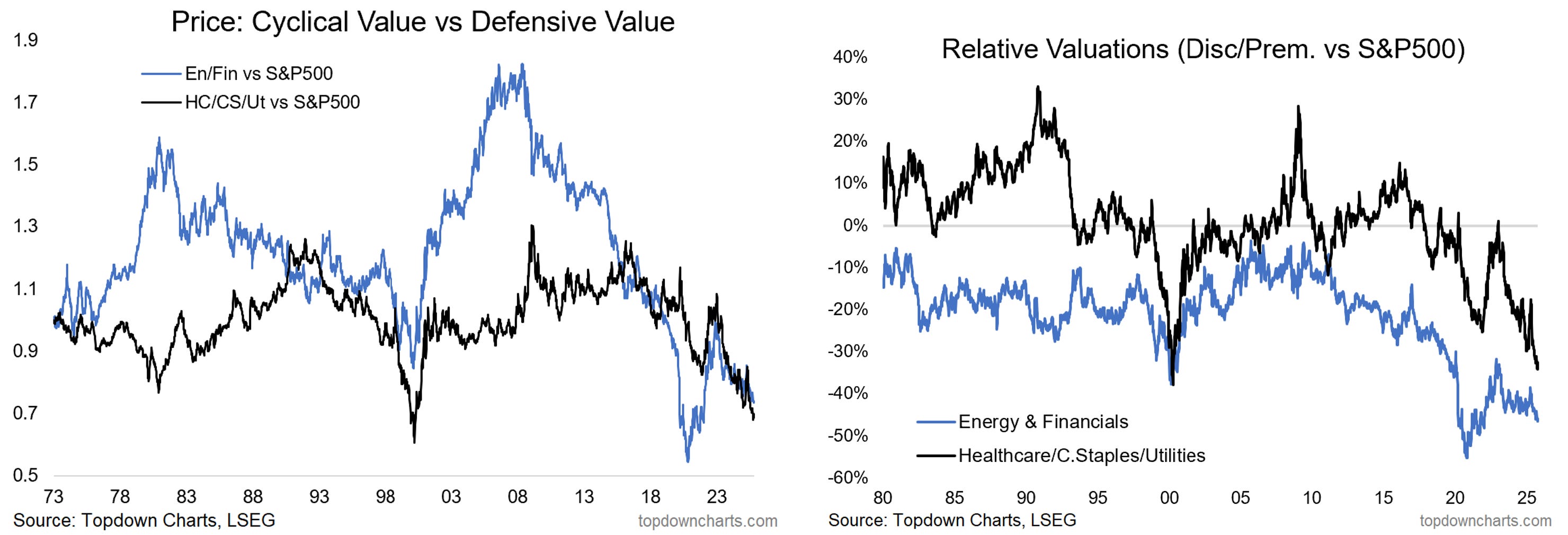
Looking at US value vs growth, the big sector weight skews are basically tech on the growth side, and cyclical (financials and energy) + defensive (healthcare, staples, utilities) on the value side. We can see that the recent push lower in the value vs growth relative price lines have been driven by both cyclical and defensive value losing ground against the ever hotter tech sectors. And as such, the relative value discounts have been driven deeper still for both groups.
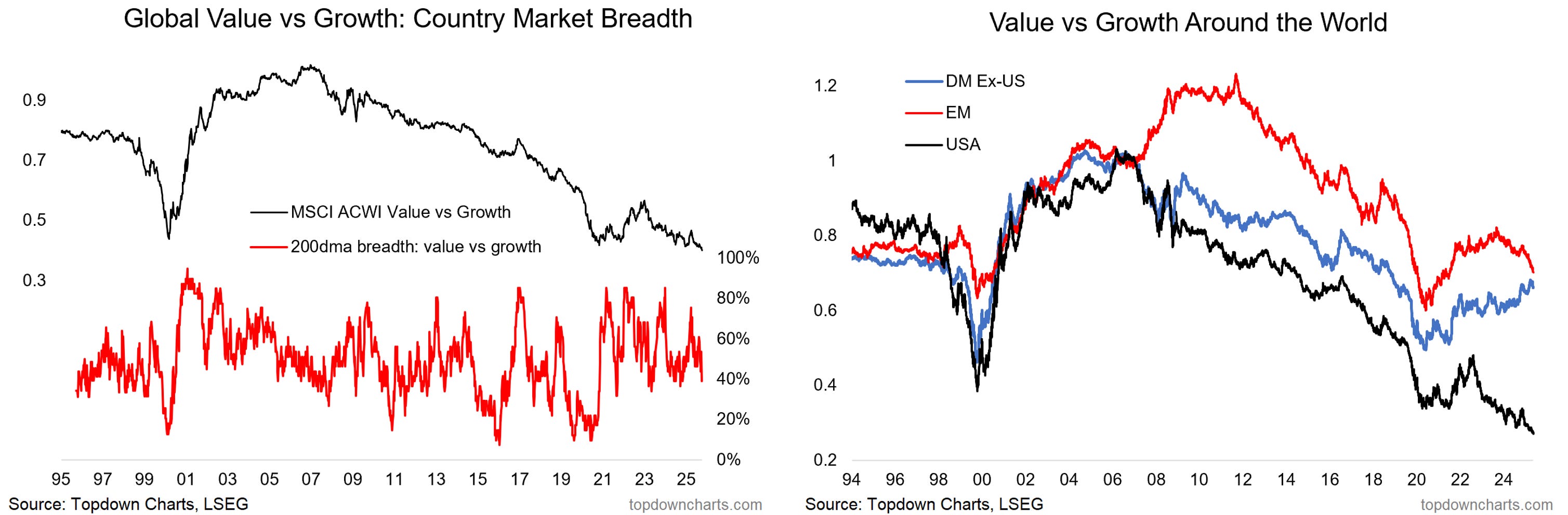
Lastly, on the global front it’s a mixed picture. The MSCI ACWI value vs growth line has broken down to new relative lows, and breadth of value vs growth across countries is clearly weakening.
Initially EM value vs growth had been trending higher, but has also peaked and rolled over. But developed markets have seen better performance (albeit partly due to better performance from financials and less exposure to growth-tech). And on that last point, it goes to show that value vs growth relative performance (and relative value) is highly sector-driven, and that we will thus either need to see tech top or value sectors gain to turn things around here.
In Summary…
US value vs growth relative performance lines have broken down to new all-time lows, with the price-only line stretched well below trend, and total return well below long-term average.
These extremes are echoed in the valuation trends picture, with the discount between the cheapest vs the most expensive parts of the market still much steeper than usual (and the most expensive parts much more expensive than usual vs their own history). This is an unusual phenomenon and tells us as much about the state of value vs growth as the stockmarket cycle as a whole.
The biggest sector skews in US value vs growth are defensives (healthcare, staples, utilities) + cyclicals (energy, financials) on the value side, and tech on the growth side. Both groups have seen very weak relative performance, and hence widening relative value discounts opening up.
Overall these observations point to both opportunity for value to potentially rebound vs growth, but also pressure points and distortions opening up in the market. Ultimately if value is to rebound vs growth it’s going to be sector driven.
Bottom line: US value vs growth has reached new all-time lows as further extremes in valuation drive large relative value gaps; the global picture is not much better (but reiterates the sector factor).
Like this post? :-) Please consider sharing it (e.g. forward this email to a friend/colleague, share the web link on social media, + feel welcome to use the charts in your own work and link-back or reference Topdown Charts)
Also, be sure to sign up for more updates:
What did you think of this note?
(feel free to reply/comment if you had specific feedback or questions)
Topics covered in our latest Weekly Insights Report
Aside from the chart above, we looked at several other charts, and dug into some intriguing global macro & asset allocation issues in our latest entry-level service weekly report:
Global Markets Update: stocks, bonds, FX, commodities commentary.
Credit Spreads & Volatility: taking stock of the latest flare-up in volatility.
EM Fixed Income: outlook for EM government bonds asset class.
Value vs Growth: reviewing pressure points, risks, opportunities.
Agri Commodities: looking at upside risks in agri commodity prices.
Frontier Markets: going neutral from bullish on valuations/technicals.
LatAm Equities: going neutral from bullish on technicals, risk window.
Subscribe now to get instant access to the report so you can check out the details around these themes + gain access to the full archive of reports + flow of ideas.
For more details on the service check out the following resources:
Getting Started (how to make the most of your subscription)
Reviews (what paid subscribers say about the service)
About (key features and benefits of the service)
But if you have any other questions definitely get in touch.
Thanks for your interest. Feedback and thoughts welcome.
Sincerely,
Callum Thomas
Head of Research and Founder at Topdown Charts
Follow me on Twitter
Connect on LinkedIn
NEW: Services by Topdown Charts
Topdown Charts Professional —[institutional service]
Topdown Charts Entry-Level Service —[entry-level version]
Weekly S&P 500 ChartStorm —[US Equities in focus]
Monthly Gold Market Pack —[Gold charts]
Australian Market Valuation Book —[Aussie markets]