12 Charts to Watch in 2024 [Q2 Update]
Key charts and issues to keep track of in H2 and beyond...
Here’s an update to the 12 Charts to Watch in 2024 as we head into quarter-end.
In the original article I shared what I thought would be the 12 most important charts to watch for global multi-asset investors in the year ahead (and beyond).
In this article I have updated those 12 charts + provided fresh comments.
[Note: I have included the original comments from back at the start of the year, so you can quickly compare what I'm thinking now vs what I said back then]
1. The Monetary Wall: Some might argue I should just remove this one since it seems to have been wrong. And indeed, I now see more signs of global economic reacceleration vs recession at this point. But I think it’s worth keeping and reflecting on because there was and still is a significant tightening of monetary conditions, it just so happened that it was initially offset by other factors — making the long and variable lags of monetary tightening longer and more variable!
“Talk of soft landings, mixedcessions, vibecessions, and things of that nature may soon turn to tradcession as looming large monetary headwinds raise the risk of a traditional-recession into 2024. Several upside surprises and spots of resilience ended up warding-off recession risk in 2023, but as motivational and inspirational speakers often tell us: “just because something hasn’t happened for you yet doesn’t mean it won’t”.”
2. Rise of Deflation: Similar vibe to the previous one, but I would note that the disinflation wave seems to have come and gone now, and just as this chart has shown a peak in the rise of deflation, I now think the greater risk is a resurgence in inflation than a widespread deflation wave (maybe later!).
“Adjacent to that, and along with multiple disinflationary drivers, the impact of base effects, and dissipating demand – raises the prospect of technical deflation risk (i.e. the CPI annual rate of change going negative). And it’s not just a vibe, it’s already happening in pockets of the global economy. Deflation was an unthinkable term early last year, but I think by now more people are starting to entertain the idea. It would almost be poetic for a deflation scare to follow the inflation shock and the higher for longer meme.”
3. Resurgence Risk: The risk of higher for longer inflation is higher — resurgence risk is in play as commodity prices push higher, capacity remains relatively tight, and a number of economic indicators show signs of reacceleration. Furthermore, at least in the USA as the election draws closer the likelihood of measures to try and dampen inflation for political purposes is likely to wane (e.g. the previous SPR draws that helped put a lid on energy price driven inflation). So remain wary of resurgence risk.
“Not to hedge the previous comments, but we still can’t rule-out inflation resurgence risk either. A “no-landing” rebound in global growth (especially trade and manufacturing – which have been in recession) would mean commodities up, capacity tight, inflation HFL.”
4. The Story Can Change Quickly: But not to get complacent on recession risk — it is important to note that things can turn for the worse very quickly. Labor markets have been getting steadily less tight, but for now it is just an unwinding of previous tightness vs outright weakness. Either way, this is an important chart to track.
“But back on the downside risks, and to caution on complacency – while labor markets are still tight, consumer strong, wages growing… note the history on this chart. The jobs market goes up the stairs on the way up, and out the window when things turn.”
5. Yield Curving: The other issue is some of the traditional cycle indicators are at peak cycle-maturity levels, and turning the corner. So again, we need to keep vigilant on this because things could turn faster and for reasons other than any of us expect.
“These 3 lines all measure the same thing – the maturity of the business cycle (**and turning points**). On all 3 counts they say the cycle is long in the tooth, and turning.”
6. Bond Bargain: Bonds are cheap, stocks are not.
“As such, and while things have moved a lot since the brief 5% reading for the US 10-year treasury yield in October last year, government bond valuations are still cheap, and the macro downside risk scenario I outline here is bond bullish. It won’t be a straight line, but bonds likely see further upside in the coming year following one of their worst bear markets in recent history.
Stocks are a different matter though…”
7. Tech Perfection: As investors continue to crowd into and chase after glittering prizes in tech stocks, valuations have reached new extremes. Yes, they could go even higher, and yes they could pull off the earnings growth required to justify it, and yes it may well be different this time… But damn is there a higher hurdle for all that. Call me a doubting Thomas, but I would advise caution — this is getting dangerous.
“Tech stock valuations, while still not quite eclipsing the dot-com heights, have returned to 2021 peak levels. Tech is priced for perfection, and untested by recession.
Indeed, big tech saw its big run from 2009 riding a wave of initial outright undervaluation, mostly accommodative monetary policy (including the ZIRP era), and importantly: a prolonged period of time where there were no recessions (albeit a few near misses, and p.s. the pandemic was a boon and a gift for most in the tech sector: delivering acceleration of existing trends, no real downside, and major monetary and fiscal tailwinds).
Maybe AI hype and exponential acceleration does see tech go on to justify these valuations, and maybe therefore these levels end up as a new normal. But if we want to think in terms of probabilities and risk management, keeping one foot out the door is probably a wise approach here.”
8. The Best and the Worst: The worst part of global equities is doing worse vs the best part of global equities — similar to the previous chart, I would note that this trend is very extended and extreme by now. Yes it could go further, but I would caution that the relative value indicators say we should start to think about swimming against the tide around about now.
“Speaking of relative value, if you look at the flipside of big tech (aka US large growth), the best relative value opportunities are small vs large, value vs growth, and global vs US – the chart below basically explains why (a decade+ relative bear market for everything other than big tech).”
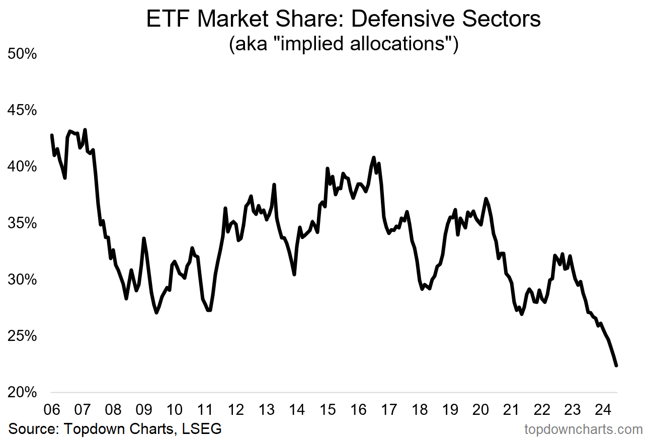
9. Defensive Doom: What does it tell you when investors hate defensives? Well, it tells you firstly we are in a bull market and they are rationally avoiding the stocks that go up the least during the up phase. But it also tells us they are underexposed to this unloved, undervalued, and unappreciated alternative hedge. In essence, this is a contrarian signal.
“The roaring rebound in (tech) stocks last year left the boring old defensive sectors behind (healthcare, utilities, staples). As such, investor allocations to defensive equities have dropped to record lows. There is a signal here — contrarians take note.”
10. Real Estate Realism: Investors are slowly becoming less extreme in their hatred of real estate as things start to stabilize and worst fears fail to materialize en masse. But on my read things are still quite mixed for real estate (I’m mostly focused on REITs), and despite the bullish contrarian sentiment signal here, there’s still a bit of water to go under the bridge in many respects..
“There is also a signal here. Investors hate real estate. The downside risks in the rising rates world (+work from home, cyclical downside risks, credit tightening, etc), are well understood, investors are already on board. That means there are a lot of minds that can change if commercial property merely does OK, and hence an upside case can be made (especially if interest rates drop).”
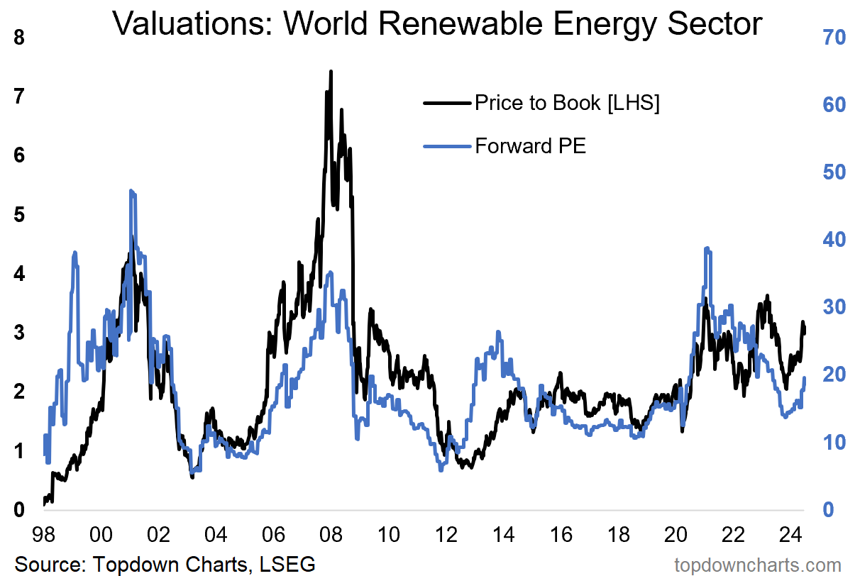
11. Renewables Renewed: After a relatively brief reset to cheap levels, renewable energy stocks are turning up again — no longer cheap, but not yet expensive either. This is the up-phase of valuation/market cycles (as explained here).
“We just lived through yet another boom-bust-bubble cycle in renewable energy. Kicked-off by a steady rise of interest in ESG investing, and then the pandemic stimulus measures, along with a brief traditional energy price spike. But monetary tightening, ESG fatigue and falling commodities have taken the steam out: making valuations for the sector attractive again.”
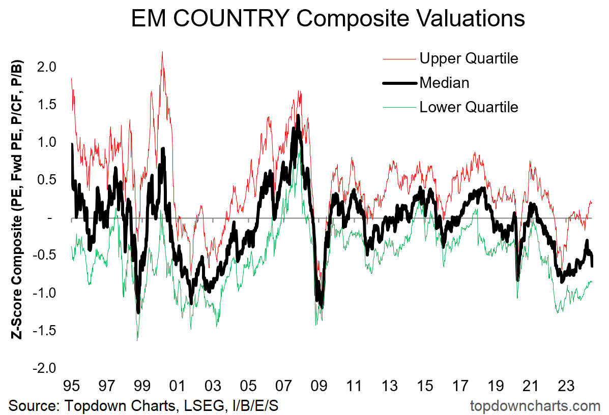
12. EM Again: Sentiment has been improving on Emerging Markets, and things are truly getting better (Fed peak, EM central bank pivot, relaxed risk sentiment, overvalued US Dollar, and global growth reacceleration). Meanwhile, EM equities are still mostly cheap…
“It was every strategist’s favorite place to be at the start of 2023. Naturally folk will be skeptical on it showing up again in outlook pieces like this, and maybe there is a sense of once-bitten, twice-shy. But things are different this time. The value story is still there (especially for China and LatAm/Non-Asia EM), however now we also have a peak in the Fed funds rate (possible easing later), a peak in the US dollar, a pivot by EM central banks from rate hikes to rate cuts, lingering pessimism on EM assets, and promising technicals as an inflection point appears to already be in place.
So as far as I’m concerned it definitely deserves a spot in the charts and themes to watch in the year ahead as multiple trends and macro cross currents come to their logical conclusion.”
For more on the macro/market outlook in 2024 and beyond (particularly as it relates to asset allocation and top-down global investing risks and opportunities), check out our upcoming Quarterly Strategy Pack + Webinar (report due out 28th June 2024 — be sure to get on the client distribution list!)
—
Thanks for reading!
Charts originally from the 2023 End of Year Special Report (free download)
Best regards
Callum Thomas
Head of Research and Founder of Topdown Charts
Twitter: https://twitter.com/Callum_Thomas
LinkedIn: https://www.linkedin.com/in/callum-thomas-4990063/
For more details on the service check out this post which highlights:
a. What you Get with the service;
b. the Performance of the service (results of ideas and TAA); and
c. What our Clients say about it.
Follow us on:
LinkedIn https://www.linkedin.com/company/topdown-charts
Twitter http://www.twitter.com/topdowncharts


