Chart of the Week - EM Inflection Point
A once-in-a-decade turning point is upon us...
Emerging Market equities are up +30% YTD.
You might think that run is overdone, but this week’s chart suggests otherwise.
One of the key principles in market analysis is: “when in doubt, just zoom out“ …and the big picture here leaves little doubt as to what’s happening in emerging markets.
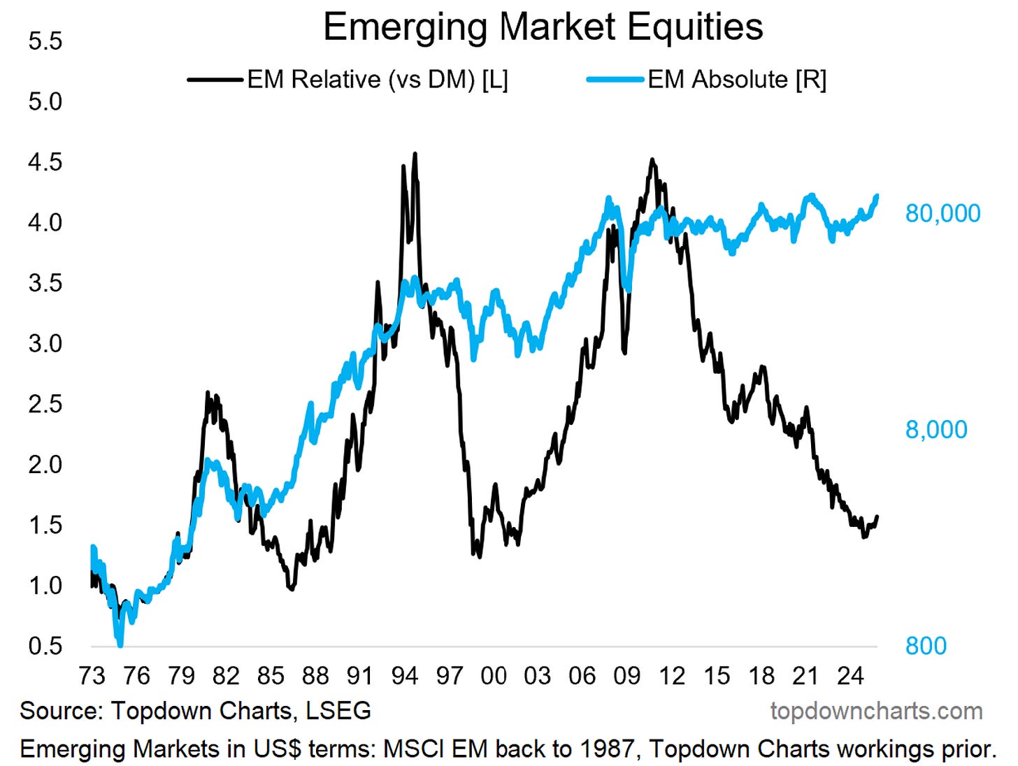
The MSCI Emerging Markets (US$) index is on the cusp of breaking out in absolute terms (from almost 20-years of stagnation/range-trading) AND is turning the corner in relative terms (after undergoing a 15-year relative bear market).
I want to pause and dwell on something there for a second…
We all know about the traditional garden variety ”bear market” —for example, what US stocks did in the years following the dot com bubble peak (i.e. the early-2000’s). It’s characterized by a market where price trends down, usually in a substantial manner and over a prolonged period …it becomes a case of sell the rip instead of buy the dip (basically the opposite of a bull market).
But you can also get 2 other types of bear market:
Relative Bear Markets: this is illustrated well in the chart below, it’s when one asset or market consistently trends down vs another asset — this is why I noted that emerging markets have been in a long-term relative bear market vs developed markets (and it actually followed a roaring relative bull market during the 2000’s).
Stealth Bear Markets: the traditional bear market is one where price corrects through time and space (price goes down in space on the chart over time), but the stealth bear market corrects mostly through time as price stays rangebound. It makes investors give up (allocations and flows drop-off), sees price lag behind fundamentals (valuations fall to cheap levels), and often happens while a period of restructuring and reform happens in the background (as most often this type of market happens following a big and unsustainable bull market).
We care about bear markets because yes: they can be destructive to portfolios during the process, but perhaps more importantly is the point that historically some of the biggest bull markets and buying opportunities emerge in their wake.
In that sense, being that we see both a (15-year) relative bear market (the black line), and a (nearly 20-year) stealth bear market (the blue line) …I would argue that this is precisely why the bull case for EM now is so interesting. And this is not just conceptual, we have seen those background adjustments actually take place: investor allocations to EM are at rock bottom, valuations are cheap, and macro/fundamentals have been slowly changing for the better.
While there have been false dawns before, I think we need to pay very close attention to this chart, because what looks to be getting underway here could easily be the beginning of a new multi-year cycle. Something of generational significance for long-term investors and asset allocators.
Key point: EM equities are at a long-term bullish inflection point.
Like this post so far? :-) Please consider sharing it (e.g. forward this email to a friend, colleague, client, or family member, share it on social media + feel welcome to use the charts in your own work)
Bonus Chart 1 — USA vs The World
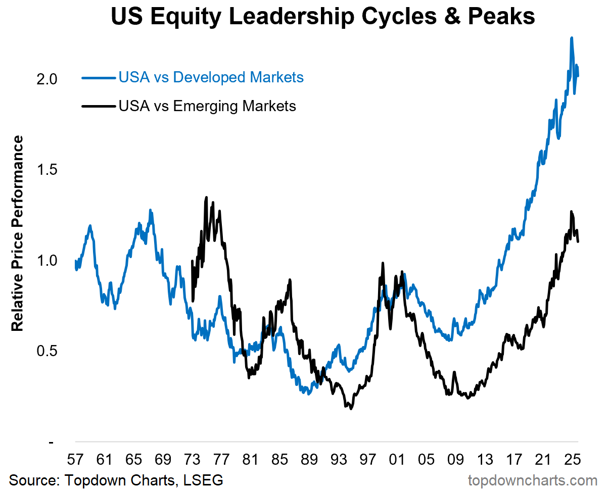
The inflection point underway in EM vs DM actually echoes a larger theme of US stocks starting to run out of steam vs the rest of the world.
A key part of the flipside of the EM vs DM relative bear market is the long-term and massive relative bull market in US vs Global stocks. But to echo the comments from above, the thing about long-running and overhyped bull markets is that they start for good reason and end when things become unreasonable e.g. valuations become stretched and set an improbable high bar for future performance, investors become giddy and overallocate to that market, and the underlying fundamental story reaches maturity (and ultimately becomes unsustainable).
In other words: the USA is towards the end of its cycle, while EM is arguably just at the beginning stages of its cycle.
If you haven’t yet, be sure to subscribe to the [free] Chart Of The Week or better yet: Upgrade to Paid for Premium Content.
Bonus Chart 2 — Global Equity Valuations
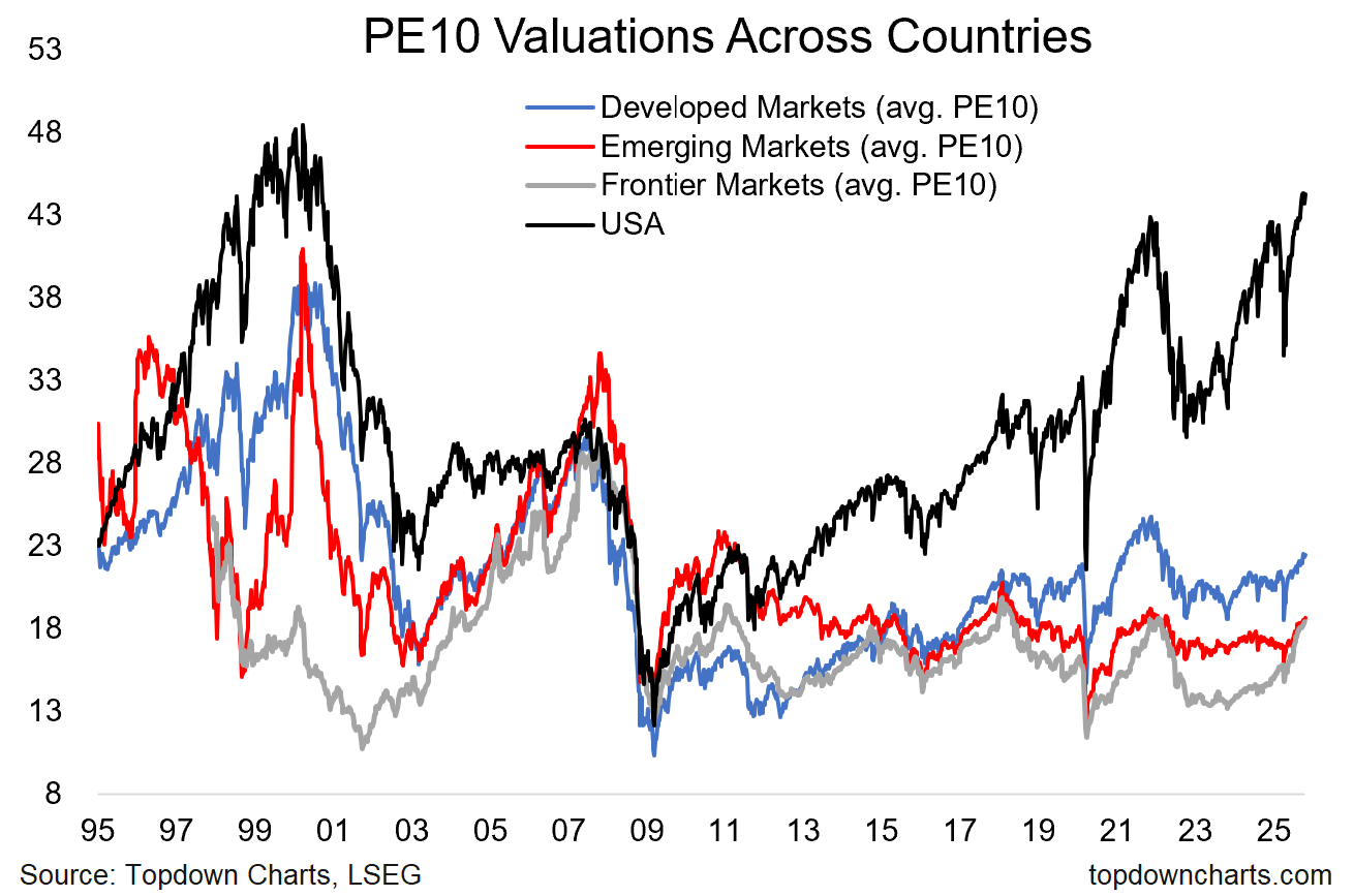
And finally, just to illustrate with data some of the points around market cycles and valuations… This chart shows the price to 10-year average trailing earnings (smooths out the sometimes highly distorted picture from just 12-month trailing) aka PE10 ratio for the USA and the average reading across the countries in Developed, Emerging, and Frontier markets.
Zooming out you can see the clear cycles of boom and bust (and the risks + opportunities in absolute terms), but also the convergence and divergence across those groups over time as international investing grew in popularity and then got cast to the wayside.
With one glance you can get a fairly good feel for where the longer-term risks and opportunities are here (and probably unsurprising given the previous charts). I can’t help but think how interesting the next decade in global equities is going to be, especially coming from this starting-point context.
Global Equities — what do you think? (/how are you positioned in portfolios)
Not a paid subscriber yet? Be sure to sign up so you can access premium content including exclusive well-rounded ideas spanning risk alerts, investment ideas, and impactful macro insights to help make you a better investor - [ Sign Up ]
Topics covered in our latest Weekly Insights Report
Aside from the chart above, we looked at several other charts, and dug into some intriguing global macro & asset allocation issues in our latest entry-level service weekly report:
Market Update: commentary on stocks, rates, FX, commodities
US Treasury Technicals: tactical update on bond yield outlook
Global Policy Pulse: tracking the big shift in monetary policy
Commodities: outlook for commodity prices (in aggregate)
Emerging Markets: updated charts/views on EM equities
Updated Ideas Inventory: current live ideas/views, and past performance
Subscribe now to get instant access to the report so you can check out the details around these themes + gain access to the full archive of reports + flow of ideas.
For more details on the service check out the following resources:
Getting Started (how to make the most of your subscription)
Reviews (what paid subscribers say about the service)
About (key features and benefits of the service)
But if you have any other questions definitely get in touch.
What did you think of this note?
(feel free to reply/comment if you had specific feedback or questions)
Thanks for your interest. Feedback and thoughts welcome.
Sincerely,
Callum Thomas
Head of Research and Founder at Topdown Charts
Follow me on Twitter
Connect on LinkedIn
NEW: Services by Topdown Charts
Topdown Charts Professional —[institutional service]
Topdown Charts Entry-Level Service —[entry-level version]
Weekly S&P 500 ChartStorm —[US Equities in focus]
Monthly Gold Market Pack —[Gold charts]
Australian Market Valuation Book —[Aussie markets]


I think within EM, Colombia, Turkey and Malaysia look particularly attractive to me.
https://borjaclavero.substack.com/p/equity-markets-forecast-q3-2025
Callum, I think you pretty much nailed it: this is probably an important turning point based on many factors. I am slowing allocating into this area. I have tried to find a 'frontier' markets ETF available in the US and it seems the last one was eliminated several years back. (Probably a good sign from a contrarian point of view)