My Favorite Charts of 2024
I really like charts, here's my favorites from the past year...
Recently I shared with you some of my Best Charts of 2024 (charts and calls that worked really well) and then my Worst Charts of 2024 (ones that didn’t work!).
This week (and before we get onto the Charts to Watch in 2025) it’s time to get back onto a brighter note and check out my favorite charts of the past year.
I selected these charts because they were either new and interesting —or ones that helped illuminate some of the key developments across macro and markets. Many of them are still relevant and important for the current backdrop and risk-return outlook.
These charts were featured in my recently-released 2024 End of Year Special Report - do check it out when you get a chance (free download as a holiday treat!).
n.b. I have updated the charts to late-Dec 2024, for your reference. Also on formatting: the italic text is a quote from the report in which the chart originally appeared so you can see what I was thinking at the time.
1. Stockmarket Euphoria: This one has become a crowd favorite, and ironically is tracking the increasingly euphoric investor crowd. The path the Euphoriameter indicator took into and out of the depths in 2022/23 highlighted the prospect of a new cyclical bull, but now with the indicator making record highs (not something it is supposed to do!) it is perhaps flagging an end of the same.
“Digging into equities, and for a moment ignoring all the macro narratives and scenarios, the longer-term sentiment and technical indicators are basically saying that 2022 was a brief bear market, and that we are now in the early stages of a new bull market. Maybe it is that simple…” (12 Jan 2024)
2. US vs Global Tech Stocks: This one has to be included due to the extreme nature of it, but also as an echo of what’s going on in the previous chart: great risk and opportunity…
“Another interesting point is following on from topic 1: US tech is utterly thrashing global tech (and fair enough, US tech looks entirely different (superior) to global tech (winner took all)). As such, US tech is trading 2-3x (+) expensive relative to global tech.” (16 Feb 2024)
3. US Dollar Range-Lock: This one makes my favorites list as it helped frame the range-trade in the US dollar, and I would say remains a very important chart for the coming years as it’s going to be the first place we see a break from this ranging for longer in what may well be the most important macro market for asset allocators to be paying attention to.
“in the short-term, the DXY has found support and oversold conditions, and the reset in sentiment could open the door to a rebound.” (12 Jan 2024)
4. Crude Oil Range-Lock: The next one is also a key chart to keep watching but also as the technical lines helped again to frame the setup and provide simple heuristics for tracking what is also a really important macro market. Curiously, the sentiment indicator has also been stuck in the range, and helping define and flag intermediate tops and bottoms within the larger setup in play here.
“Looking at crude oil in particular, WTI crude has ticked up from a key long-term support level, and sentiment has reset back to neutral – positioning has also take a lurch lower. These are conditions it could easily rally from (but like commodities in general, has potential for breakdown and bearish capitulation). One thing potentially helping the case is positive seasonality from late-Feb/March, so the technicals are mixed-to-promising.” (19 Jan 2024)
5. Treasuries Sentiment Range: Another one with important sentiment shifts and another one of the big 3 macro market range-trades was treasuries. And it’s kind of interesting to reflect for a minute how much of a range trade oil/USD/treasuries were… and thus how truly significant and rattling it will be when and if they eventually break out of these ranges. But also snapping out of these sentiment ranges and regimes as highlighted in the chart below.
“Sentiment has shifted sharply from consensus bearish to now about neutral – but given the sentiment regimes of the past few years, we will need to exit from that inflation risk sentiment regime for bond yields to get materially lower from here. A scenario of policy perfection and soft landing may get yields a little lower, otherwise bullish bonds is ultimately a deflation/recession bet.” (12 Jan 2024)
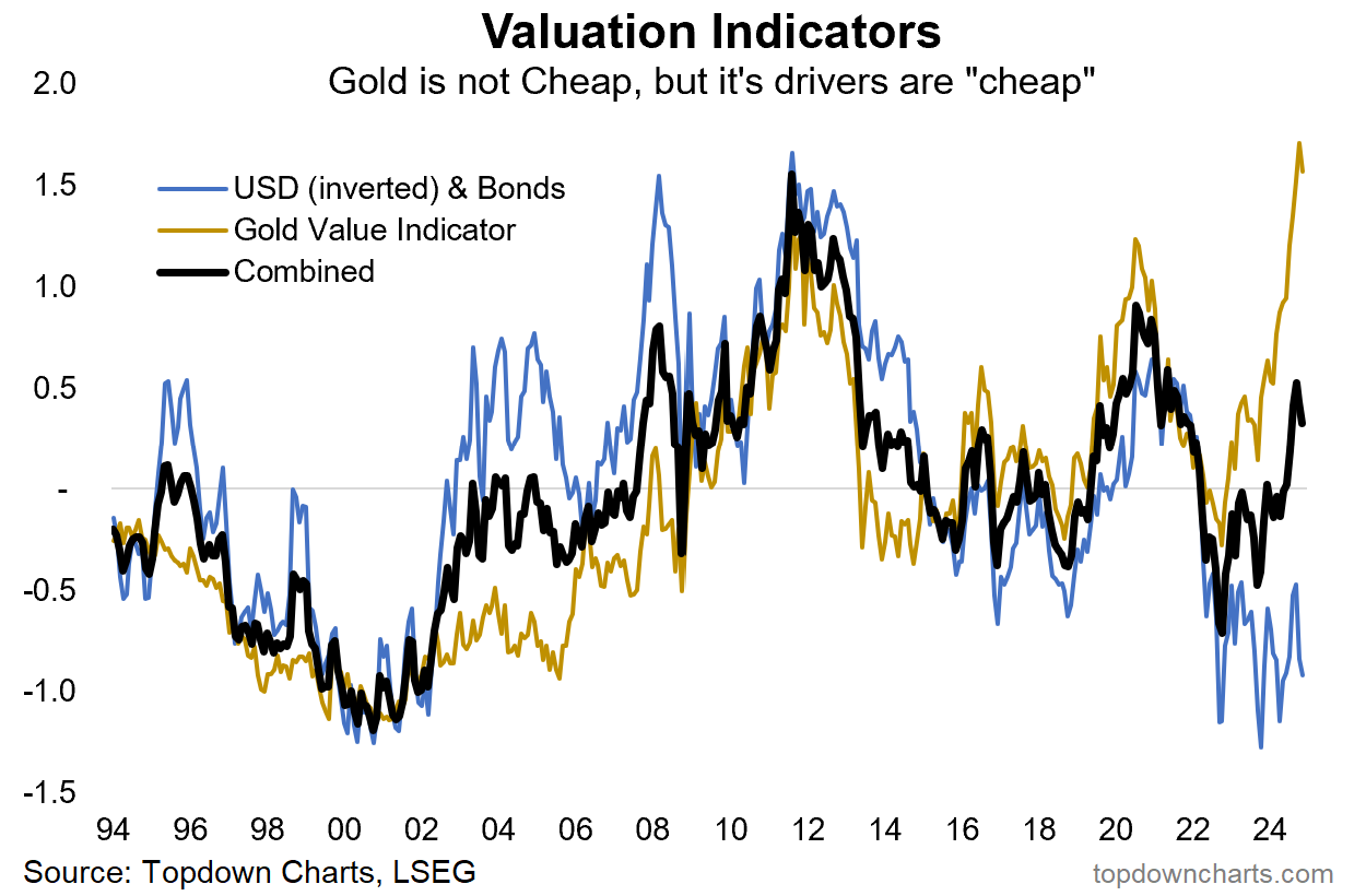
6. Gold Valuations? Lastly, this one was useful as the gold-driver valuations indicator helped offset the expensive absolute value indicator and provide a basis and rationale to be favorable on gold and disregard the otherwise unfavorable prognosis.
“Gold has faced significant previous headwinds from a strong dollar and rising real yields – but both of those elements are now effectively “cheap” (bonds cheap, USD expensive) despite the gold value indicator itself being expensive.” (12 Jan 2024)
So there you have it, a good survey of some key macro-market developments, a good glimpse at some of my work from the past year, and some good clues on the next steps in macro and markets…
—
Thanks for reading!
Check out the Full Report here (free download)
Best regards
Callum Thomas
Head of Research and Founder of Topdown Charts
Twitter: https://twitter.com/Callum_Thomas
LinkedIn: https://www.linkedin.com/in/callum-thomas-4990063/
For more details on the service check out this post which highlights:
a. What you Get with the service;
b. the Performance of the service (results of ideas and TAA); and
c. What our Clients say about it.
Follow us on:
LinkedIn https://www.linkedin.com/company/topdown-charts
Twitter http://www.twitter.com/topdowncharts


