My Worst Charts of 2024
Because we don't always get it right!
Last week I shared with you some of my Best Charts of 2024... i.e. the charts and calls that worked really well in either building the picture or presenting a specific idea.
Of course, it would be incomplete without a look at some of the charts that *didn’t* work (or shall we say the ones that worked “less well!”).
As noted in my previous article, I think it's good to review what worked well -- I believe in learning from success. But naturally it's also good to review what didn't work, to see if we can improve processes, thinking, and to make sure we stay humble.
But also it's important to keep the gaze looking forward: some of the themes and ideas listed below might not have worked this year, but they may well become all the more relevant in the months and years ahead.
Hope you find these interesting and informative...
These charts were featured in my just-released 2024 End of Year Special Report - do check it out when you get a chance (free download as a holiday treat!).
n.b. I have updated the charts with the latest data, for your reference. Also on formatting: the italic text is a quote from the report in which the chart originally appeared so you can see what I was thinking at the time.
n.b. be sure to check out our [FREE] Chart Of The Week series.
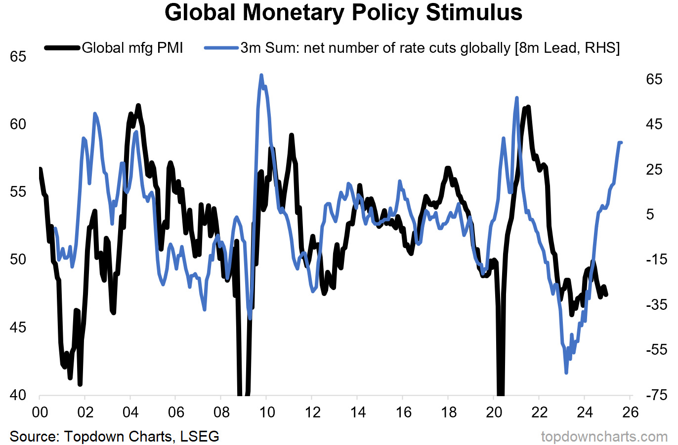
1. No Reacceleration: Early in the year a number of leading indicators began to shift to the upside, pointing to the prospect of reacceleration (and I called it that term as there wasn’t really a recession, rather a softening, so it would be reacceleration instead of recovery). As far as the manufacturing PMIs go this is still a work in progress; mixed macro.
“reacceleration risk – basically that we get the opposite of recession, instead we get a reacceleration in growth as the shocks and headwinds of 2022/23 fade. And, looking at the chart below we can start to sling some data at the idea – with the pivot from shock tightening to pockets of rate cuts suggesting we get precisely that happen” (9 Feb 2024)
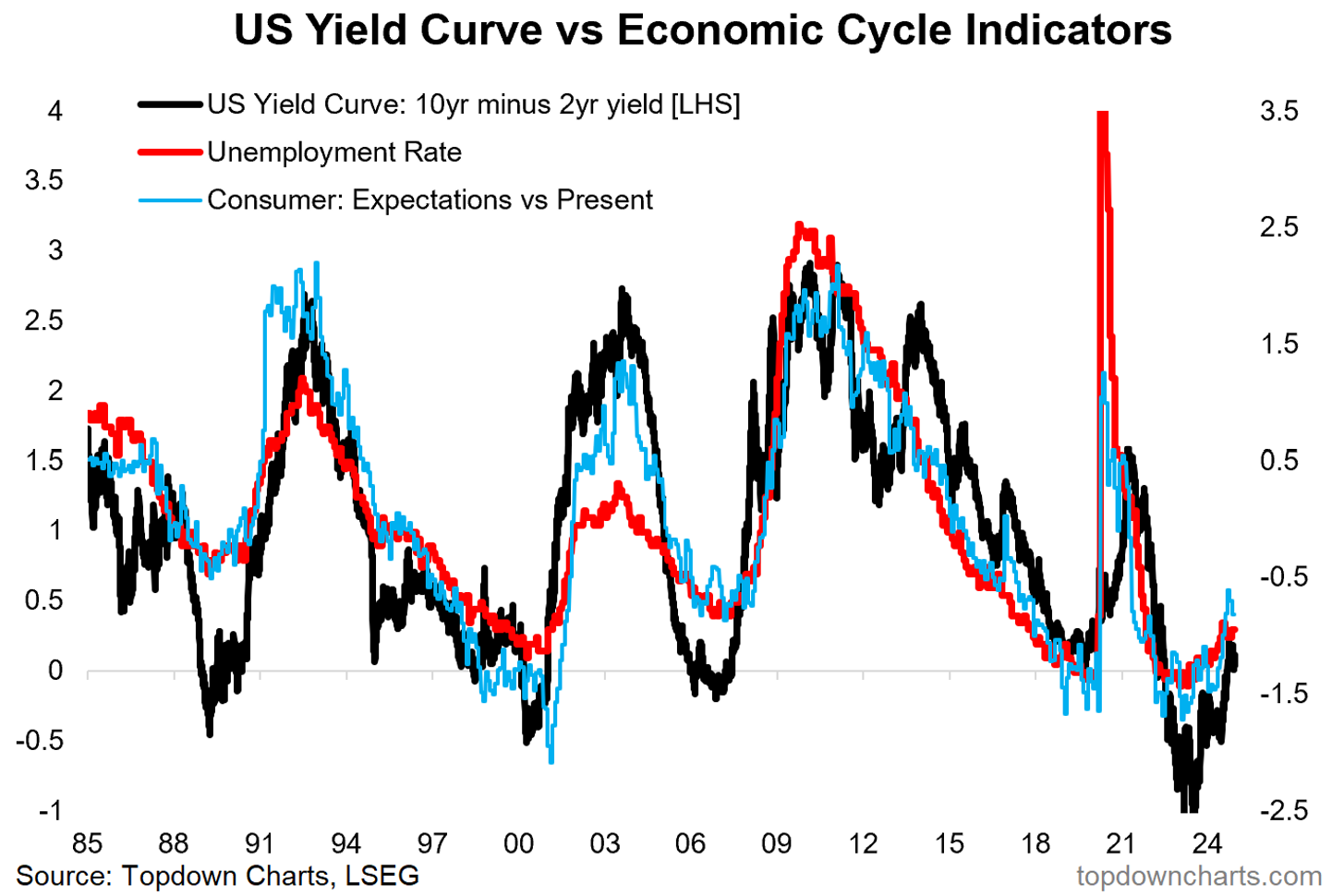
2. No Recession: On the flipside, the turn in some of the key cycle indicators like the yield curve raised the prospect of the opposite; recession. There have been pockets of weakness for sure, but no larger recession (at least not yet: one to watch!).
“it is important to note that we still have some leading indicators flagging downside risk, and a soft landing can very quickly turn to a hard landing without warning and without an obvious known-in-advance reason.” (12 Jan 2024)
3. Credit Spreads Down: Similarly, while manufacturing PMIs bounced along the bottom, with sub-50 readings suggesting normally recessionary conditions… markets did an entirely different thing. Instead of rising, credit spreads did the opposite; making 17-year lows as complacency and bullish optimism negated any bad macro data.
“credit spreads are expensive, and there are as a minimum mixed messages on the macro. As for the macro edge risks – recession would hit credit, reacceleration would hit duration… a diversified exposure to both risks within one asset class!.” (12 Jan 2024)
4. Stocks Beat Bonds: This one is perhaps another in the “not yet” basket, basically stocks have reached extreme expensive valuation levels vs history and vs bonds. But that’s been no barrier and the stock bond ratio has pretty much gone up in a straight line. One lesson is that for this one to turn you really do need a catalyst (e.g. recession).
“In terms of stocks vs bonds, stocks are expensive outright, bonds cheap outright, and stocks expensive vs bonds – that sets the risk backdrop. Along with that, while we do face the prospect of reacceleration and resurgence, the bulk of evidence says growth is levelling off and there are still the monetary leading indicators pointing to recession. If you get a traditional recession that’s exactly when bonds will outperform stocks.” (12 Jan 2024)
5. US Beat Global: Another one in the “not yet” basket, global vs US relative valuations went from cheap to cheaper. As they say the trend is your friend until it bends, and this trend has not bent yet. Be careful picking turning points in the absence of an actual turn (but do note that the relative value picture has become more extreme now; again though we need catalysts and technical confirmation).
“Starting off with global ex-US equities, from a value standpoint and knowing nothing else, global is the place to be. The absolute value indicator shows them cheap vs history, and the relative value indicator shows them cheap vs US.” (16 Feb 2024)
6. Non-Renewable: The bubble burst in renewable energy stocks, but no new bubble or uptrend has been forthcoming as yet. At least the bottom does look to be in for now.
“After much hype in the wake of the pandemic stimulus, just about everything has gone wrong for renewable energy stocks. For contrarians this is something to keep an eye on – valuations have reset to cheap levels after the bursting of the bubble, but the longer-term thematic case is not going anywhere soon (unless we see radical tech breakthroughs that make solar, wind, hydrogen obsolete). Meanwhile the relative performance of renewables vs fossils has turned up off the lows.” (12 Jan 2024)
So an interesting set of charts and lessons, but also some interesting clues and snippets for the year ahead (and p.s. stay tuned for the “Charts to Watch in 2024” blog coming soon…!)
—
Thanks for reading!
Check out the Full Report here (free download)
Best regards
Callum Thomas
Head of Research and Founder of Topdown Charts
Twitter: https://twitter.com/Callum_Thomas
LinkedIn: https://www.linkedin.com/in/callum-thomas-4990063/
For more details on the service check out this post which highlights:
a. What you Get with the service;
b. the Performance of the service (results of ideas and TAA); and
c. What our Clients say about it.
Follow us on:
LinkedIn https://www.linkedin.com/company/topdown-charts
Twitter http://www.twitter.com/topdowncharts


