
My Favorite Charts of 2025
I really like charts, here's my favorites from the past year...

Recently I shared with you some of my Best Charts of 2025 (charts and calls that worked really well) and then my Worst Charts of 2025 (ones that didn’t work!).
This week (and before we get onto the Charts to Watch in 2026) it’s time to get back onto a brighter note and check out my favorite charts of the past year.
I selected these charts because they were either new and interesting —or ones that helped illuminate some of the key developments across macro and markets. Many of them are still relevant and important for the current backdrop and risk-return outlook.
These charts were featured in my recently-released 2025 End of Year Special Report - do check it out when you get a chance (free download as a holiday treat!).
n.b. I have updated the charts to late-Dec 2025, for your reference. Also on formatting: the italic text is a quote from the report in which the chart originally appeared so you can see what I was thinking at the time.
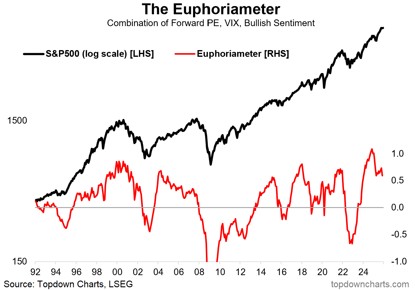
1. Euphoria Heights: The peak in this indicator at record highs helped forewarn of the April correction, but perhaps just as interesting is how it’s moved down again from a lower peak more recently. So an interesting one in retrospect, but also in reminding us not to get too complacent as risks build-up in the system.
“sentiment has reached record highs and now ticking down from the highs. This is what we call a mature/aging bull market.” (10 Jan 2025)
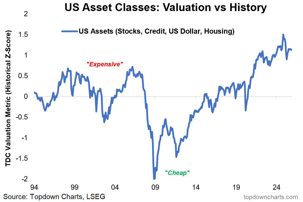
2. Peak Exceptionalism: One such risk is how after reaching record highs in late-2024, the combined valuation indicator for US equities, US credit spreads (inverted), USD, and US housing market valuations still remains at historically elevated levels. As I noted in the comments below, this is the opposite of where things sat at the beginning of the golden decade+ that followed from the 2009 extreme lows in this chart.
“it’s not isolated to stocks; credit spreads are expensive, the US dollar is expensive, housing is expensive, and treasuries by contrast are cheap. We now find ourselves sitting at a broad US asset valuation picture basically the opposite of that of March 2009.” (31 Jan 2025)
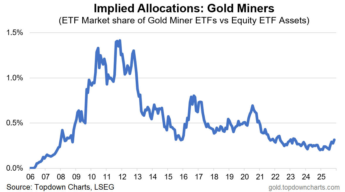
3. Gold Miner Allocations: This one makes the favorites, not just because it’s one of my favorites, but probably one of the most shared charts (on social media). Despite the triple-digit percent gains for gold miners, the implied allocations to these stocks by ETF investors barely managed to blip up from near record lows. Which begs the question as to whether gold miners may even still be early despite the strong performance to date.
“In absolute terms gold miners are in the process of establishing an uptrend, but with attention still mostly on tech and passive flowing to larger stocks it may take a top in tech to drive rotation (or a more undeniable rise in gold). This mood is captured in the ETF market implied allocations to gold miners, which is near a record low. ” (31 Jan 2025)
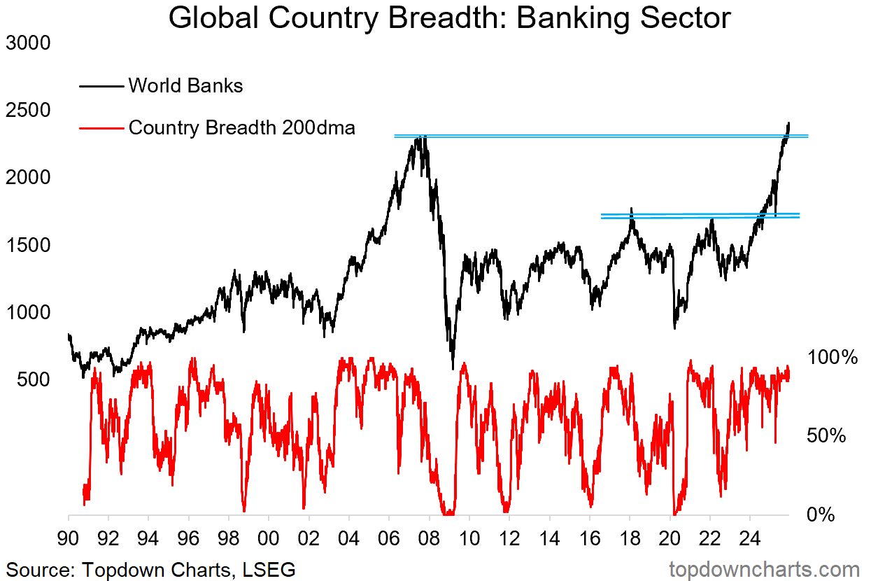
4. Big Bank Breakout: Another big beautiful breakout —global banking stocks broke out, retested that breakout during the April tariff tantrum, and then proceeded to launch to new all-time highs. This makes the favorites for obvious reasons on first glance, but also because of how it played in to the resurgence in global equities.
“Global bank stocks have broken out 3rd time lucky against that major resistance zone. A big part of the strength has been global ex-US, but US banks have also started to regain ground vs the index. Overall this is technically a clear sign of strength in a key sector (especially so for global equities).” (14 Feb 2025)
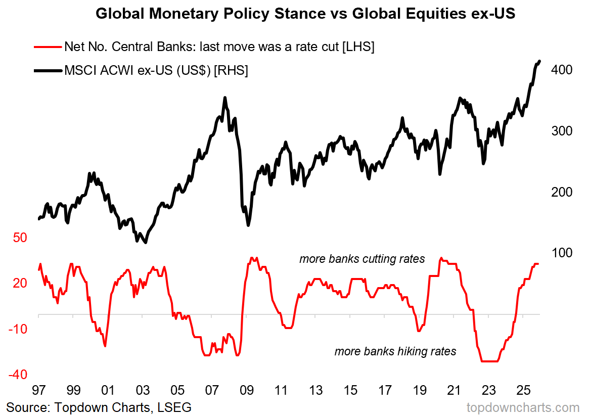
5. Global Rate Cuts vs Global Equities: Speaking of resurgence in global (ex-US) equities, this chart helped capture what was a major driver of performance and a key catalyst set against a backdrop of cheap valuations. This was a particularly important one because basically we were seeing much more aggressive monetary easing by rest-of-world, and of course that is the type of thing that’s going to disproportionately add tailwinds to global stocks.
“Meanwhile the shift to easing is bullish for global equities; particularly global ex-US where there has been more easing + monetary conditions easing from a weaker US dollar.” (30 May 2025)
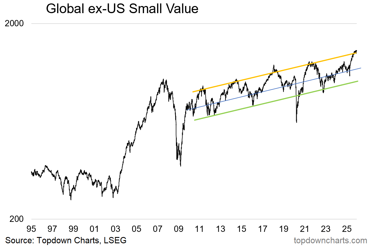
6. Global Small Value Stocks: Staying with global stocks, this curious line traces the path of “GSV” (global ex-US, Small, Value) – which is the cheap side of the global equities relative value trinity (global vs US, small vs large, value vs growth); where all 3 are trading at record cheap relative valuations. But this chart shows that the absolute performance of GSV actually put in a pretty good run this year.
Albeit the pessimists are probably pointing at that price line now hitting the upper end of that uptrend channel…
“Looking at absolute performance, GSV has pulled back to its mid uptrend channel line where it looks to find support… given the emerging evidence for reacceleration we’d keep a bullish bias for GSV.” (24 Jan 2025)
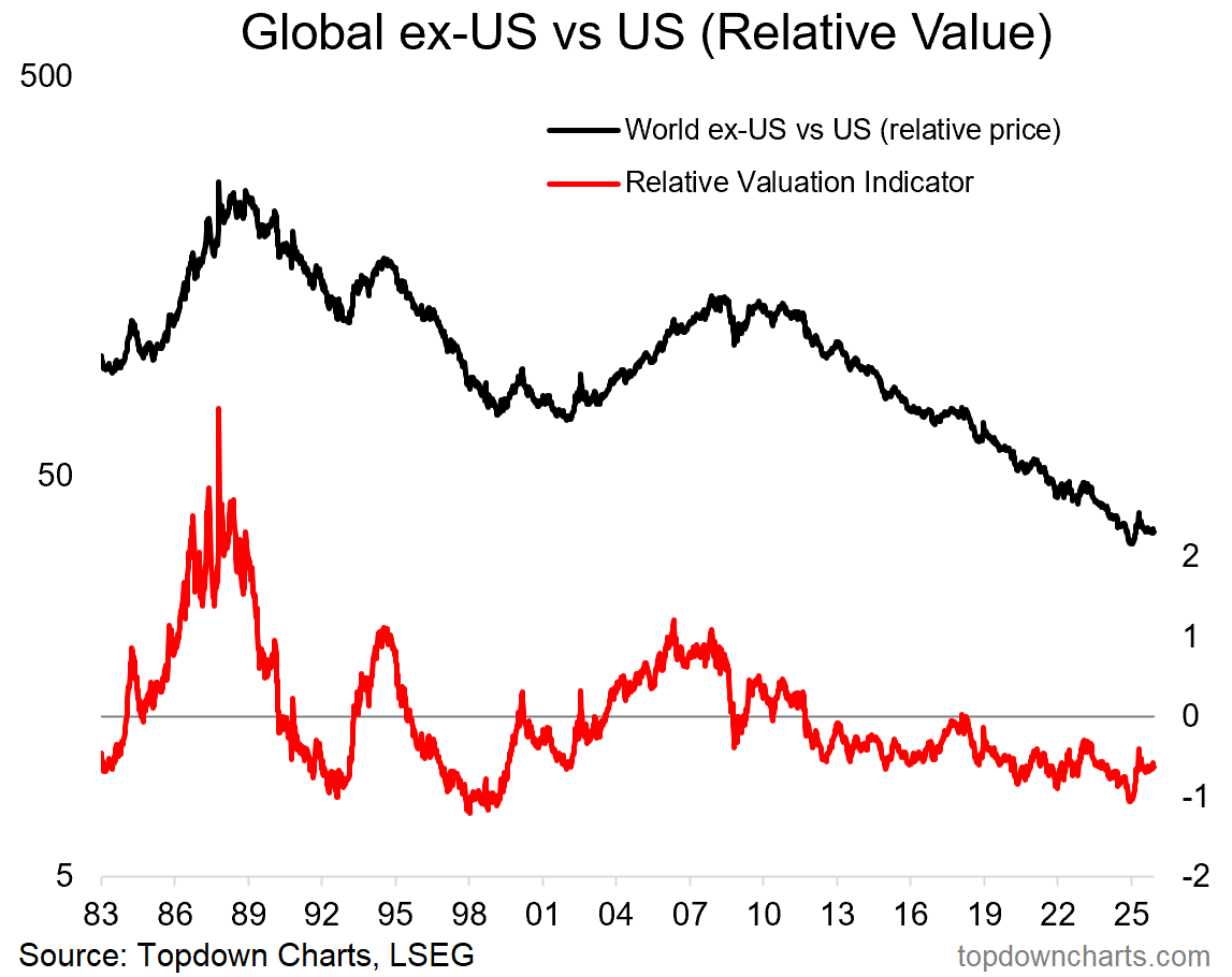
7. Global vs US Stocks: Lastly on global equities, the chaos of Q1 helped remind folk of political risk, with the USA unleashing the type of policy/political risk often only seen in emerging markets. This was a key catalyst for at least a momentary turnaround in the long-term underperformance of global vs US stocks. But add to that also this chart which showed the relative valuation indicator reaching an extreme multi-decade low just prior. Funny how excuses and catalysts tend to conveniently show up around big extremes like that.
“But to summarize with composite valuation signals, global ex-US are cheap/reasonable by themselves, but just reached a 27-year extreme on a relative basis. We need to pay attention when such extremes are reached, especially when there is a credible macro scenario for a turn (reacceleration) and promising technicals.” (14 Feb 2025)
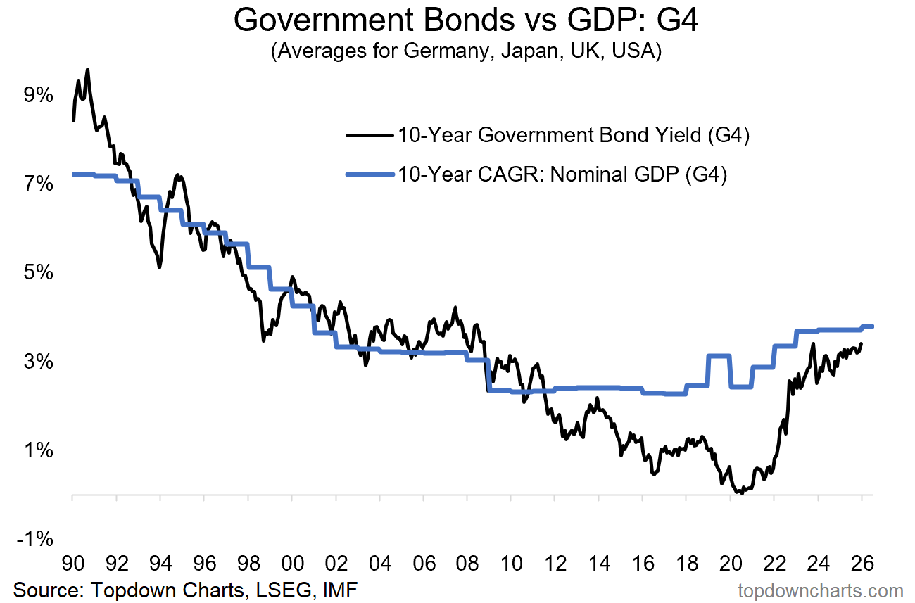
8. Global Bond Yields: Higher for longer lingered longer.
“Bonds are cheap and sentiment remains bearish, yet getting bullish on bonds is tricky with the very real prospect of growth/inflation resurgence and the tail risk of a bond vigilante revolt with regards to US fiscal risks (not to mention possible policy mistakes if all these rate cuts turn out to be unnecessary and prompt a return to hikes). ” (10 Jan 2025)
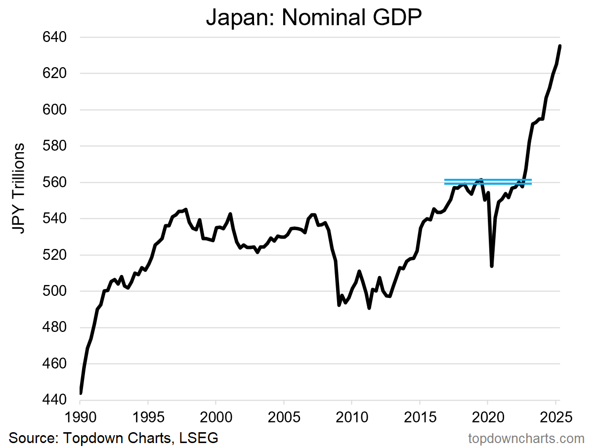
9. Japan’s Big Breakout: This chart is a favorite because it will offend some nerds who say you can’t use technical analysis on macro data! But when you see any data series just tick along in a range, stagnating for decades like this and then moving distinctly and materially out of that range, it should make you pay attention no matter what. And this chart has been huge in driving Japanese stocks –and especially; JGB yields higher.
“Similarly, Japan has seen nominal GDP breakout after prolonged stagnation, and a clear and distinct upshift in the long-term rate of nominal growth; this should correspond to higher Stockmarket valuations (for logical reasons).” (14 Feb 2025)
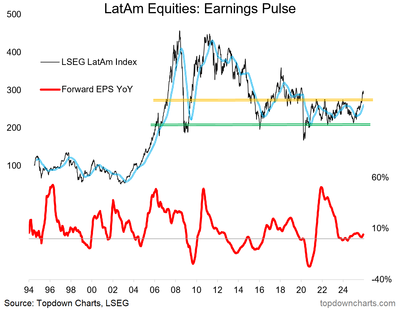
10. LatAm Equities: When a support line gets challenged + valuations are cheap + macro supportive, and then price turns up, that’s a good formula for gains. Big turnaround in progress here.
““Latin American Equities (Brazil, Mexico, Colombia, Chile, Peru) have been ticking higher recently off of a major long-term support line. This also comes as forward earnings are starting to get revised higher from previous stagnation (a bullish cyclical signal), and set against a backdrop of cheap valuations (average PE10 ratio near record lows).” (28 Feb 2025)
So there you have it, a good survey of some key macro-market developments, a good glimpse at some of my work from the past year, and some good clues on the next steps in macro and markets…
—
Thanks for reading!
Check out the Full Report here (free download)
Best regards
Callum Thomas
Head of Research and Founder of Topdown Charts
Twitter: https://twitter.com/Callum_Thomas
LinkedIn: https://www.linkedin.com/in/callum-thomas-4990063/
For more details on the entry-level service check out the following resources:
Getting Started (how to make the most of your subscription)
Reviews (what paid subscribers say about the service)
About (key features and benefits of the service)
But if you have any other questions definitely get in touch.
NEW: All Services by Topdown Charts
Topdown Charts Professional —[institutional research service]
Topdown Charts Entry-Level Service —[entry-level version]
Weekly S&P 500 ChartStorm —[US Equities in focus]
Monthly Gold Market Pack —[Gold charts]
Australian Market Valuation Book —[Aussie markets]