10 Charts to Watch in 2025 [Q3 Update]
Key charts and issues to keep track of in Q4 and beyond...
Here’s an update to the 10 Charts to Watch in 2025 as we head into the final quarter of the year (and what a year it’s been so far!)
In my original post from earlier this year I shared what I thought would be the 10 most important charts for investors to watch in the year ahead (and beyond).
In this article I have updated those 10 charts + provided fresh comments.
[Note: I have also included the original comments from back at the start of the year, so you can quickly compare what I'm thinking now vs what I said back then …and see where I’ve been right/wrong so far]
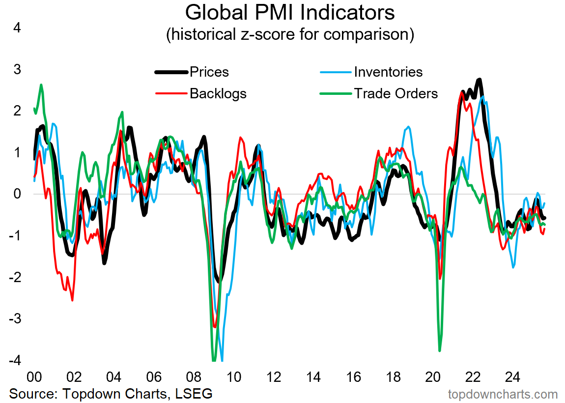
1. Recession or Resurgence? So far it has been a case of *neither* recession nor resurgence in the aggregate/global level for 2025 as the global economy processes through the competing forces of tariff impacts and policy uncertainty on the downside vs increasing monetary stimulus on the upside. But there are still a few months to go… and more to the point: 2026 is approaching —a year in which we are likely to see these key macro themes come to a head.
“This is really the big macro question for 2025; do the various weak spots spread and combine with (geo)politics + the long and variable lags of monetary tightening + fiscal reforms —to result in full blown recession?
Or does an inventory (restocking) cycle + global monetary easing tailwinds + China stimulus — combine to trigger an economic reacceleration (+inflation resurgence)?
This chart sets the scene on both respects (it represents both current weakness and potential strength), and will play a key part in ongoing real-time monitoring.”
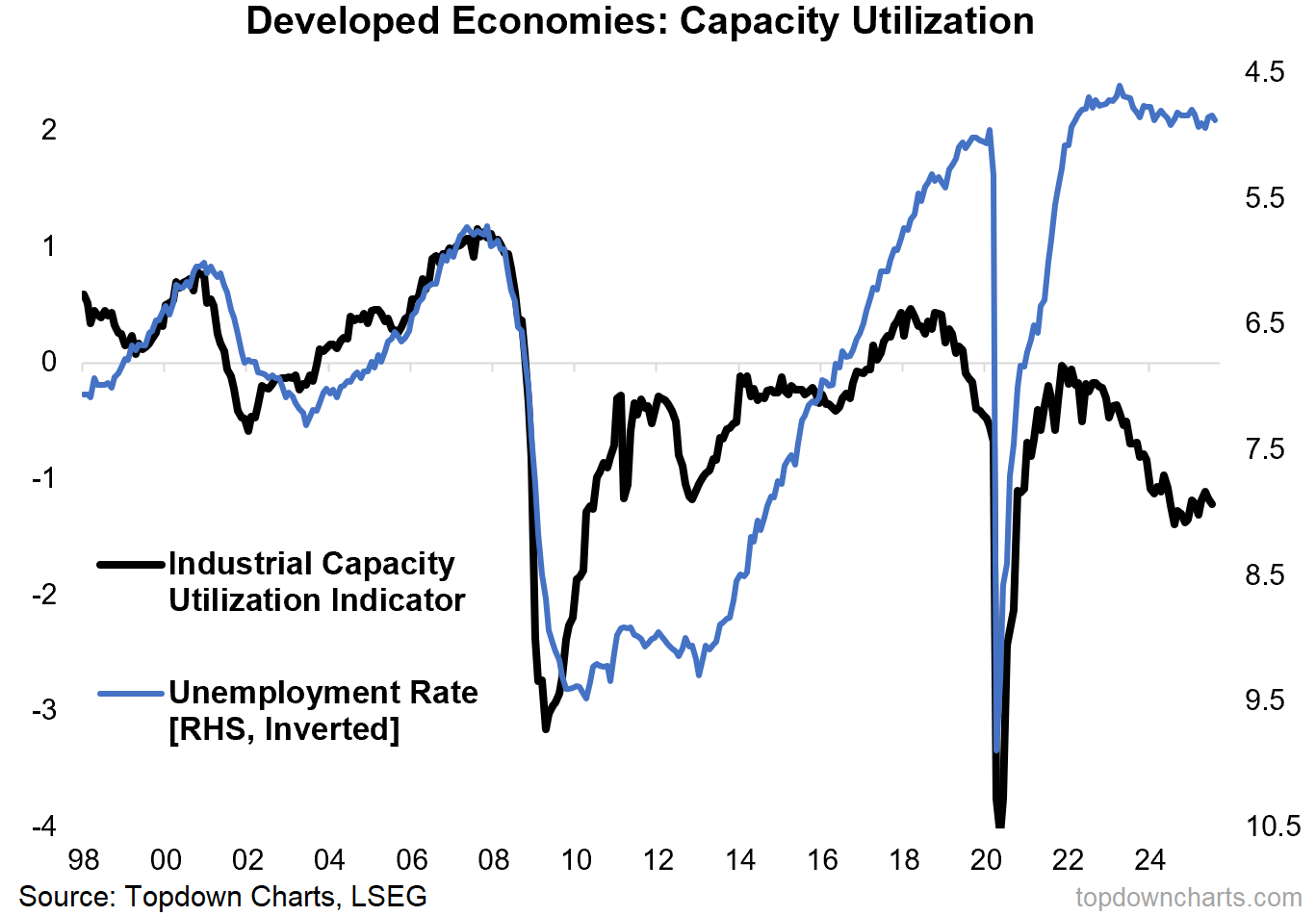
2. The Macro Risk Sandwich: And there’s no resolution on this front yet either — labor markets are still relatively tight across developed markets, and industrial capacity utilization is still loose (but turning the corner). With monetary tailwinds mounting, capex continuing, and commodities picking up, I’d expect we see some follow-through in the initial upturn in the black line below (good for traditional cyclical stocks, commodities, global equities).
“This chart also puts the “macro-risk-sandwich” of recession vs resurgence on display; this time showing the strength and tight capacity in labor markets [blue line] vs excess capacity and weakness in industry (global trade and manufacturing) [black line].
The open question here is will the blue line catch down (recession) or the black line catch up (resurgence)?”
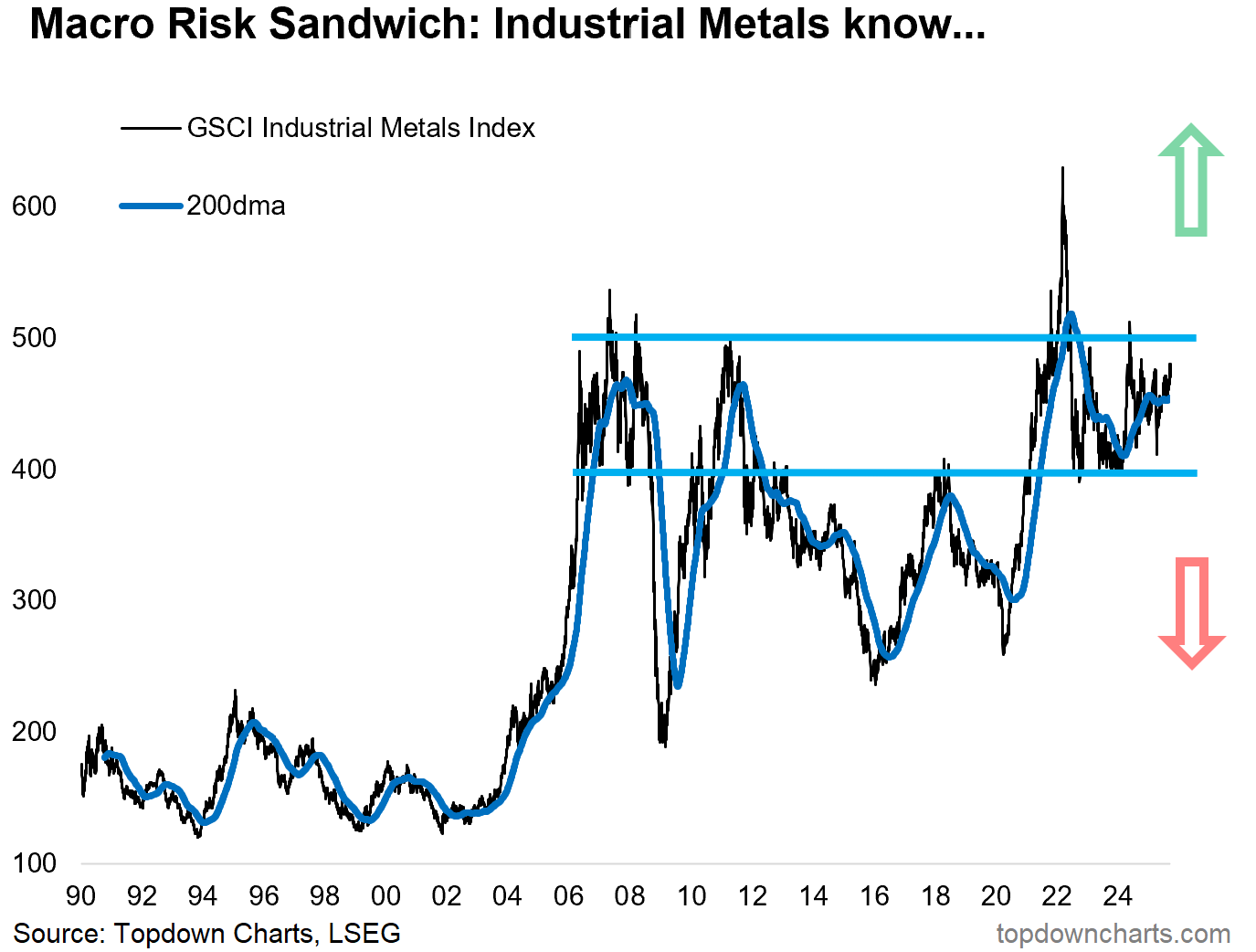
3. Industrial Metals will let us Know: Speaking of resolution or not, the key macro-market barometer of industrial metals have been making promising moves towards the reacceleration and resurgence side —but for now: it’s still stuck between the two big macro edge risks. I strongly recommend you keep a close eye on developments here as it will give a real-time heads up on the next big macro theme for markets (resurgence if it breaks higher, recession if it rolls over and breaks down).
“We can try to form a view on whether it’s going to be one or the other or something in between, or we could just watch industrial metals —as they will be the first to know.
Breakout = resurgence. Breakdown = recession.
The battle lines are drawn.”
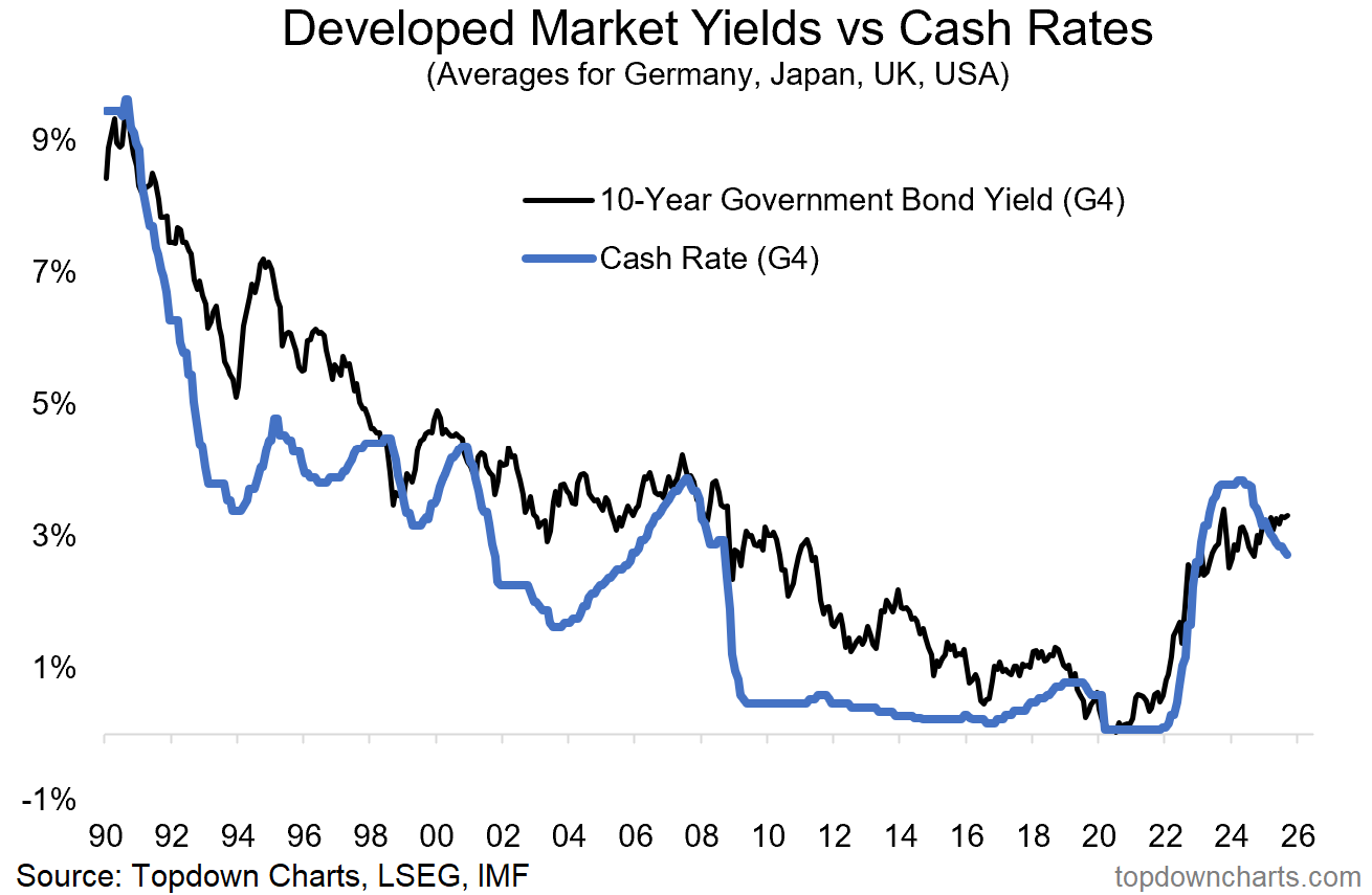
4. Normal no Longer? Speaking of cross-currents I think this chart helps spell it out; long-term government bond yields are in Higher-For-Longer mode while policy rates trend lower. This tells you that the bond market is looking at rate cuts as something that is going to drive growth reacceleration and eventual inflation resurgence… and in the end: higher bond yields.
It was too early to call for “unpivots” in 2025 given what unfolded in H1, but I think we need to consider the currently unthinkable prospect of rate *hikes* in 2026 if reacceleration and resurgence start to come online in a meaningful way.
“Policy rates have peaked as central banks pivoted to rate cuts. Bond yields also peaked —initially; but that’s changing. Both lines in this chart are going to be at the mercy of the macro-risk-sandwich (a binary prospect: recession = down, reacceleration + inflation resurgence = up).
For a market hooked on rate cuts, 2025 could present a wake-up call; we may need to be prepared for pauses and “unpivots” instead of just consensus cuts.”
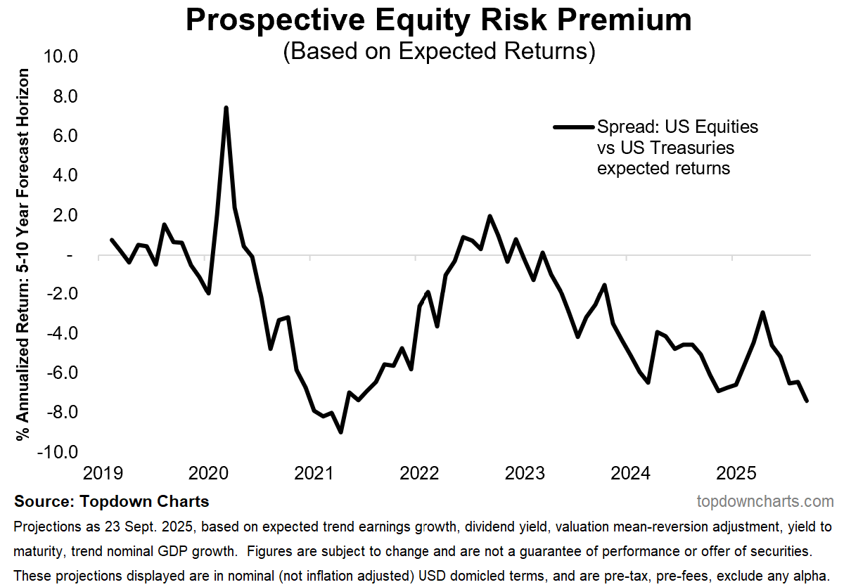
5. No Equity Risk Premium: Meanwhile the macro-middle scenario that has prevailed in 2025 has helped stocks push higher, and with still elevated bond yields that has squeezed the forward-looking “prospective equity risk premium” deeper into the negatives. That may not matter this week, this month, or even this quarter, but it does tell us the forward looking risk vs return set points to an entirely different regime than what we’ve become accustomed to.
“Speaking of bonds, there will be *no* risk premium for equity investors over-and-above bonds in the coming years (based on forward-looking expected returns).”
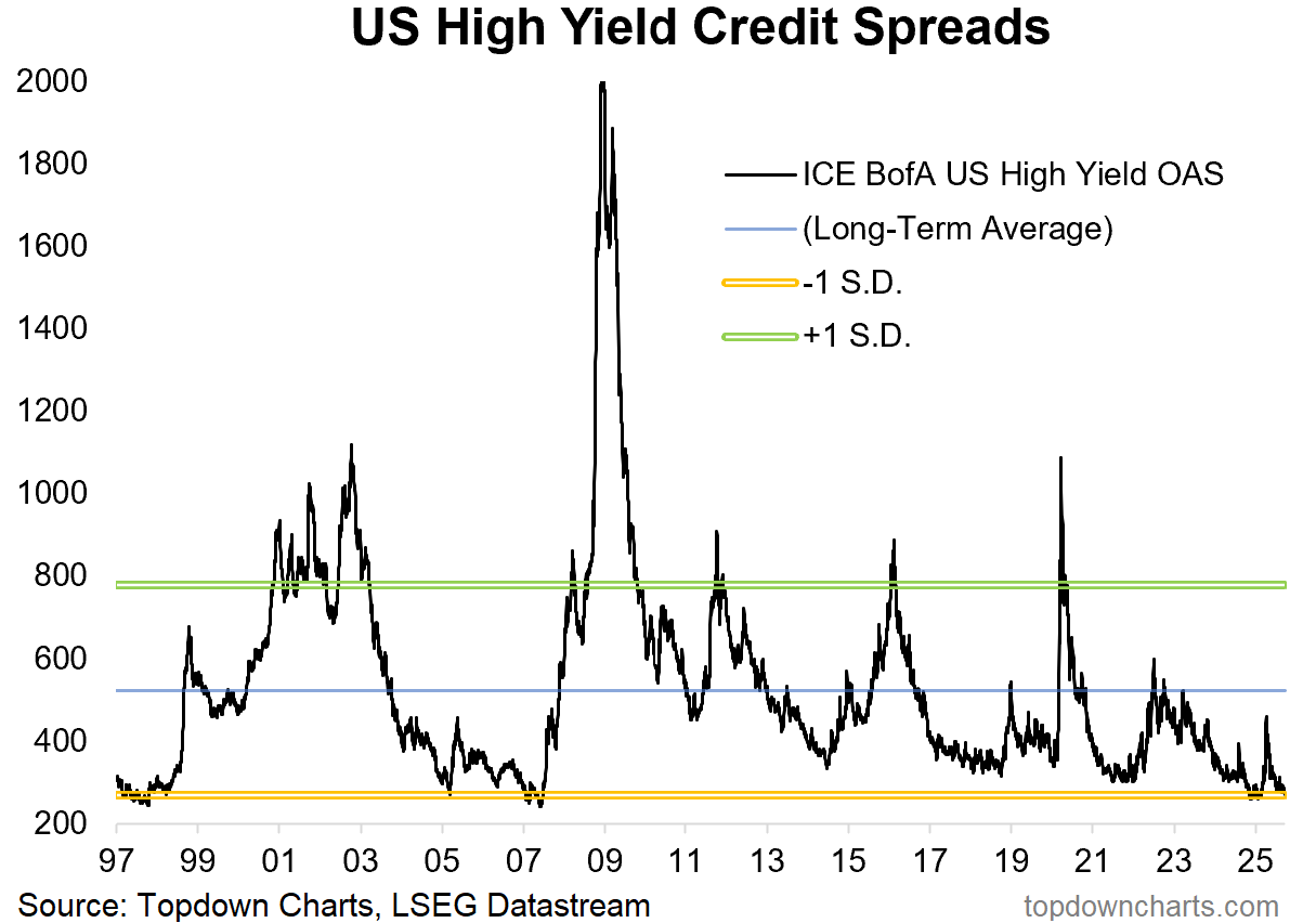
6. No Credit Risk Premium: On risk premia, the credit risk premium has also been squeezed down to rock-bottom as investors reach for yield rather than safety in corporate bonds. Tight credit spreads and low equity risk premiums point to a market that is highly confident and probably a little bit complacent by now.
“There’s also very little risk-cushion on offer in credit — credit spreads and Stockmarket valuations are pretty much priced for perfection. Do you believe in perfect? (you better believe if you are all-in on risk assets!)”
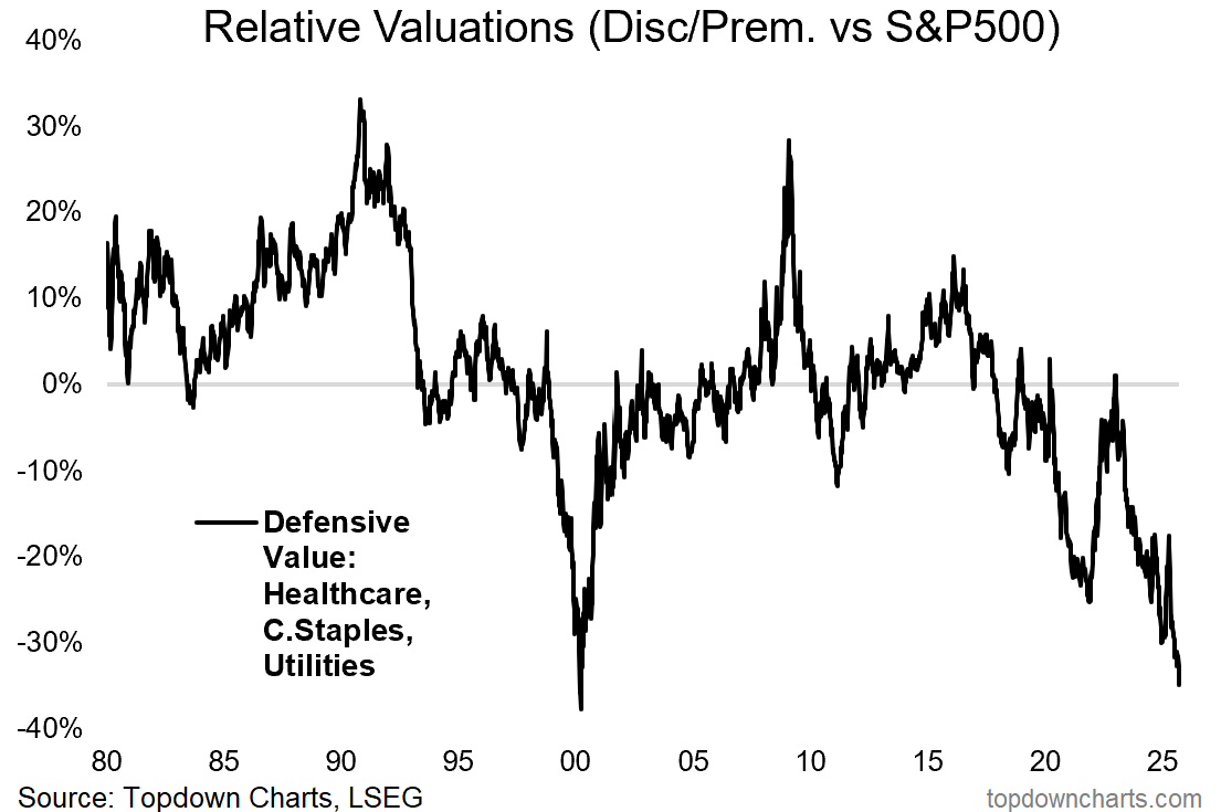
7. Defensives Deep Discount a Premium Deal: Meanwhile, as investors reach out the risk spectrum in search of higher returns, defensive stocks have been left behind — and now the relative value indicator for defensive stocks is almost as cheap as it got to at the peak of the dot com bubble(!).
I don’t know if this is the top, but charts like this are definitely the kind of thing you see in the final stages of bulls, booms, and bubbles.
“But it’s not all gloom and risk, there are some extremely attractive relative value opportunities that have opened up. One is in defensive sectors (albeit, please n.b. the parallels with 2000(!) i.e. contrarian risk flag waving here). Defensives are unloved, underowned, and undervalued.”
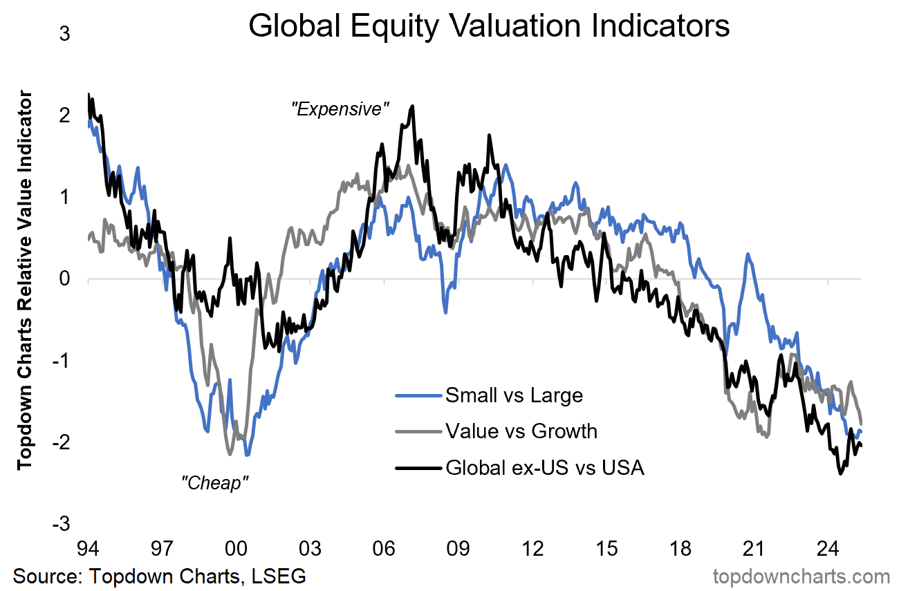
8. Ditto the Relative Value Trinity: There’s also deep relative value across the 3 big levers in global equities — but unlike dot com, the current bull/boom/bubble is concentrated in the USA… making global stocks (and small, value) look cheap by comparison to the effervescent US large growth stocks.
The key point to ponder on this one is whether you see a bullish or bearish resolution (i.e. catch-up by the cheap ones, or catch-down by the expensive ones respectively).
“Bigger picture across global equities; small caps are cheap vs large caps, value is cheaper than usual vs growth, and global is at record cheap levels vs US. Will 2025 be the year where the elusive turning point is found for a multi-year move here?”
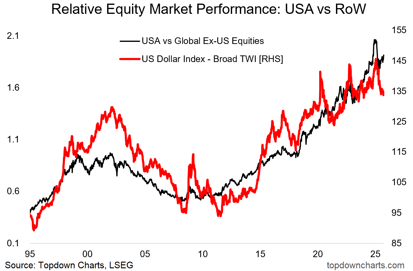
9. Know thy Dollar: The US dollar is well advanced in the process of transitioning from cyclical bull to cyclical bear market. Its traveling partner in this chart; the relative performance of US vs global stocks, has turned the corner as global stocks start to play catch-up, but the jury is still out on whether that one has seen *the* turning point (this will be a key chart in setting the tone into 2026).
“One key clue in the global vs US market relative performance debate will be the US dollar. It plays a direct (currency translation effects), and indirect role (as it reflects relative macro strength, and impacts the world through financial conditions effects). We can see this playing out clearly in the chart below; a stronger dollar is consistent with US outperforming vs global.
It's an important chart because we need to keep track of the USD (being particularly on watch in case of upside breakout, which it is currently in the process of doing!), but also because of the black line and what it means for both global and domestic investors.”
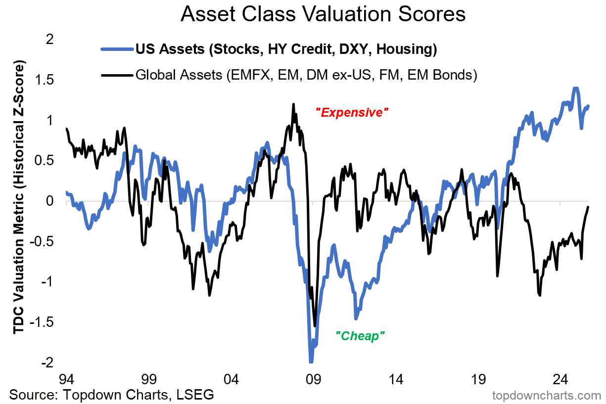
10. US Asset Valuation Exceptionalism: Something very interesting is going on in this final chart. US assets continue to track around record high valuations as a group (stocks, USD, housing, credit spreads), but global assets are starting to catch-up in a big way (especially emerging and frontier market equities).
While the elevated US valuations aspect is a cause for pause in terms of what it means for future possible paths (think of valuations as pointing to possibilities: cheap = possibility of upside in the future, expensive = possibility of downside or less good returns in the future) — the movement in the black line is a positive sign indeed for the global equity bull market.
“Last but not least, call it the US Asset Premium — US assets (stocks, US dollar, housing market, credit spreads inverted) are trading at their combined most expensive level on record. This is well beyond what we saw in 2021, and even handily eclipses the dot com and pre-GFC peaks. Meanwhile global assets are cheap (DM/EM/FM equities, EMFX, and EM bonds).
The level of US assets by itself is stark, but the spread or premium is even more significant. I’ll tell you what this looks like to me: this is either a generationally risky point in markets, or a generational opportunity …and probably both.
Keep this one high on the watch-list!”
So there you have it: some key macro questions and themes to keep track of + some challenging but also tantalizing market and asset allocation prospects to factor in. It’s been an interesting year so far, and it’s not over yet…
For more detail (+ new ideas and charts) on the macro/market outlook in 2025/26 (particularly as it relates to Asset Allocation and top-down Global Investment Strategy), check out our forthcoming Quarterly Strategy Pack + Sign up as a client of the Topdown Charts institutional service to join the next Quarterly Strategy Pack walkthrough!
—
Thanks for reading, you can check out my 2024 End of Year Special Report, in which these charts were originally featured here: (free download)
Best regards,
Callum Thomas
Head of Research and Founder of Topdown Charts
Twitter/X: https://twitter.com/Callum_Thomas
LinkedIn: https://www.linkedin.com/in/callum-thomas-4990063/
For more details on our Entry-Level service check out the following resources:
Getting Started (how to make the most of your subscription)
Reviews (what paid subscribers say about the service)
About (key features and benefits of the service)
But if you have any other questions definitely get in touch.
NOTE: Other Services by Topdown Charts
Topdown Charts Professional —[institutional service]
Topdown Charts Entry-Level Service —[entry-level version]
Weekly S&P 500 ChartStorm —[US Equities in focus]
Monthly Gold Market Pack —[Gold charts]
Australian Market Valuation Book —[Aussie markets]


