10 Charts to Watch in 2025
Key charts and issues to keep track of in the year ahead and beyond...
Recently I shared with you some of my Best Charts of 2024 (charts and calls that worked really well) and then my Worst Charts of 2024 (ones that didn’t work!), my Favorite Charts of 2024 (new, interesting, useful charts), and some Honorable Mentions (charts worthy of note, but not quite fitting into the other posts).
But now it’s time to stop looking backwards, and time to focus forward with a list of my top 10 charts to watch in 2025 (and beyond).
These are the charts that I feel best capture the key macro/asset allocation issues relevant to investors right now or set to soon come onto the radar.
1. Recession or Resurgence? This is really the big macro question for 2025; do the various weak spots spread and combine with (geo)politics + the long and variable lags of monetary tightening + fiscal reforms —to result in full blown recession?
Or does an inventory (restocking) cycle + global monetary easing tailwinds + China stimulus — combine to trigger an economic reacceleration (+inflation resurgence)?
This chart sets the scene on both respects (it represents both current weakness and potential strength), and will play a key part in ongoing real-time monitoring.
2. The Macro Risk Sandwich: This chart also puts the “macro-risk-sandwich” of recession vs resurgence on display; this time showing the strength and tight capacity in labor markets [blue line] vs excess capacity and weakness in industry (global trade and manufacturing) [black line].
The open question here is will the blue line catch down (recession) or the black line catch up (resurgence)?
3. Industrial Metals will let us Know: We can try to form a view on whether it’s going to be one or the other or something in between, or we could just watch industrial metals —as they will be the first to know.
Breakout = resurgence. Breakdown = recession.
The battle lines are drawn.
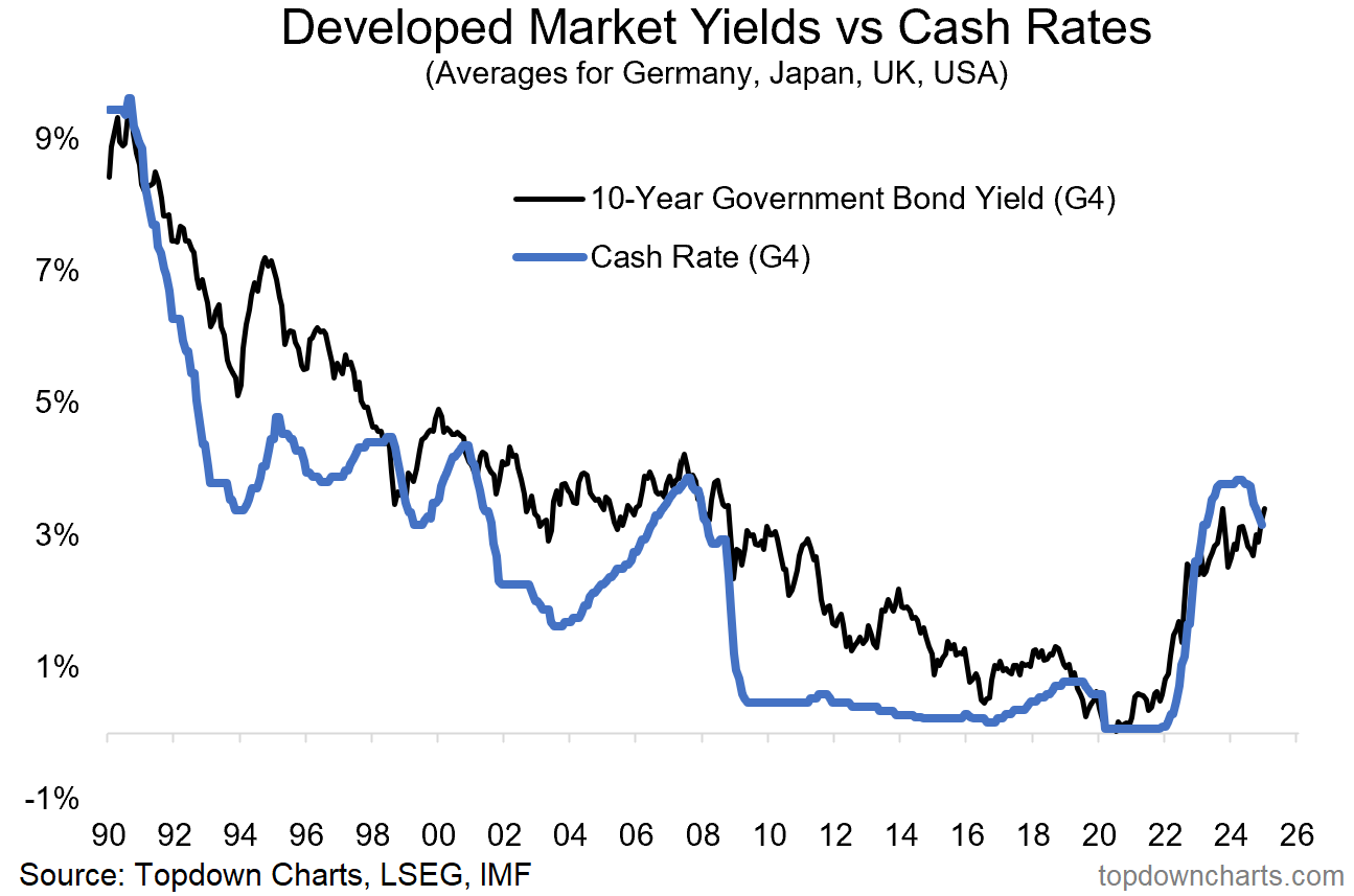
4. Normal no Longer? Policy rates have peaked as central banks pivoted to rate cuts. Bond yields also peaked —initially; but that’s changing. Both lines in this chart are going to be at the mercy of the macro-risk-sandwich (a binary prospect: recession = down, reacceleration + inflation resurgence = up).
For a market hooked on rate cuts, 2025 could present a wake-up call; we may need to be prepared for pauses and “unpivots” instead of just consensus cuts.
5. No Equity Risk Premium: Speaking of bonds, there will be *no* risk premium for equity investors over-and-above bonds in the coming years (based on forward-looking expected returns).
6. No Credit Risk Premium: There’s also very little risk-cushion on offer in credit — credit spreads and Stockmarket valuations are pretty much priced for perfection. Do you believe in perfect? (you better believe if you are all-in on risk assets!)
7. Defensives Deep Discount a Premium Deal: But it’s not all gloom and risk, there are some extremely attractive relative value opportunities that have opened up. One is in defensive sectors (albeit, please n.b. the parallels with 2000(!) i.e. contrarian risk flag waving here). Defensives are unloved, underowned, and undervalued.
8. Ditto the Relative Value Trinity: Bigger picture across global equities; small caps are cheap vs large caps, value is cheaper than usual vs growth, and global is at record cheap levels vs US. Will 2025 be the year where the elusive turning point is found for a multi-year move here?
9. Know thy Dollar: One key clue in the global vs US market relative performance debate will be the US dollar. It plays a direct (currency translation effects), and indirect role (as it reflects relative macro strength, and impacts the world through financial conditions effects). We can see this playing out clearly in the chart below; a stronger dollar is consistent with US outperforming vs global.
It's an important chart because we need to keep track of the USD (being particularly on watch in case of upside breakout, which it is currently in the process of doing!), but also because of the black line and what it means for both global and domestic investors.
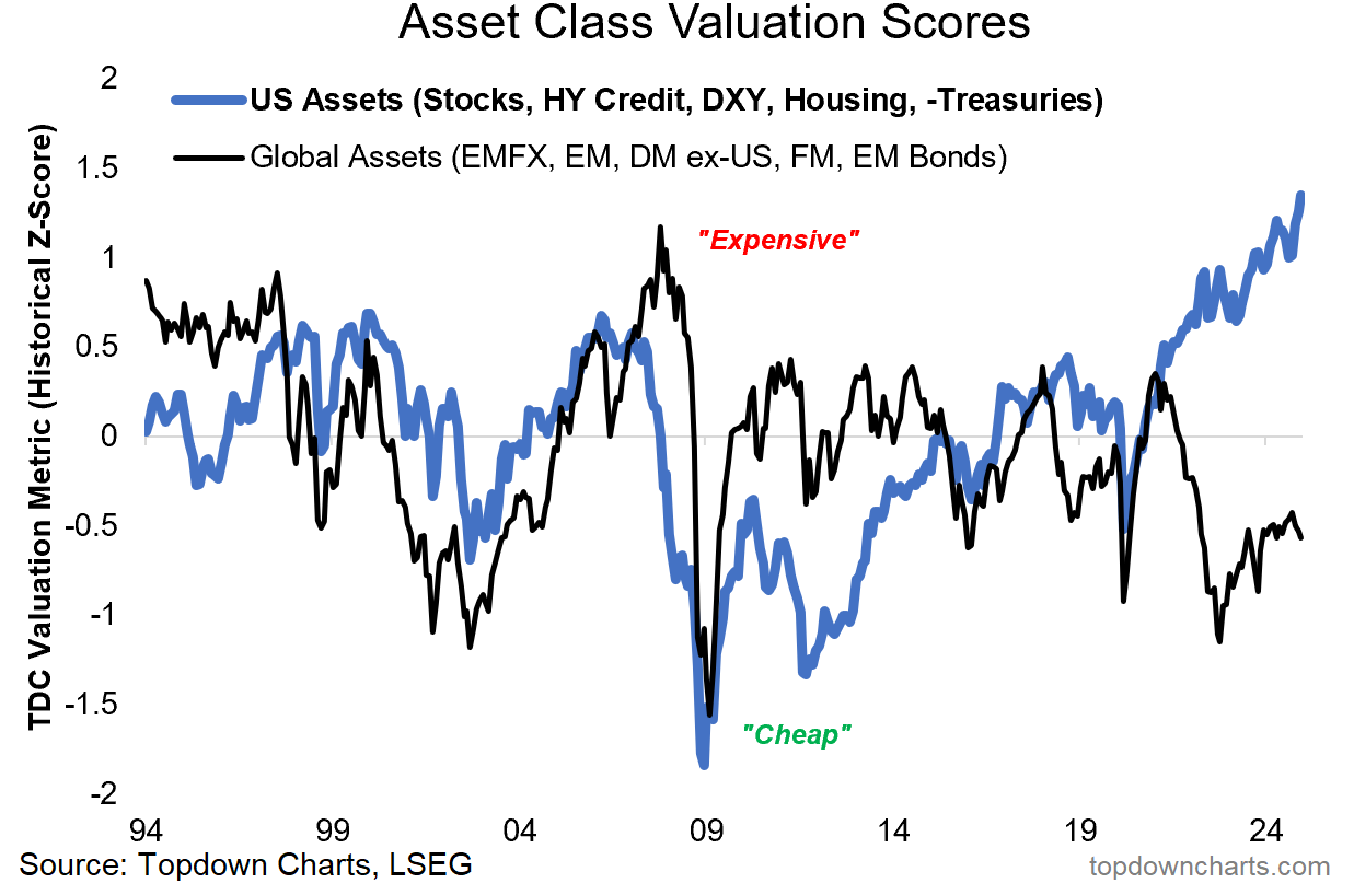
10. US Asset Valuation Exceptionalism: Last but not least, call it the US Asset Premium — US assets (stocks, US dollar, housing market, credit spreads inverted, and US treasuries valuation inverted) are trading at their combined most expensive level on record. This is well beyond what we saw in 2021, and even handily eclipses the dot com and pre-GFC peaks. Meanwhile global assets are cheap (DM/EM/FM equities, EMFX, and EM bonds).
The level of US assets by itself is stark, but the spread or premium is even more significant. I’ll tell you what this looks like to me: this is either a generationally risky point in markets, or a generational opportunity …and probably both.
Keep this one high on the watch-list!
For more on the macro/market outlook in 2025 (particularly as it relates to asset allocation and top-down global investment strategy), check out our latest Quarterly Strategy Pack.
—
Thanks for reading!
Charts from the 2024 End of Year Special Report (free download)
Best regards
Callum Thomas
Head of Research and Founder of Topdown Charts
Twitter/X: https://twitter.com/Callum_Thomas
LinkedIn: https://www.linkedin.com/in/callum-thomas-4990063/
For more details on the service check out this post which highlights:
a. What you Get with the service;
b. the Performance of the service (results of ideas and TAA); and
c. What our Clients say about it.
Follow us on:
LinkedIn https://www.linkedin.com/company/topdown-charts
Twitter/X http://www.twitter.com/topdowncharts


