
Chart of the Week - Global Equities
We've got a technical breakout, monetary tailwinds, and cheap valuations -- what more do you want?

Global Equities are breaking out and there’s 3 key drivers of further upside.
But most investors are still skeptical…
And it’s kind of understandable. As I noted last week, global equities (ex-US) have underperformed vs US equities for more than a decade.
They’ve also been on a much more volatile and ranging path vs the near-exponential run in US stocks. But as noted there is good reason to believe that things are different this time (in a good way), and I’ve got the charts to prove it…
Here’s why you should be bullish on Global Equities:
Technicals: global ex-US equities have broken out through a major long-term overhead resistance level to new all-time highs (i.e. the MSCI All Countries World Index, excluding USA). And they did it with strong (and improving) breadth.
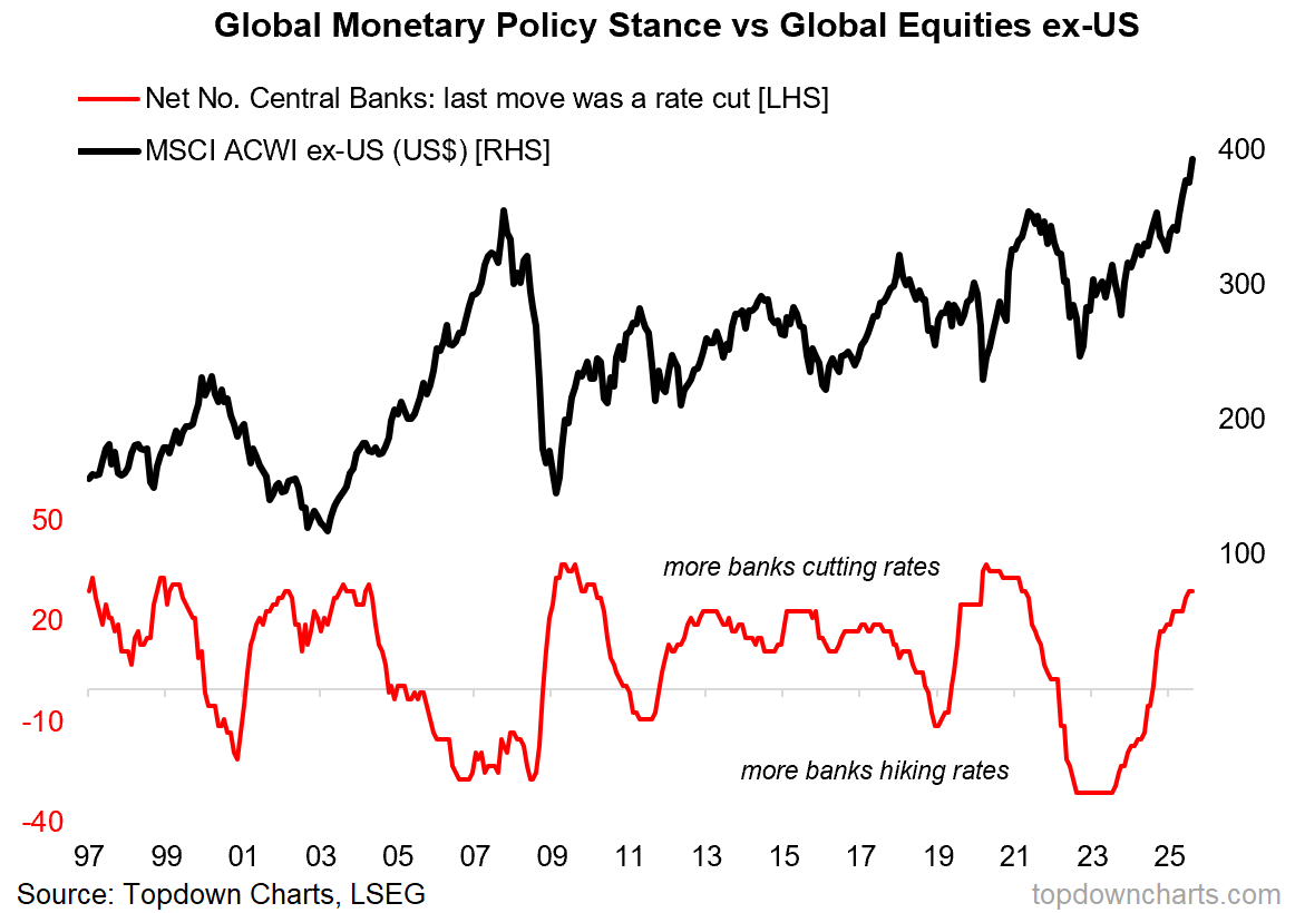
Monetary: while the Fed is a whole different issue, globally we’ve seen a widespread rush to rate cuts (which typically points to an acceleration in global growth and upside in stocks), the US dollar has also entered into a bear market, which helps global ex-US equities on multiple fronts (FX translation effects for US$ denominated investors, easier financial conditions, bullish self-reinforcing flows dynamics).
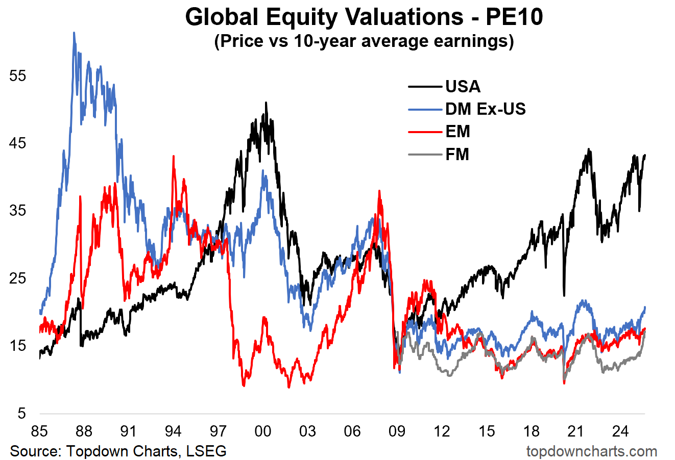
Valuations: as noted last week just about every country in the world is trading at least 20% cheaper than the USA (and in many cases the relative value discount is much more significant than that) —and absolute valuations are also attractive (all 3 major country groups are cheap/fair vs history: ample room to run).
In my experience when you get alignment across technicals, monetary factors, and valuations: you’ve got something special, and you want to treat it with appropriate conviction (strong bullish in this case).
For completeness I will say that no investment thesis is ever infallible (“failure is always an option”), and in my almost 10 years of running Topdown Charts I’ve seen plenty of great ideas get completely ruined by unforeseen forces (and mediocre ones get carried by upside surprises too for that matter).
The key risks to this idea would be that despite the monetary tailwinds in play the global economy somehow falls into recession (recessions are bull market killers —the main fundamental driver of bear markets historically has been economic recessions), or some sort of external and unforeseeable shock (e.g. geopolitics, financial crisis, etc), or maybe a surge in inflation and interest rates (which is entirely possible).
You might be able to see 2 of those risks coming via early warning indicators, but the unknown unknowns will always haunt us from the shadows and the only thing you can do about those is to practice smart diversification and prudent risk management.
Other than that though, I would emphasize again: it looks genuinely good here for global equities, and in a way that we haven’t seen in years.
And at the end of the day, when it looks like a bull, walks like a bull, and talks like a bull, it probably is…
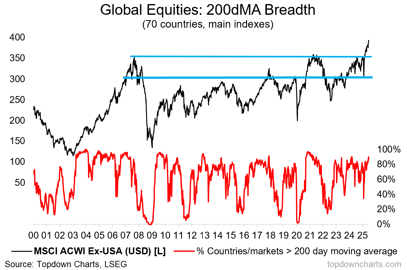
Key point: Global Equities are breaking out with a clear case for further upside.
Bonus Chart 1 — The Monetary Factor
I told you I have the receipts, here’s the global monetary policy map vs global stocks — we’ve seen a big wave of easing globally and the majority of central banks around the world are in rate cut mode.
Normally that’s the kind of thing you see at the bottom of the market cycle, so when you see this type of thing happening when a bull market is already underway and there’s no slip into recession that’s a recipe for upside and acceleration.
Bonus Chart 2 — Valuations
Meanwhile on the valuation front, there’s room to run.
Now to be clear, we’re no longer as cheap as it was at the cheapest point, but we’re still looking at valuations across Developed, Emerging, and Frontier markets at historically low levels — and all at a major discount vs USA.
Maybe we don’t ever see them entirely close that gap vs US, but even getting half-way there would be a major development in terms of re-rating and upside price action.
Subscribe to the Topdown Charts Entry-Level service (click below) for more insights, or sign up to Topdown Charts Professional for more in-depth reports and further details on the major macro/asset allocation themes of our time...
Topics covered in our latest Weekly Insights Report
Aside from the chart above, we looked at several other charts, and dug into some intriguing global macro & asset allocation issues in our latest entry-level service weekly report:
10-Year Bond Yields: looking at the “interestingly boring price action”…
Global Growth/Inflation: update to the key macro tail risk scenario.
Commodities: update on the outlook and impact on inflation risk.
China Macro: property market, policy outlook, Chinese government bonds.
Chinese Equities: good technicals, cheap valuations, very interesting setup.
Emerging Markets: increasingly bullish outlook developing.
Subscribe now to get instant access to the report so you can check out the details around these themes + gain access to the full archive of reports + flow of ideas.
For more details on the service check out the following resources:
Getting Started (how to make the most of your subscription)
Reviews (what paid subscribers say about the service)
About (key features and benefits of the service)
But if you have any other questions definitely get in touch.
And if you would like a greater level of depth and detail + access, check out our Institutional Service for the full reports: Topdown Charts Professional
Thanks for your interest. Feedback and thoughts welcome.
Sincerely,
Callum Thomas
Head of Research and Founder at Topdown Charts
Follow me on Twitter
Connect on LinkedIn
CHART UPDATE!! Global Equity A/D Lines (at the Country Level)
This one is from a few weeks ago. Being that it’s touching on similar themes I thought it might be interesting to update…
And well, it’s the same story as before: a picture of bullishness, and one that only seems to get better by the week.
When you look all across global equities and you see most countries’ stock markets going up there’s a simple description to call that: a bull market. Now there will be a time to go against it and get cautious and turn defensive, but that time is not now, not yet, and I will be sure to let you know once I start to see signs and signals to pivot to defense… but for now, keep calm and bull-on.
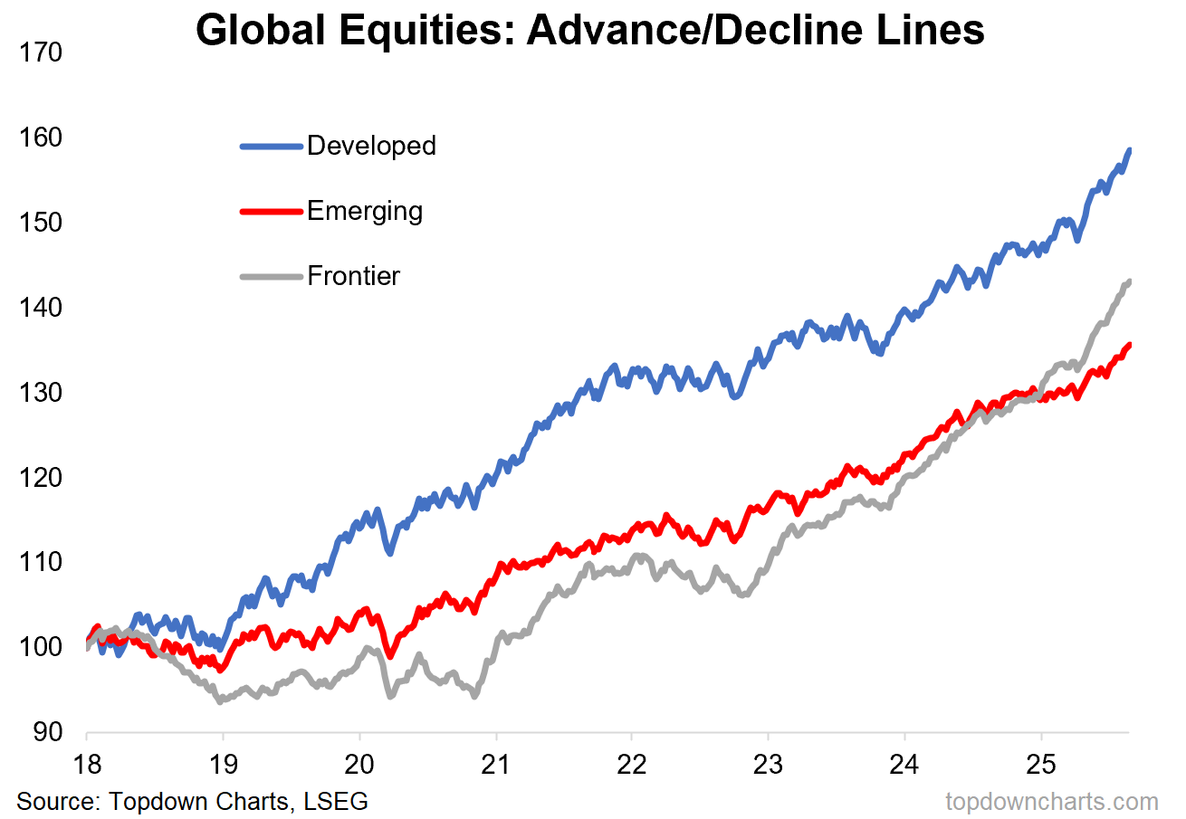
Chart of the Week - Global Equity Advance

Here’s a weird technical indicator you might not have seen before…
NEW: Services by Topdown Charts
Topdown Charts Professional —[institutional service]
Topdown Charts Entry-Level Service —[entry-level version]
Weekly S&P 500 ChartStorm —[US Equities in focus]
Monthly Gold Market Pack —[Gold charts]
Australian Market Valuation Book —[Aussie markets]